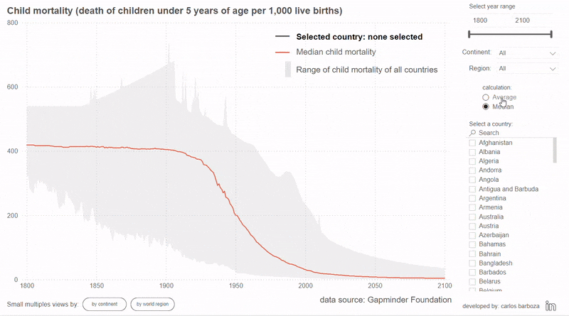
How about switching the average calculation to median or viceversa. The technique of disconnected tables is proper for this scenario and chart example.
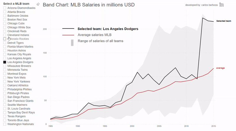
How about switching the field dimension upon which the iterators on the calculations of the average, min and max are based on. On this example, field parameters come to the rescue.
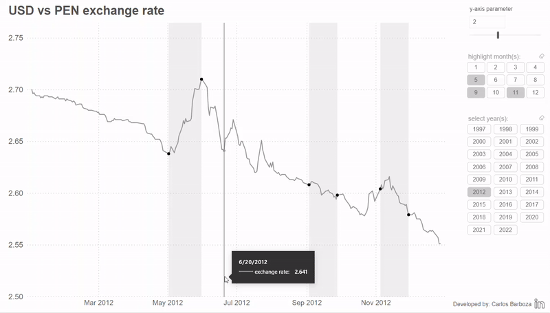
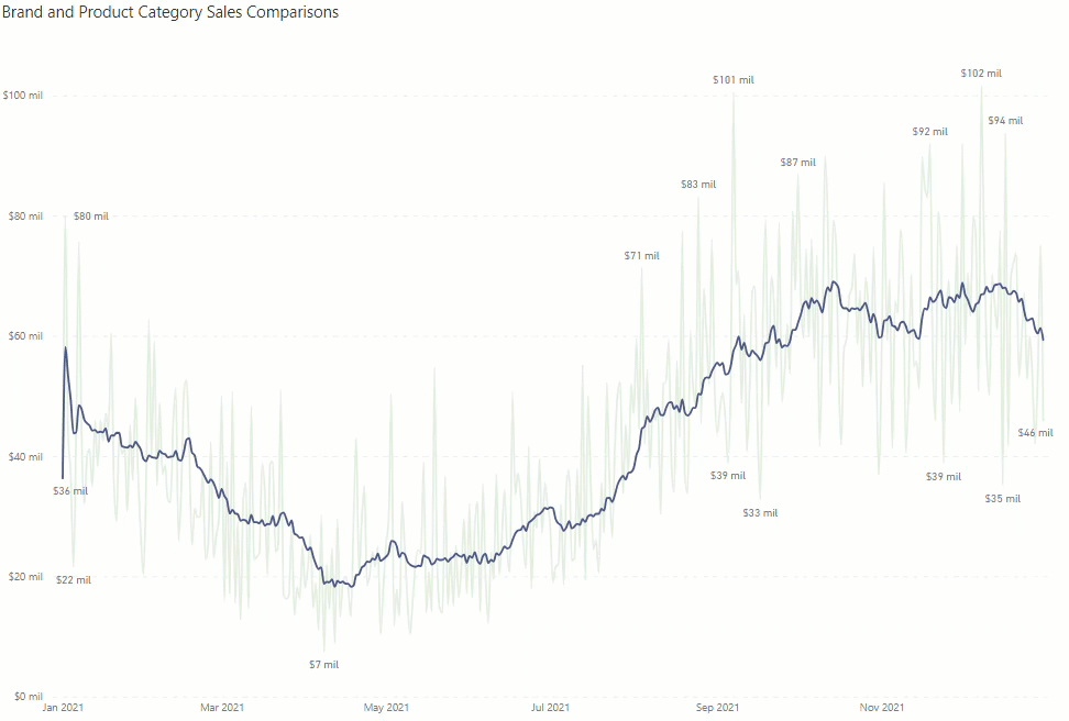
Now with error bars, the implementation of adding these bands is quite easy. Bonus: you will also learn about two interesting approaches for writing the formulas for graphing these bands.
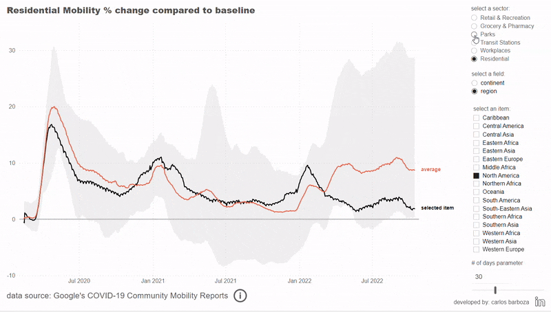
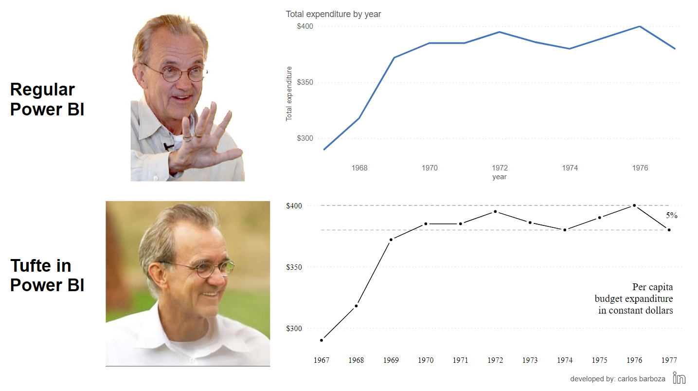
Sometimes the high variability or dispersion of a metric on a line chart can create a very sharpy and edgy look. On this post, we present two versions on how to improve this in Power BI.
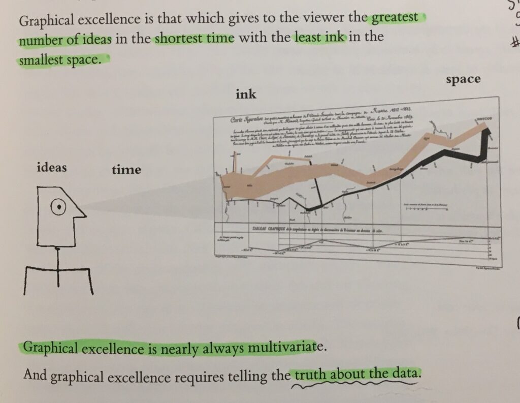
I once read from Edward Tufte that “graphical excellence is nearly always multivariate” from his book: The Visual Display of Quantitative Information (page 51)