Band charts and disconnected tables
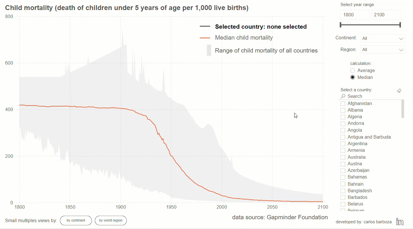
Another interesting example where we utilize the band chart to put numbers into context. In the first part (video 1 of 3) I will share where the inspiration came to implement band charts with this world dataset. Be sure to check out all the links mentioned in the video at the end of this post. Let’s begin.
The implementation with disconnected tables is easy, my approach is through DAX but you can also build them with PowerQuery. Very importantly, in the following video (2 of 3), I will explain why I didn´t use field parameters for the switching of the calculation: average or median on the visual.
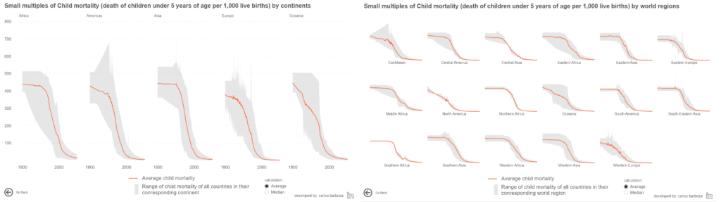
In this last video (3 of 3), I’m again extending the view of a single band chart to small multiples, or to put it sexier: Small multiples band charts. Woah, like the two images below:
Before concluding, below is the interactive report from the example of this post:
Finally, many thanks to Robert for writing about band charts and Hans Rosling for developing Gapminder.org and authoring his awesome book: Factfulness. Thank you both! Be sure to check our Han’s TED talk on “The best stats you’ve ever seen”.
Case you may want the pbix file, you can download it from here.
Thank you for reading/watching.