How to make user-defined tooltips
in Power BI
If you’re seeking inspiration, seek the amazing work of others, emulate it, and distribute the credit accordingly.
Back in August of 2016, Robert Mundigl shared an amazing post on his website on user-defined tooltips with Microsoft Excel, the GIF below is his work:
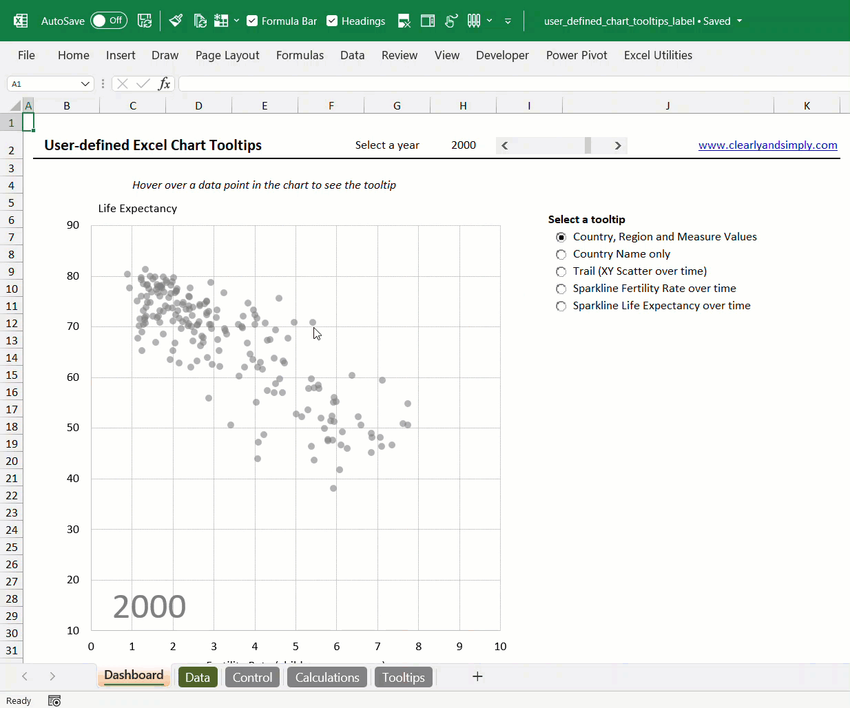
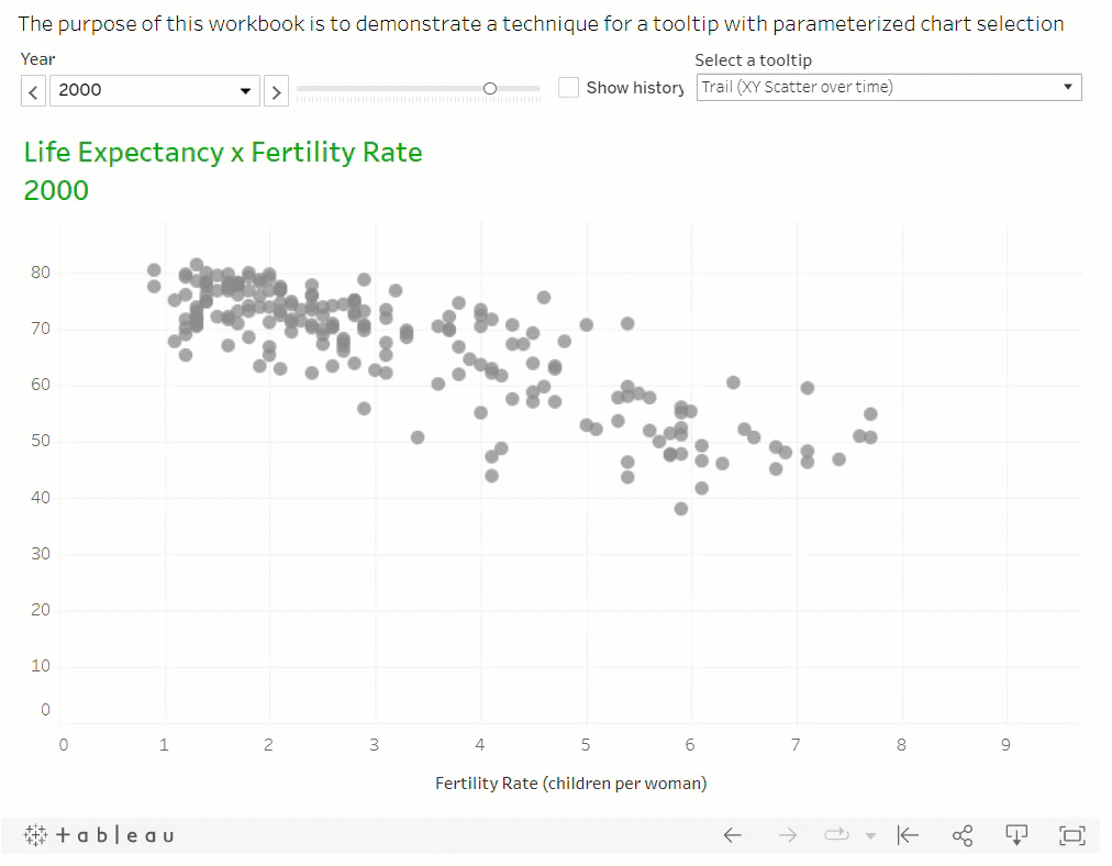
Pretty amazing right? Especially for the “Excel haters” out there. Joke aside, I posted this on LinkedIn because Robert’s work should be known to all of us. Honestly speaking, he takes Excel and VBA to the extremes with regards to data visualization, interactive dashboards, and a role-model work in presenting the information properly plus much more, like Neural Networks in Excel. Now, in the comments of that LinkedIn post, another good friend of mine: Owen Price commented that it was possible to make user-defined tooltips in Tableau as well, and his work on this is the GIF below:
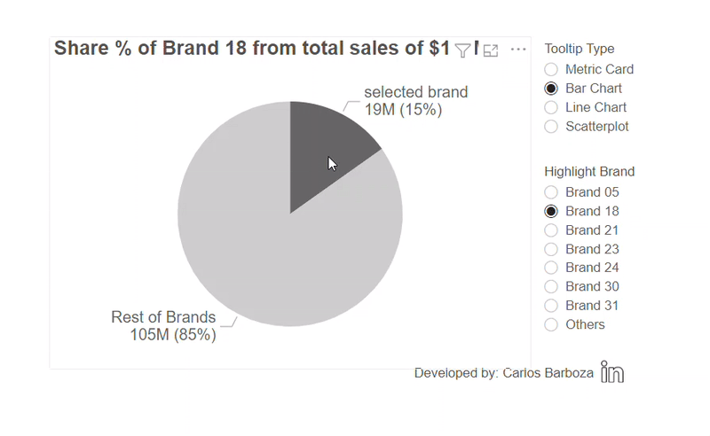
Now the question is: can we make them in Power BI? The answer: YES! Let’s begin with Part 1 of 2.
Now, in part 2 of 2, I will be sharing “the hack” so pay attention to that part on the following video. Let’s go.
Before concluding, below is the interactive report from the example of this post:
Finally, I would like to thank my friend Robert for writing about user-defined tooltip in Microsoft Excel. Be sure to check out his work, it is mind-blowing to say the least.
Also, huge thanks to Owen Price, for sharing his work on user-defined tooltip with Tableau. Be sure to check out his work on LinkedIn as well, his stuff with Excel’s LAMBDAs is out-of-this-world.
Case you may want the pbix file, you can download it from here.
Thank you for reading/watching.