From edgy
& sharpy lines
to dots in Power BI
So, I’m back blogging about Power BI graphics. Sorry for the absence ladies and gentlemen, I’ve been busy in the trenches (consulting) battling crap data and improving chaotic spreadsheets.
Recently, I watched this amazing video by Reid Havens:
And I hope he continues to publish videos like these because the world needs to fight chart-junk. Don’t get me wrong, chart-junk can be beneficial, when wisely used. The chart junk I’m referring to: flamboyant, eye-candy, non-functional chart junk. The kind of junk on data graphics that is just clutter, and it does not add any value to the visual understanding for an audience.
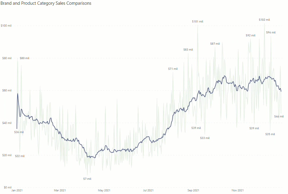
Now on Reid’s tutorial (above), he got up to this enhanced version:
And it is much better than the original version. Please watch the video above. Also subscribe to Reid’s YouTube channel. It’s amazing, loaded with so many tutorials and live sessions where interesting nuances about data management with Power BI are revealed.
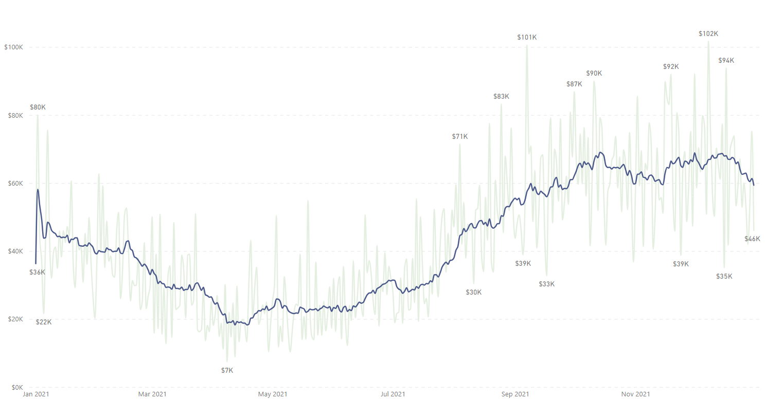
Now, the question is: can we do more to it? Here’s are two versions I came up with:
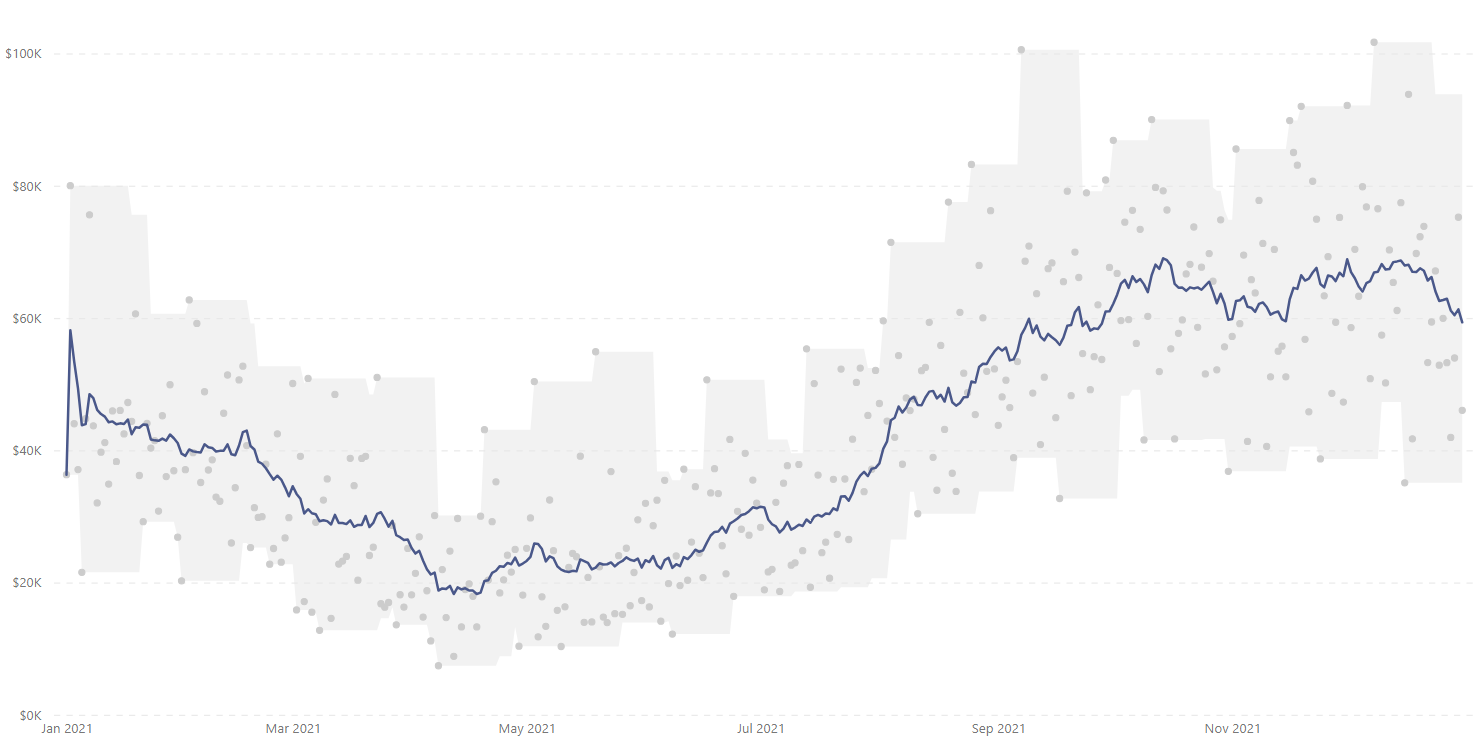
The first: converting the light green line (daily sales) to light grey dots:
And you may be wondering why. Well, what’s the point of line charts? Answer: seeing trends. And with the version that Reid got to, I think we could switch the light green line to grey dots, so the rolling average (blue line) has more prominence if, the focus or objective of the chart is to emphasis this. I congratulate Reid for adding the rolling average to smooth out the high variability of the original light green line. Kudos Reid.
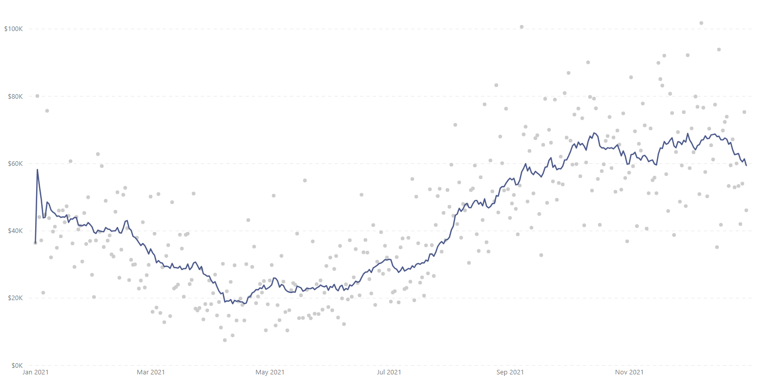
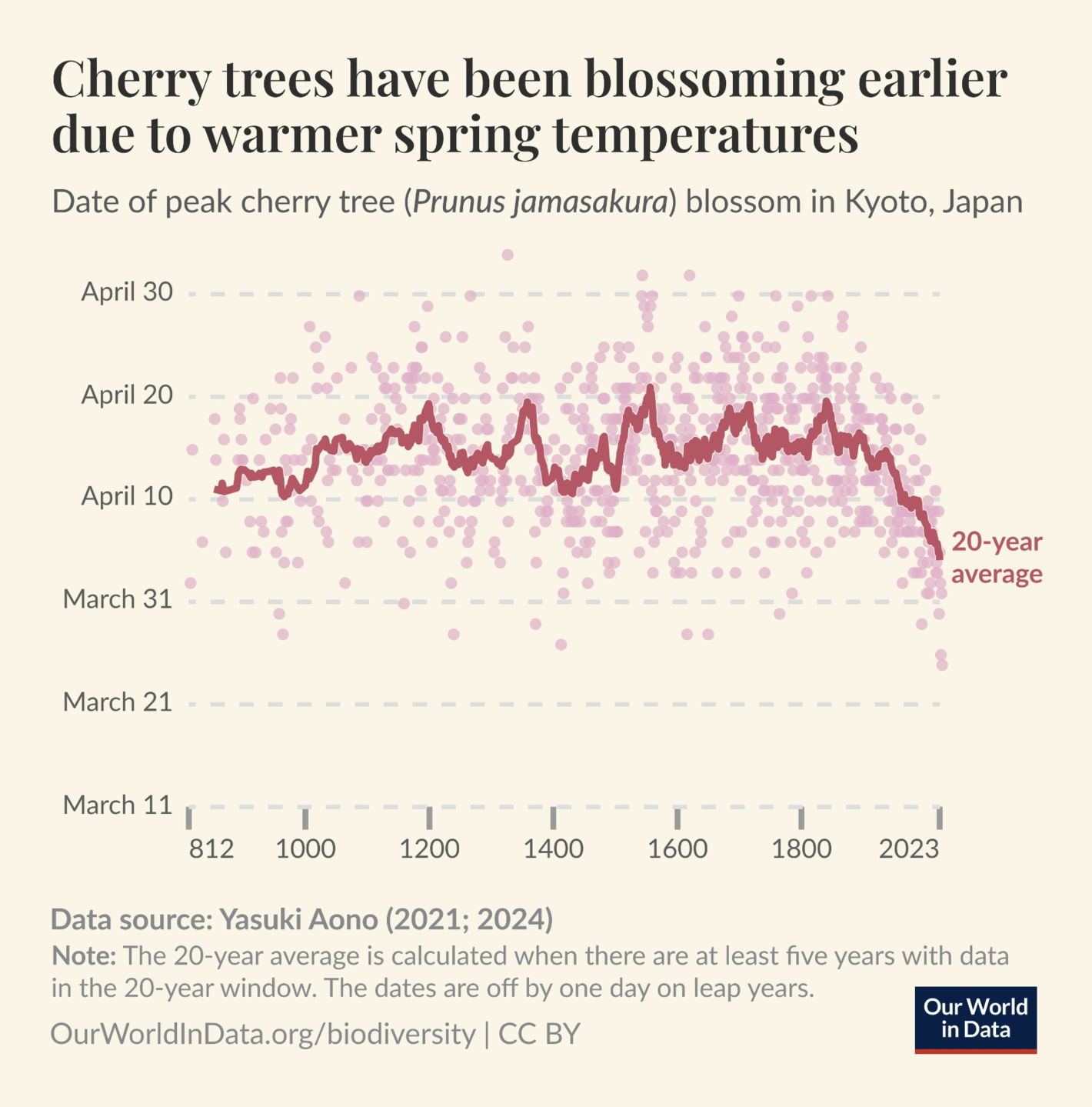
Now, I have to share that I got inspired to proceed with making this switch after seeing these two graphics on the wild:
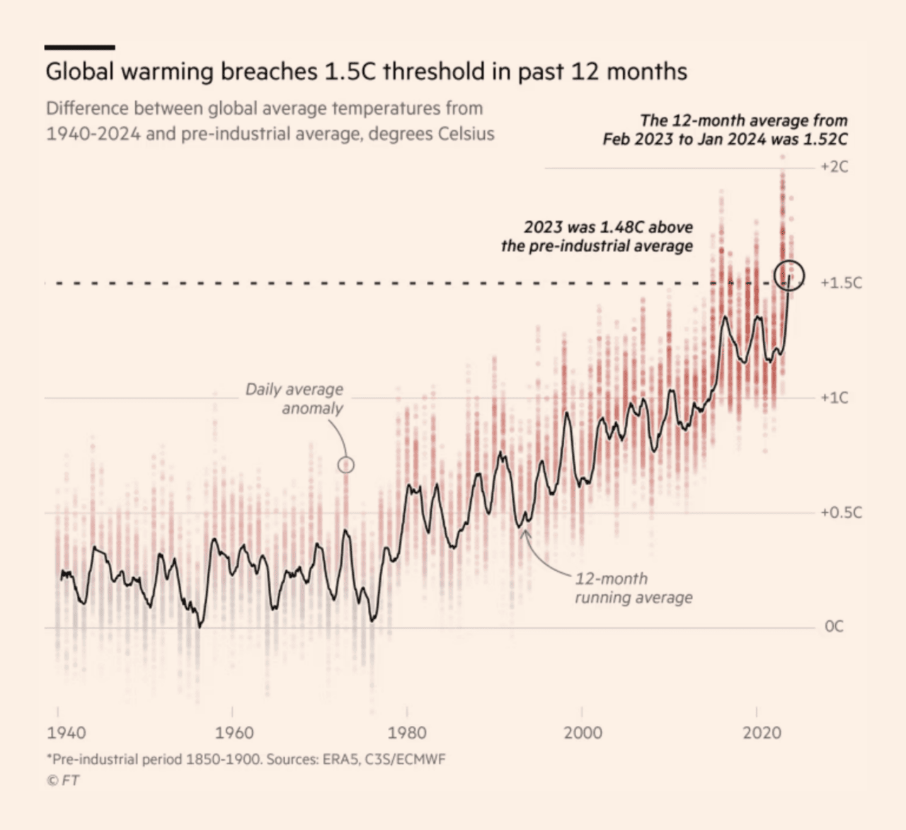
 Source: https://twitter.com/OurWorldInData/status/1765399130405208181
 Source: https://www.ft.com/content/8927424e-2828-4414-86b7-f3a991214288
As you can see on the two previous charts (from Our World in Data and The Financial Times) the rolling averages are more prominent when the other series of data points is plotted as dots and these dots are not connected with lines.
And now, how about adding a band to the rolling average? Like this:
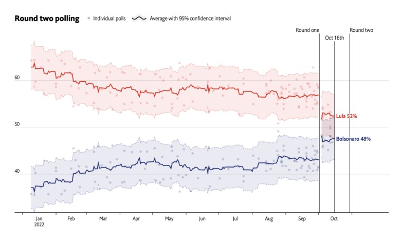 Source: https://www.economist.com/interactive/brazil-2022
Inspired by the graphic above from The Economist, I proceed with implementing something similar and it came out like these:
I think the rolling average still remains prominent. And now we have a band in which all the data points are like “inside”, and this facilitates in seeing how spread out the variability is. The wider the band, the higher the variability and vice versa.
This could be helpful for exploratory data analysis when understanding how much a metric varies across time.
Now, how can you achieve this in Power BI? It’s very easy but it comes with a caveat. Let’s see:
Case you may want the pbix file, you can download it from Reid’s video here. And follow along the video above to implement the changes. Sorry that I’m not providing you a direct link to my file, I just don’t want to cause any discomfort with the original author of the file.
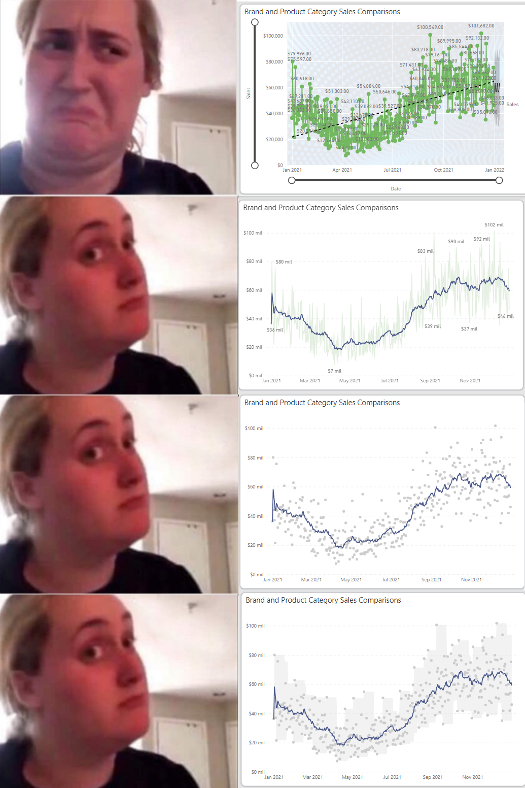
And finally, a meme 😁 to recapitulate what’s been discussed:
Thank you for reading/watching.