How to make band charts in Power BI
So, band charts are not something new, but they are rarely seen in practice and that´s a big pity. They can be highly informative and provide good context for analysis, especially when you are exploring the data. I got inspired to replicate this chart in Power BI after checking out Robert Mundigl´s post on band charts which you can read here. Note: Robert´s work in Excel and Tableau is mind-blowing and his post was made more than 10 years ago.

If you read Rob´s post, you will find the following definition about band charts, which I quote:
“Basically, a band chart is a standard line chart enhanced with a shaded area displaying the upper and lower boundaries of groups of data (e.g., the range between the minimum and the maximum of all members of the category). Band charts are very often supplemented by another line showing the arithmetic mean (the average).
Band charts provide far more context to your visualization and more insight into your data. Especially if you have to explore unknown data sets. They are easy to implement, very intuitive, very effective and do not require one pixel more of your dashboard real estate than a standard single line chart.”
And now the question is: can we make them in Power BI, easily? The answer: YES!
Note: this post has been updated to October 2022, because before we had to recur to the Line & stacked column visual in Power BI to produce it. Now, the way to go is using a line chart with error bars (or bands to be more precise). Let me show you the before-and-after in the following video (part 1 of 3):
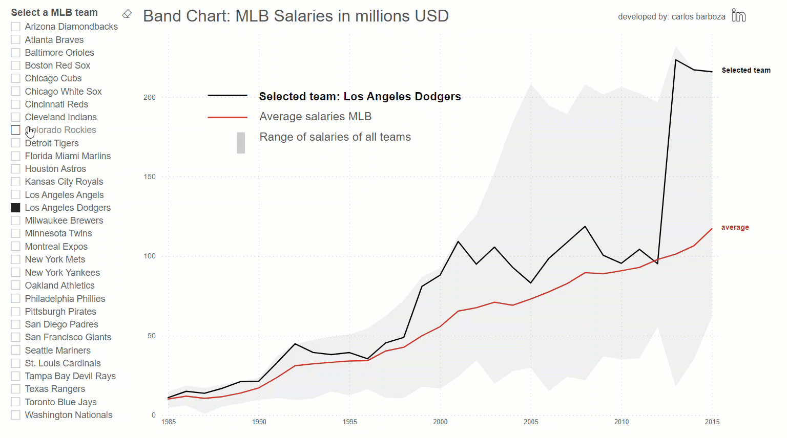
Now, in the following video (part 2 of 3), I will show you how to implement the band chart easily, and visualize it like the GIF below:
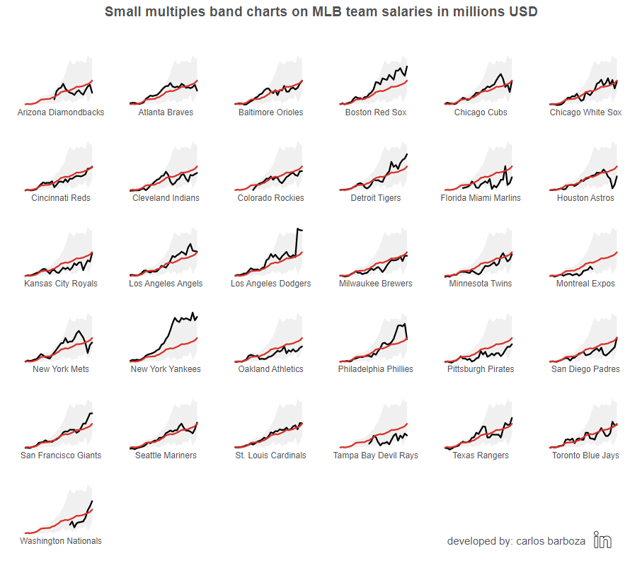
The final video (part 3 of 3) shows how to implement the small multiples band charts version like the image below:
Before concluding, below is the interactive report from the example of this post:
Finally, I would like to thank my friend Robert for writing about band charts and Sean Lahman for sharing the MLB data. Thank you both! Case you may want the pbix file, you can download it from here.
Thank you for reading/watching.