Band charts and fields parameters
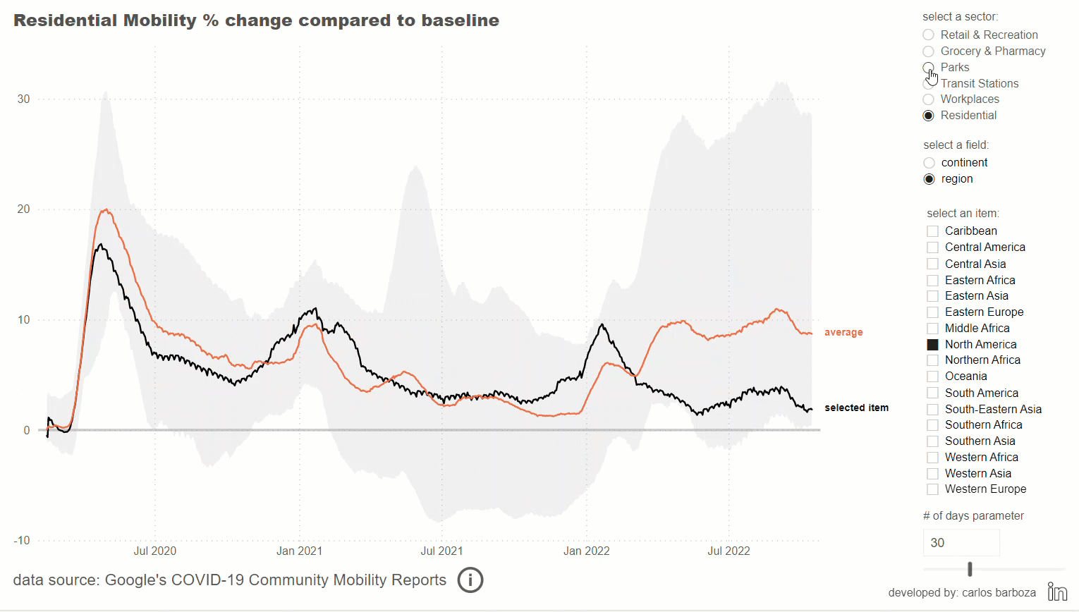
Another interesting example where we utilize the band chart to put numbers into context. In the first part (video 1 of 3) I will share where the inspiration came from to implement band charts with this world dataset provided by Google. Let’s begin.
In the following video (2 of 3), I will be showing how to combine the feature of field parameters, the new DAX function: NAMEOF, and a small hack with another disconnected table to dynamically obtain the items of a field depending on the selection of a field in another slicer.
In this last video (3 of 3), I will show the adjusted formulas for this example.
Before concluding, below is the interactive report from the example of this post:
Finally, many thanks to Robert for writing about band charts and Google for allowing us to analyze a remarkably interesting dataset.
Case you may want the pbix file, you can download it from here.
Thank you for reading/watching.