Data visualization memes with Power BI
Note: this blogpost is updated as new memes come along.
Can we teach, train or educate others with a small dose of humor? Data visualization is fun field to get into, I kid you not, you will come across, great principles, rules, “laws”, marvelous scientific research, amazing authors, mind-blowing examples of others, and to everything that has been advanced in this field, I take my hat off.
Now, I often use metaphors or analogies when I try to explain something technical to someone who is not tech-savvy. And it never fails to use a simple language to communicate worthy things. Now, what I´ve been trying, and it has been working; is adding a bit of humor for comparing and contrasting, the good versus the bad in data visualization by using: memes.
In the quest for great discussion on data visualization with my clients, can a bit of humor help? I’m not sure but here we go. In case you would like to interact with the report (shown in the memes below) go here. In some memes, you will see Zebra BI visuals in action (my advice: invest in getting acquainted with them, they’re worth the investment for your Power BI reporting).
001: “Bars over Pies” powered by Zebra BI for Power BI
Track ID: Groove Committee – I Want You To Know [Nu Groove]
002: Small multiples over “Spaghetti charts”
(Please don’t tell Edward Tufte I made him into a meme, I still want my books to be autographed by him). The custom visual below is powered by Daniel Marsh-Patrick’ small multiple for Power BI. For more information about this visual go here.
Track ID: Fruit Loops – Dance Dance Dance (Original Mix)
003: “Spaghetti chart” or highlighting one line at a time?
“Spaghetti chart” or highlighting one line at a time? Just in case, no custom visual or no layering hacking for the example below, just using a line chart visual in Power BI and displaying some of the visual benefits of highlighting a line individually. I would like to invite you to check out the discussion on how to avoid spaghetti charts, amazing post by the Storytelling With Data team, here.
Track ID: Alphonse Mouzon – Everybody Get Down (Original Mix)
004: Power BI’s stacked bar chart or Zebra BI’s
Displaying below some of the cool benefits of Zebra BI visual: stacked bar chart, which enhances the visualization with having the option to convert it into small multiples so all the stacks can be properly comparable with having a common base or starting point respective to corresponding categories or, brands for this example.
Track ID: Gwen McCrae – Keep The Fire Burning (UK Club Remix)
005: Comparing the slices of two pies or using the undervalued slope graph?
Displaying below some of the cool benefits of slope graphs in comparison to using two pie charts, there are two versions of slope graphs, one with a highlighting feature which you can setup easily in Power BI and another without it, right next to each other.
Track ID: The Whatnauts – Help Is On The Way (Original Mix)
006: Clustered Column chart or Zebra BI’s Actual / Absolute Variance Bars?
Displaying some of the cool and visually enriching capabilities of Zebra BI‘s visuals. My favorite: to be able to switch the visual with just a click. Usually, moving averages are best seen with line charts, but…there are many users who love their column graphs to see trending data. Why not have both options at your disposal with just one click?
Track ID: Sonny Jenkins + NY Potpourri Strings – That Friday Pay (Original Mix)
007: Pie Charts with User Defined Tooltip?
When you read about data visualization theory, you’ll come to realize that the pie chart becomes the most hated graph of all. There are many valid reasons for it, but at the same time, I think there can be value on this chart type when designed properly and strategically. It can serve as the “entry-point chart” to start discussing the data or information in the quest of finding the insight.
In addition, we can add context to the pie chart by implementing a useful technique called “User Defined Tooltip”, where the user can switch the graph type of the tooltip for additional context and precision on the slice selected. Many thanks to Robert Mundigl and Owen Price for their work on this technique in Excel and Tableau respectively, and for which led me to figure out how we can implement it in Power BI.
Track ID: Deodato – Keep It In The Family (Original Mix)
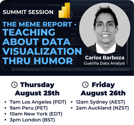
On June 4th, 2022, the “Unleashed-quality-content-Machine” (no kidding on that title) Brian Julius invited me to deliver a presentation at The Business Intelligence Summit 2022 organized by Enterprise DNA. From August 24 through August 26th of 2022, this 3-day event delivered some mind-blowing presentations by Power BI Experts from all around the world. On this opportunity, I decided to showcase The Meme Report, sharing the possibility that we could potentially teach about the fascinating field of data visualization through humor or memes.
And the five lessons I wanted the audience to take home were:
- The importance of reading about data visualization theory.
- Compare and contrast, through memes, the positives & negatives of bad versus good graphics.
- The benefits of Zebra BI visuals for Power BI reporting.
- Knowing more DAX for hacking Power BI to get the desired outcome on visuals.
- Organization of work on Power BI reports: Folders for DAX measures.
Again, thank you, Brian – for the opportunity!
And now, the following video is the presentation of The Meme Report:
Thank you for reading/watching.