How to add borders to markers
in Power BI
I enjoy checking out the data graphics from major news outlets like the Wall Street Journal, The Economist, The Financial Times, The Washington Post and The New York Times, among others. Several months ago, I came across the following graphics from The Wall Street Journal, and I noticed the markers on them (red arrows):

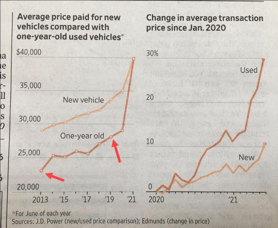
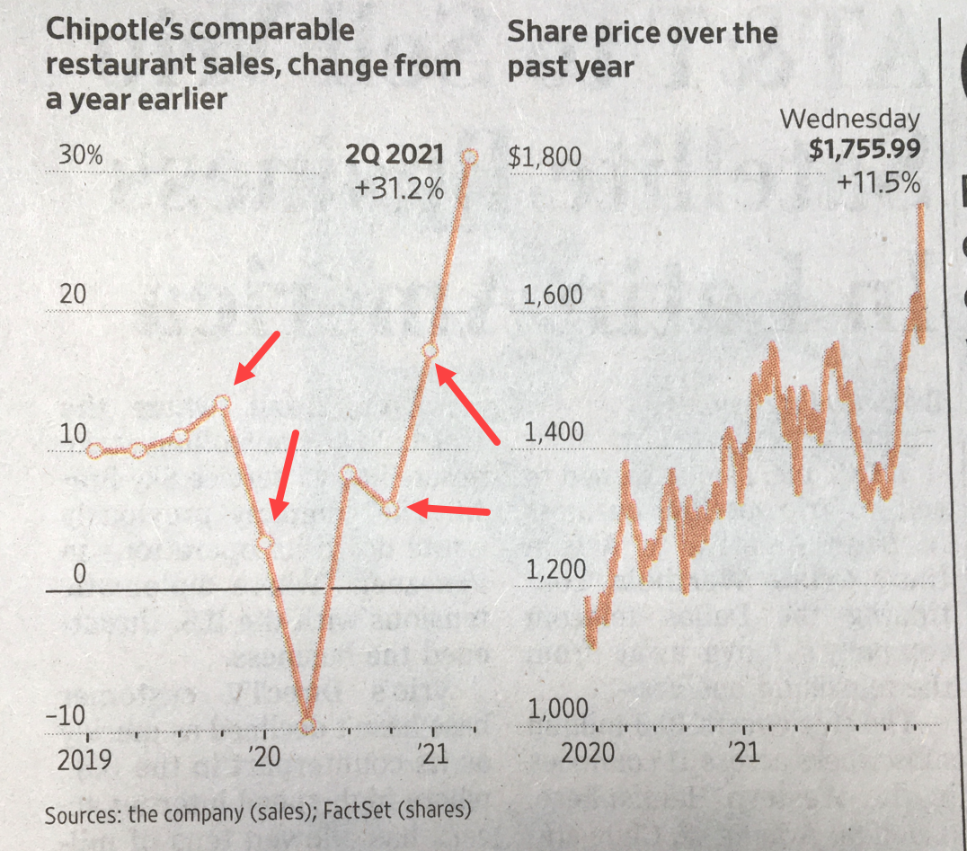
From a design perspective, I think markers in this format add an appealing design touch to your line visuals. I then wondered how we can add borders to markers in line visuals of Power BI and at that moment, I couldn’t figure it out. Several months later, I saw Gustaw Dudek‘s approach on LinkedIn. And here’s my reaction and my approach to his post (thank you Gustaw!):
And now comes the implementation which is very easy. Let’s go.
As a summary of the video above (part 2), always keep in mind the following:
-
-
- You will need two measures; one is a duplicate of the first one.
- Formatting will be needed on the lines and markers of the two series due to the fact of using two measures.
- Designing a custom tooltip to hide the fact that there’s two measures on the visual.
- The caveat of many data points on a line graph with markers.
-
Finally, and as a bonus, let’s proceed with an example with real data that has borders on markers. Let’s go.
Before concluding, below is the interactive report from the example of this post:
Finally, I would like to thank Gustaw Dudek again for posting his approach in LinkedIn about borders on markers. Case you may want the pbix file of this blogpost, you can download it from here.
Thanks for reading / watching!