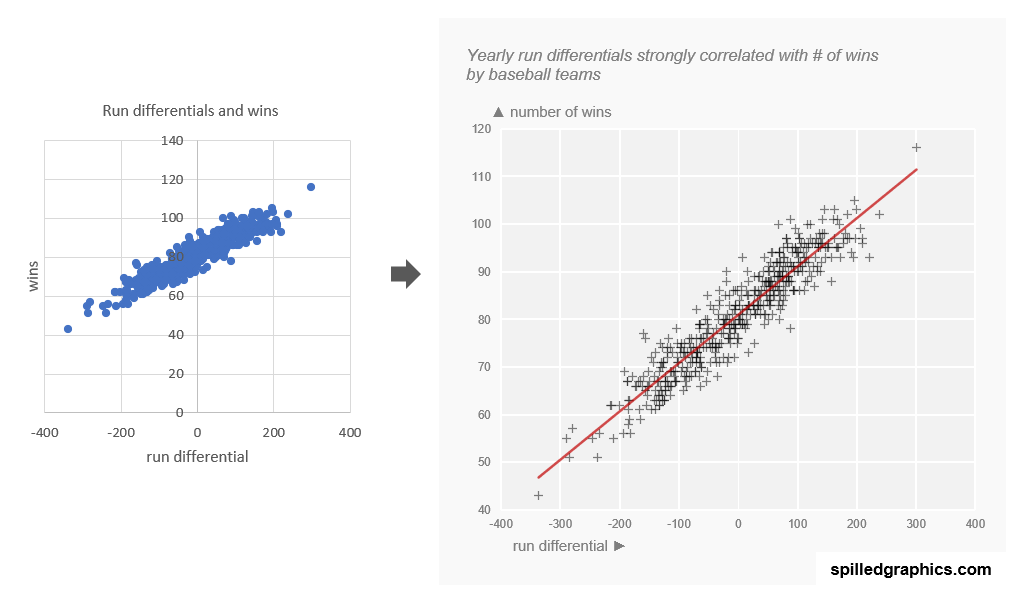
Personal mantra: Don’t ever leave the defaults, untouched. When we accentuate elements in our graphs we do a favor to our audiences in making the visualization easier to interpret.
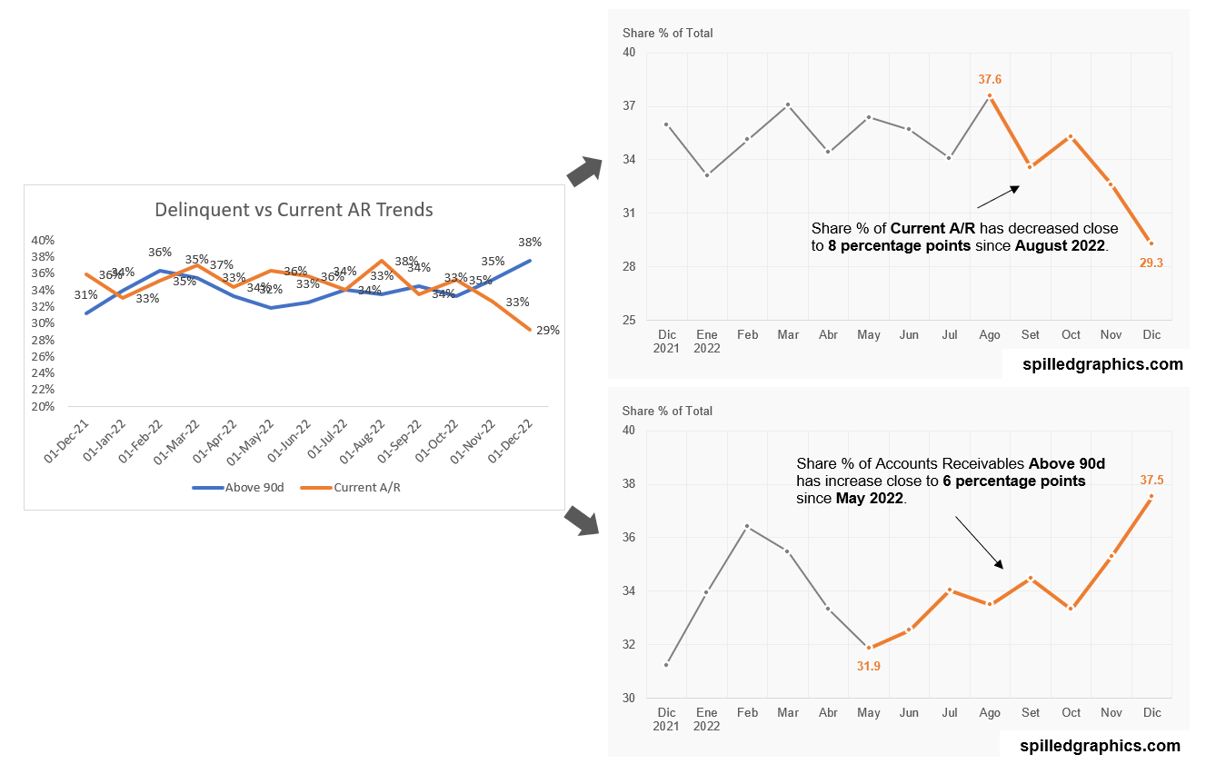
One chart broken down into two to emphasizes better the stories it was containing. Annotations for these situations are sacrosanct. Never leave the defaults untouched.
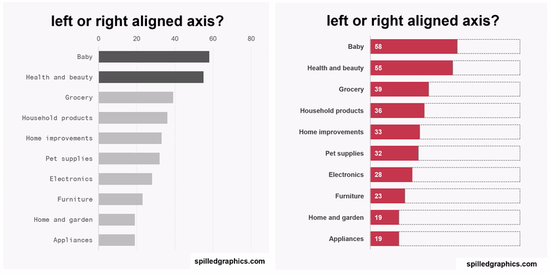
Three approaches for left aligning the vertical axis of a bar chart. Which one is better left or right aligned? I’m not sure, but it’s interesting that something as banal as this it’s not natively possible in Excel.
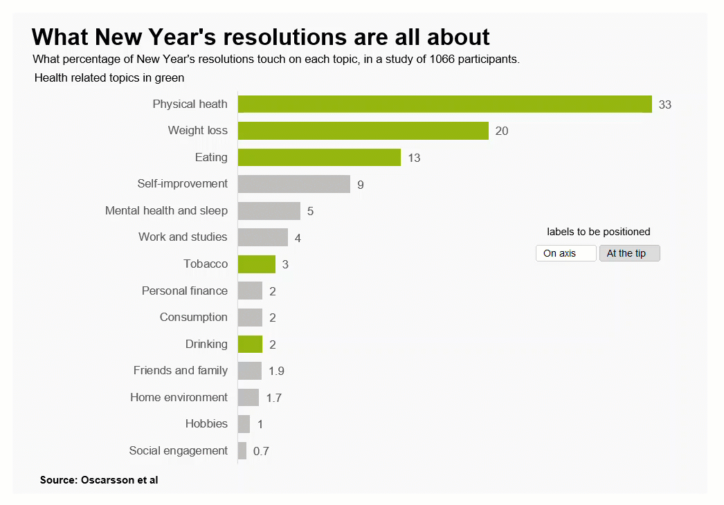
Where should data labels be: on axis or at the tip? As always with data graphics, it depends. A cool formula to obtain this effect along with a brief introduction to the amazing LET function.
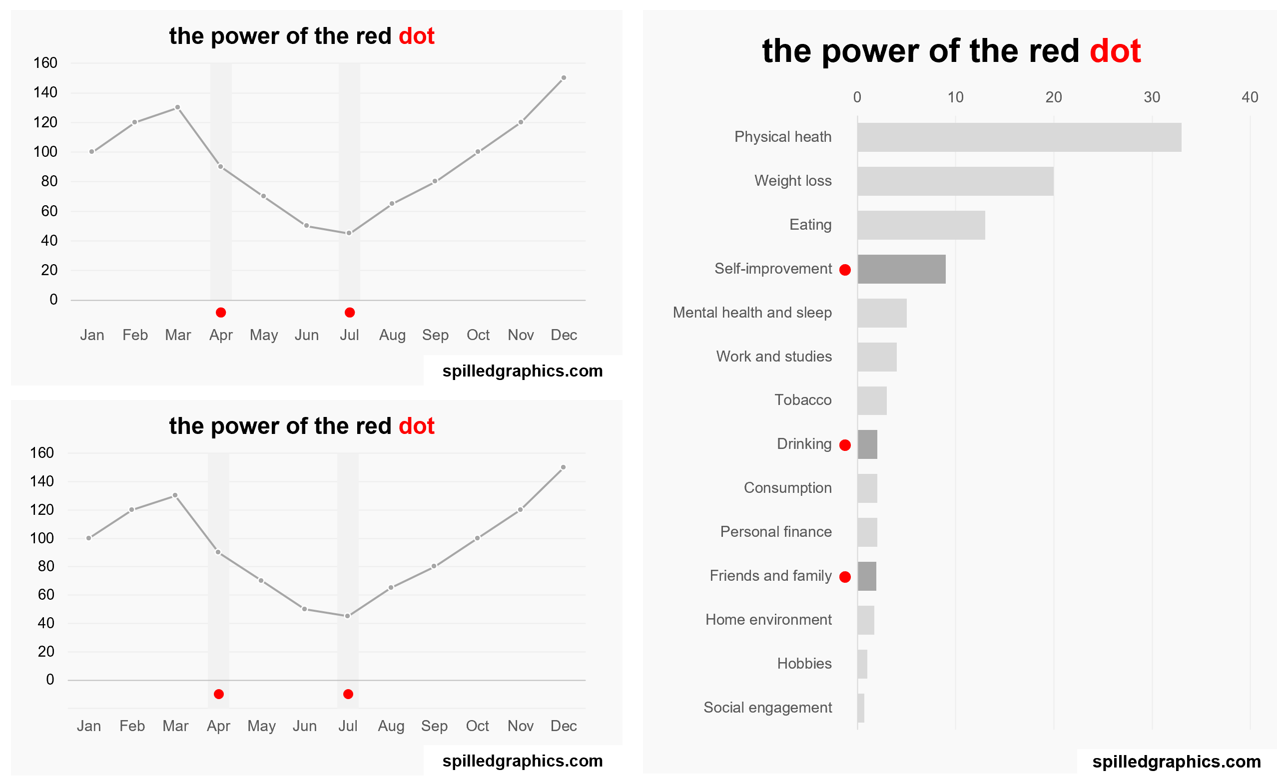
The powerful red dot in data graphics can ignite attention and bring focus to the decision makers so they can concentrate on the signals rather the noise. A simple colored point may lead to smart decisions.
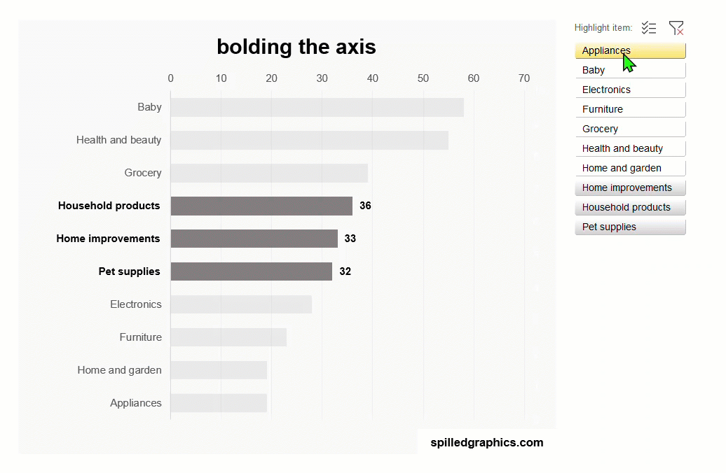
Highlighting or “brushing” interactivity in data graphics is essential to obtain focus and attention on specific item(s) of the visualization displayed. Now, can the items of an axis of an Excel chart be highlighted or bolded? Answer: yes.
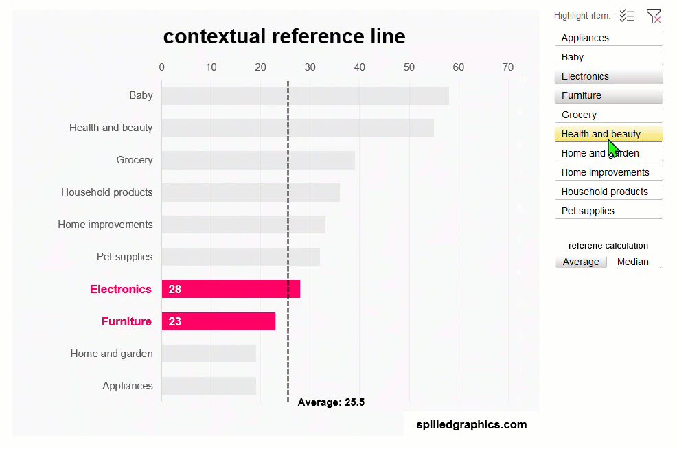
“Compared to what?” is a magical question I learned from reading Edward Tufte’s books. All the time we are evaluating numbers, and this question should be paramount to keep in mind when analyze them.