enhancing
the defaults 002:
the helper series
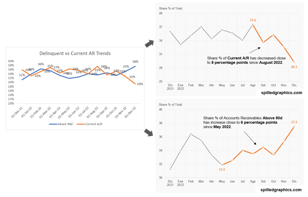
The three charts above show or display the same information, but the two on the right look a bit more aesthetically. Why is that? Simply, because the defaults have been enhanced. Let’s begin.
Things to remember with Excel charts:
-
-
- Graphics must be enhanced for seeking clarity on the information they display.
- Helper series for Excel charts comes from the term “helper columns” from Excel formulas.
- In graphics, readability is accessibility. Be careful with visual noise. Master visual prominence.
- Negative space = white space.
- Gray is your friend, be stingy with the color.
- Minute 35:50: File > Options > Advanced > Chart > (disable) > Properties follow the chart data point of the current workbook.
- Lastly, don’t leave the default values intact.
-
If you have any questions or suggestions, let me know in the comments section on the YouTube video above.
For consulting inquiries, please direct message me on LinkedIn. Thank you.