enhancing
the defaults 001:
the cross markers
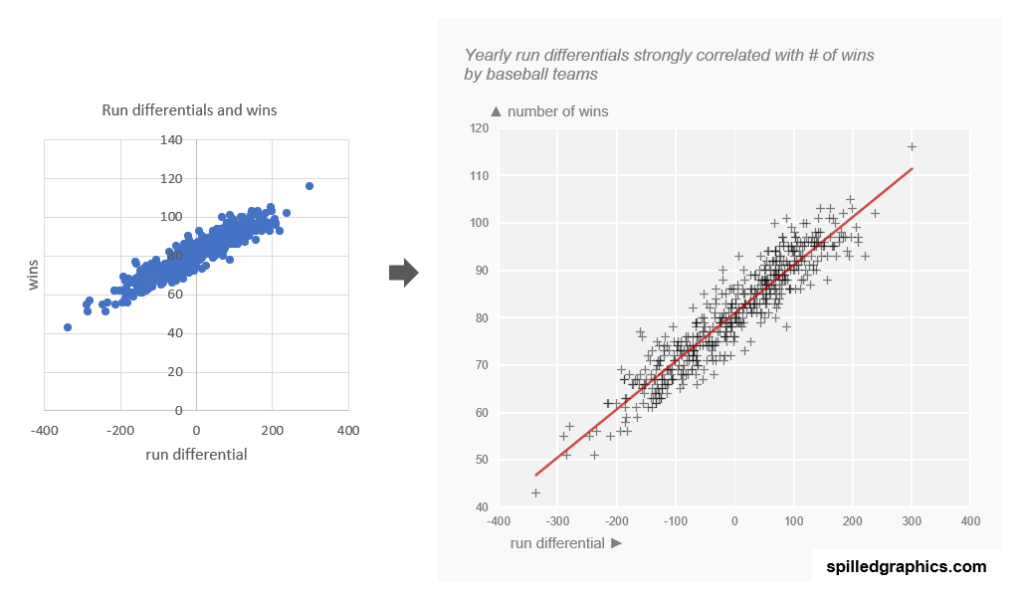
The two charts above show or display the same information, but the one on the right looks a bit more aesthetically. Why is that? Simply, because the defaults have been enhanced. Let’s begin.
Things to remember or to keep in mind with Excel charts:
- Excel chart’s elements are clickable or touchable so don’t be shy in enhancing them. Refine your graphic.
- Grey is friend, be stingy with color.
- Adjusting the transparency level % can help in reducing the visual noise when overplotting data.
- Vertical labels are tricky, be careful when implementing then, horizontally is better, its more legible and therefore, accessible.
- Lastly, don’t leave the defaults untouched.
Again, many thanks to the authors of the amazing book mentioned in the video: The data visualization handbook. for the inspiration of this post.
If you have any questions or suggestions, let me know in the comments section on the YouTube video above.
For consulting inquiries, please direct message me on LinkedIn. Thank you.