enhancing
the defaults 005:
red 🔴 dot on axis
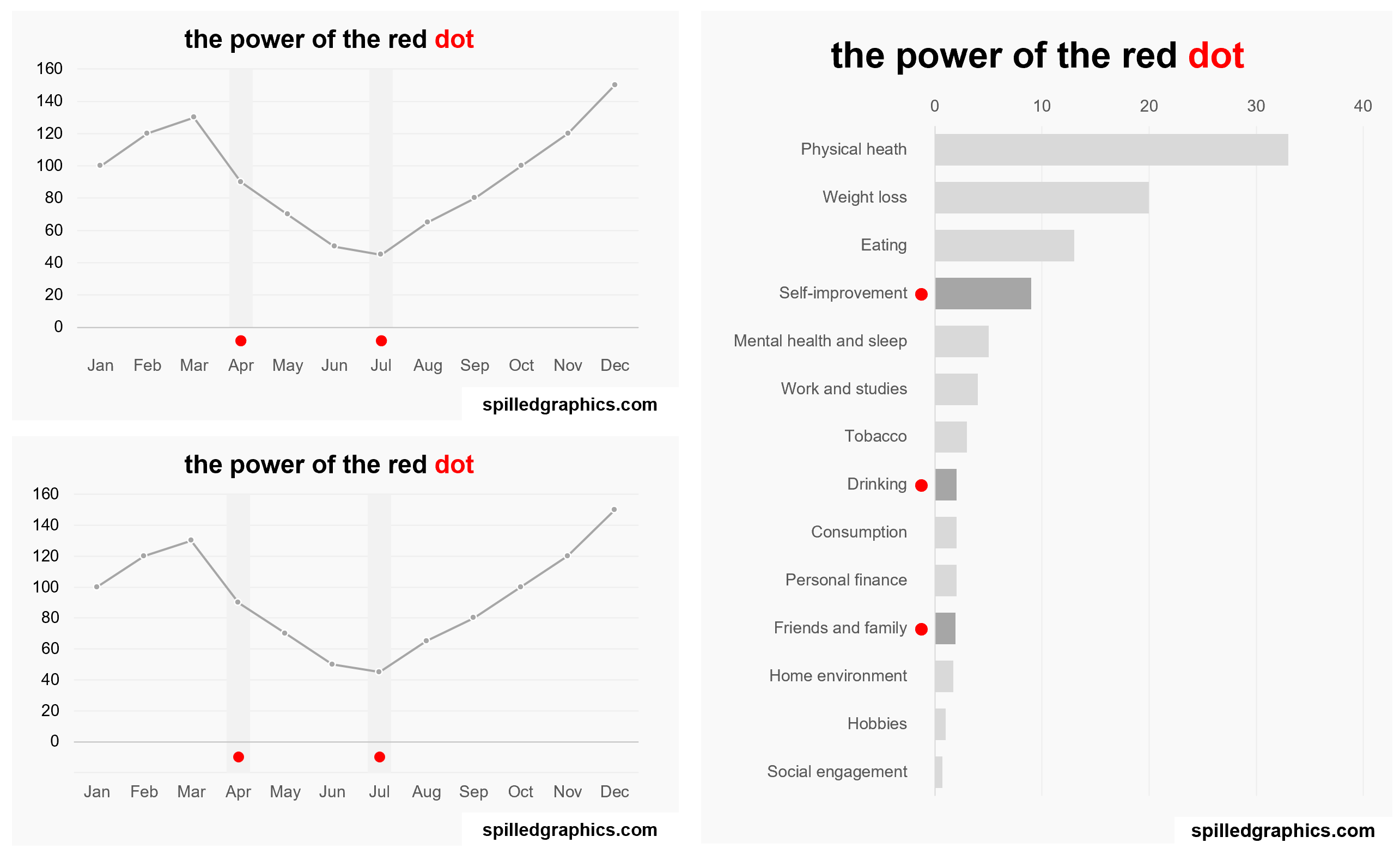
How powerful can a simple red dot be on the axis of a graph? Many thanks to Stephen Few for writing about this powerful technique. Let’s learn how it can be implemented with Excel charts.
Links mentioned in the video:
If you have any questions or suggestions, let me know in the comments section on the YouTube video above.
For consulting inquiries, please direct message me on LinkedIn. Thank you.
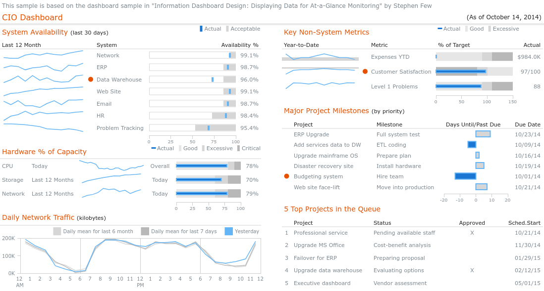
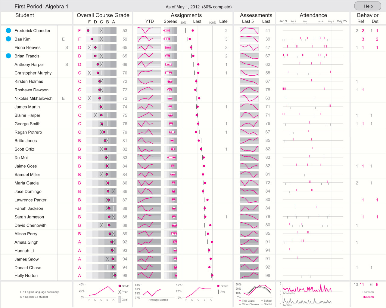
Below are real examples in the wild of charts with the powerful red 🔴 dot:
 Source: https://robslink.com/SAS/democd46/cio.htm
 Source: https://www.anychart.com/products/anychart/gallery/Dashboards/CIO_Dashboard.php
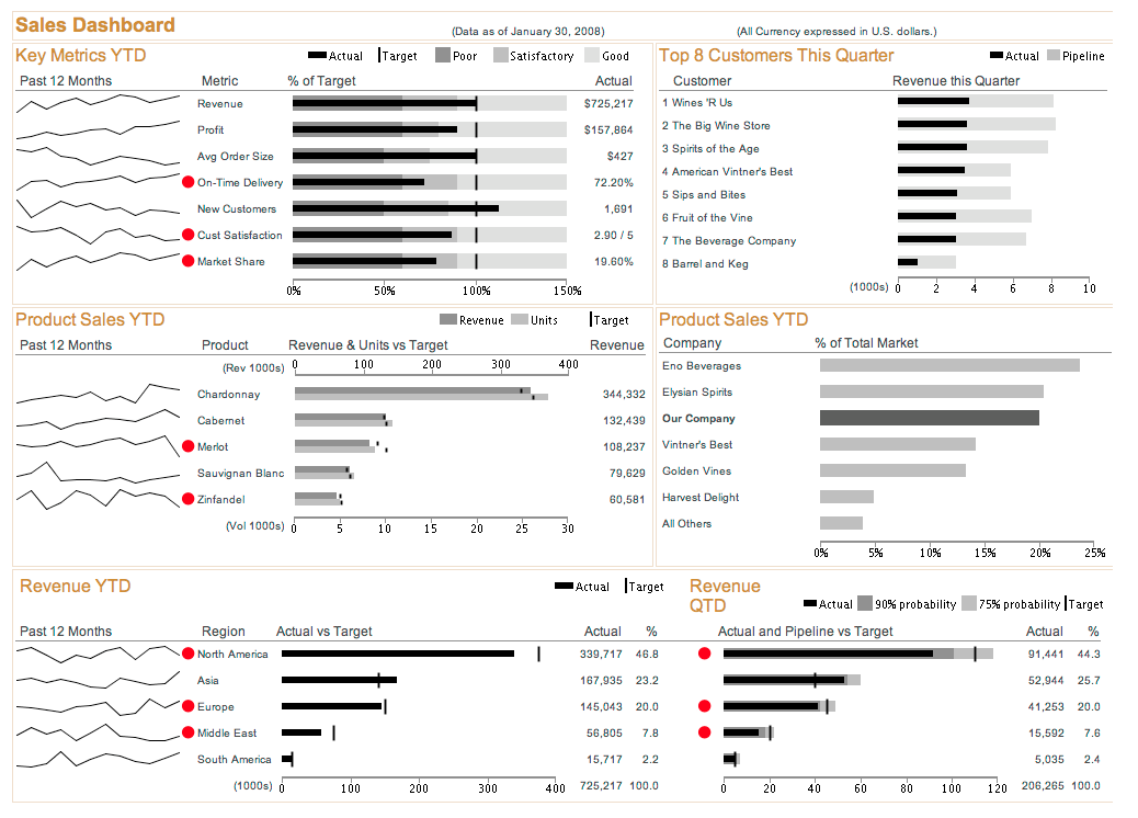 Source: https://speckyboy.com/designing-information-dashboards/
 Source: https://www.perceptualedge.com/blog/?p=1466
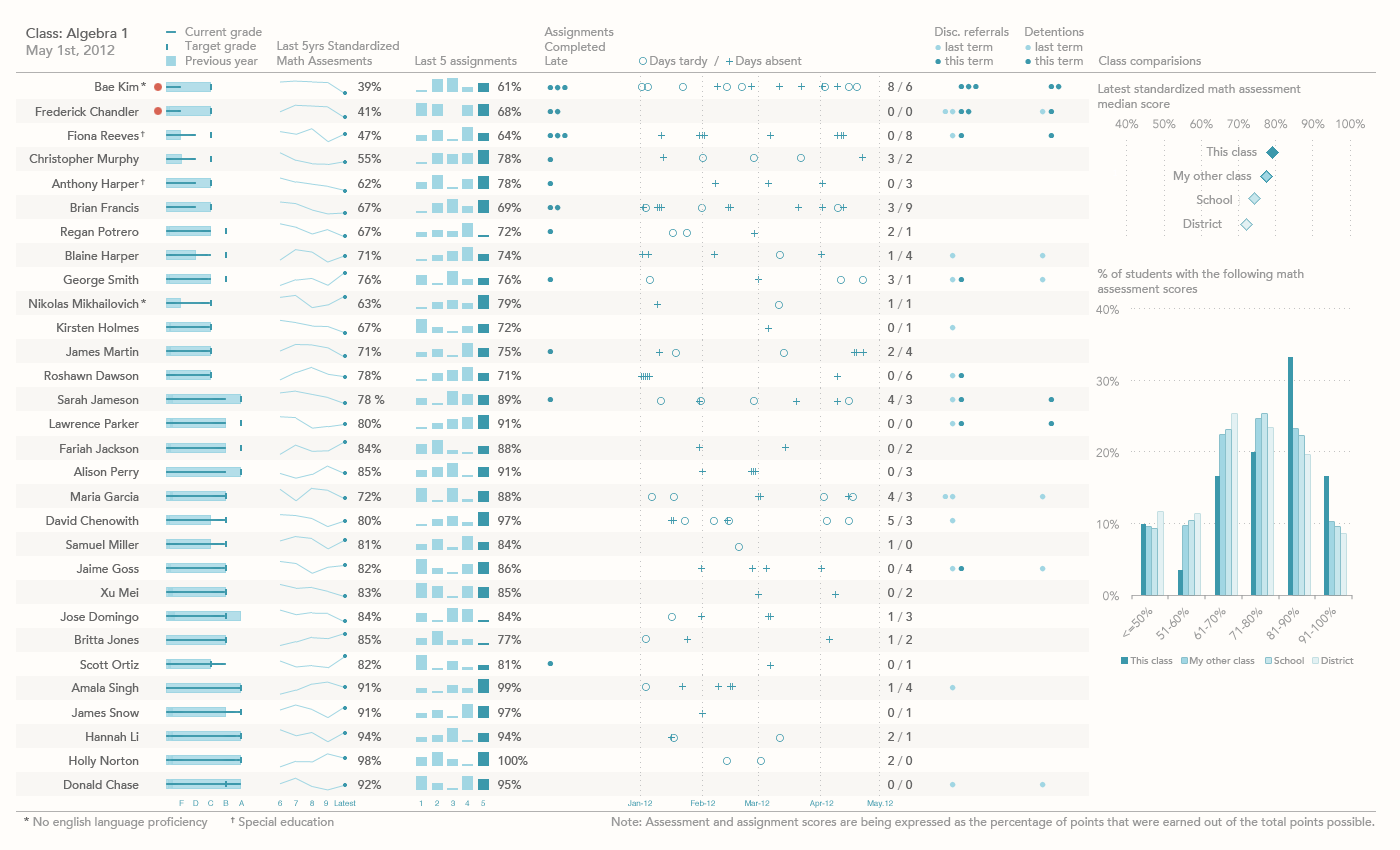 Source: https://www.perceptualedge.com/blog/?p=1374
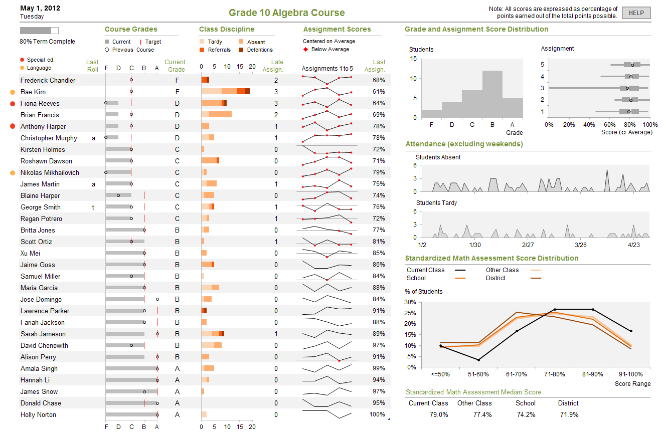 Source: https://www.perceptualedge.com/blog/?p=1374