enhancing
the defaults 004:
labels on axis or at the tip
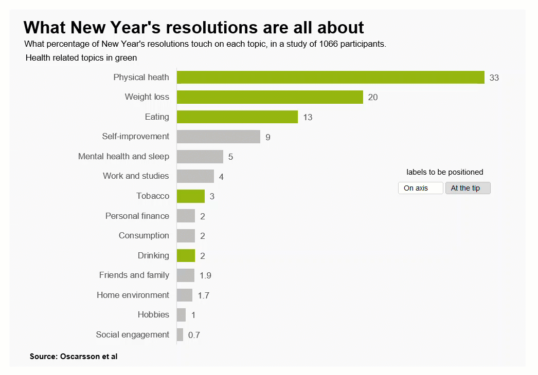
Should data labels be at the tip or end of the bars…or how about on the axis? Which one is better? It depends (as usual in data graphics). Let’s begin how to set it up in with Excel charts:
If you have any questions or suggestions, let me know in the comments section on the YouTube video above. For consulting inquiries, please direct message me on LinkedIn. Thank you.
And lastly, below 4 real examples in the wild with labels at the tip or on the axis:
The first with the labels at the tip:
source: https://x.com/paulfeig/status/1529309507788103681?s=20
The second one with labels on axis:
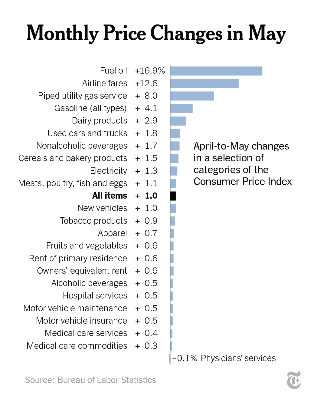
source: https://x.com/nytimes/status/1535328488735006722?s=20
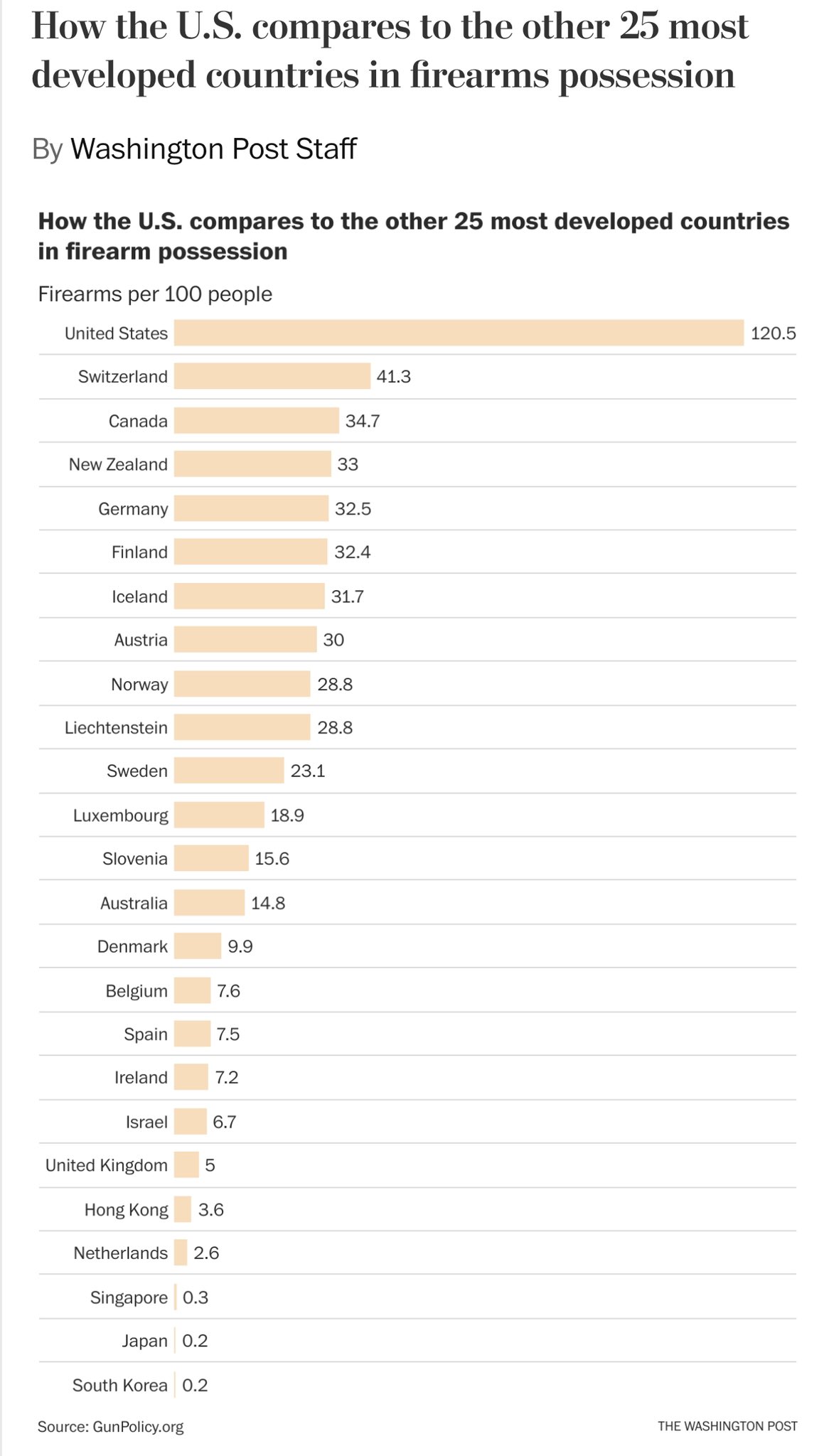
The third one also with the labels on the axis:
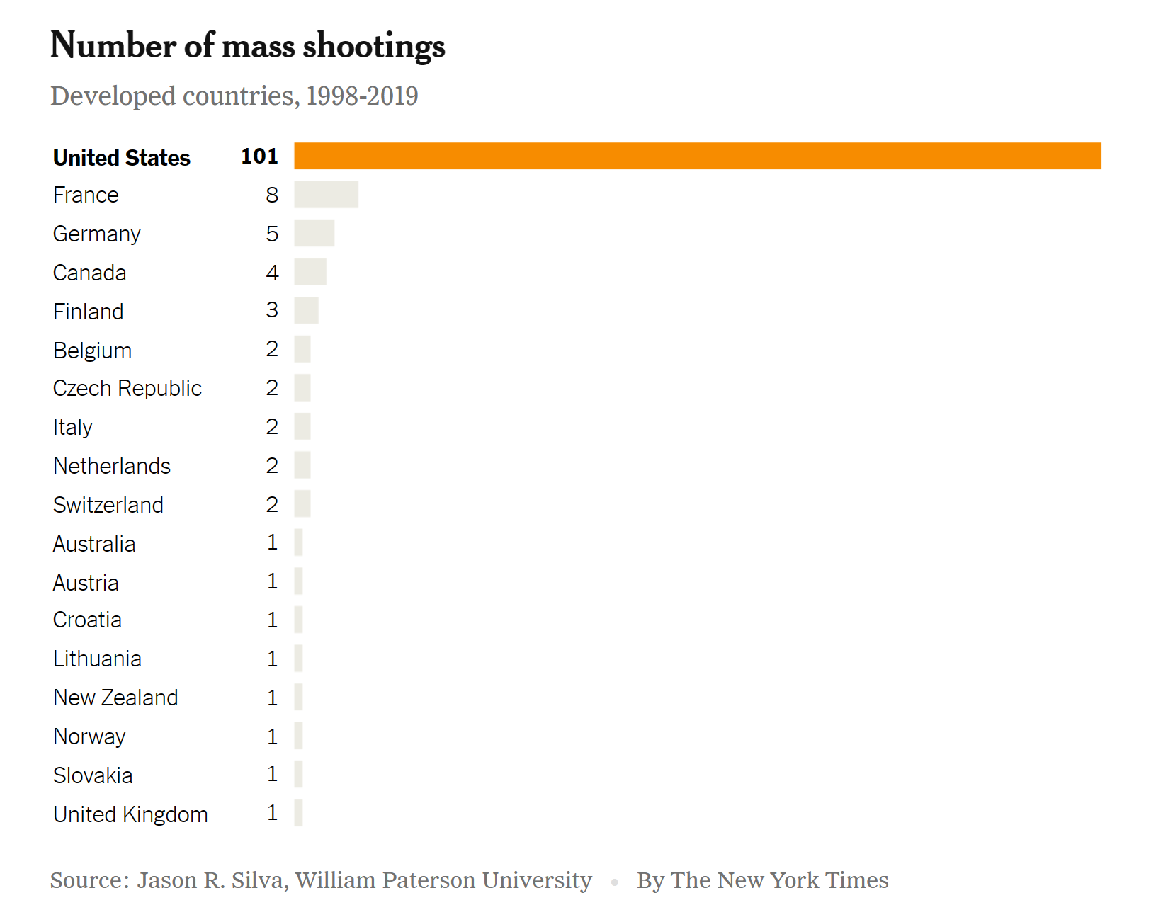
source: https://www.nytimes.com/2022/05/26/briefing/guns-america-shooting-deaths.html
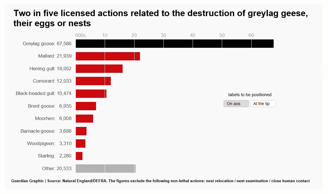
And how about this fourth one?
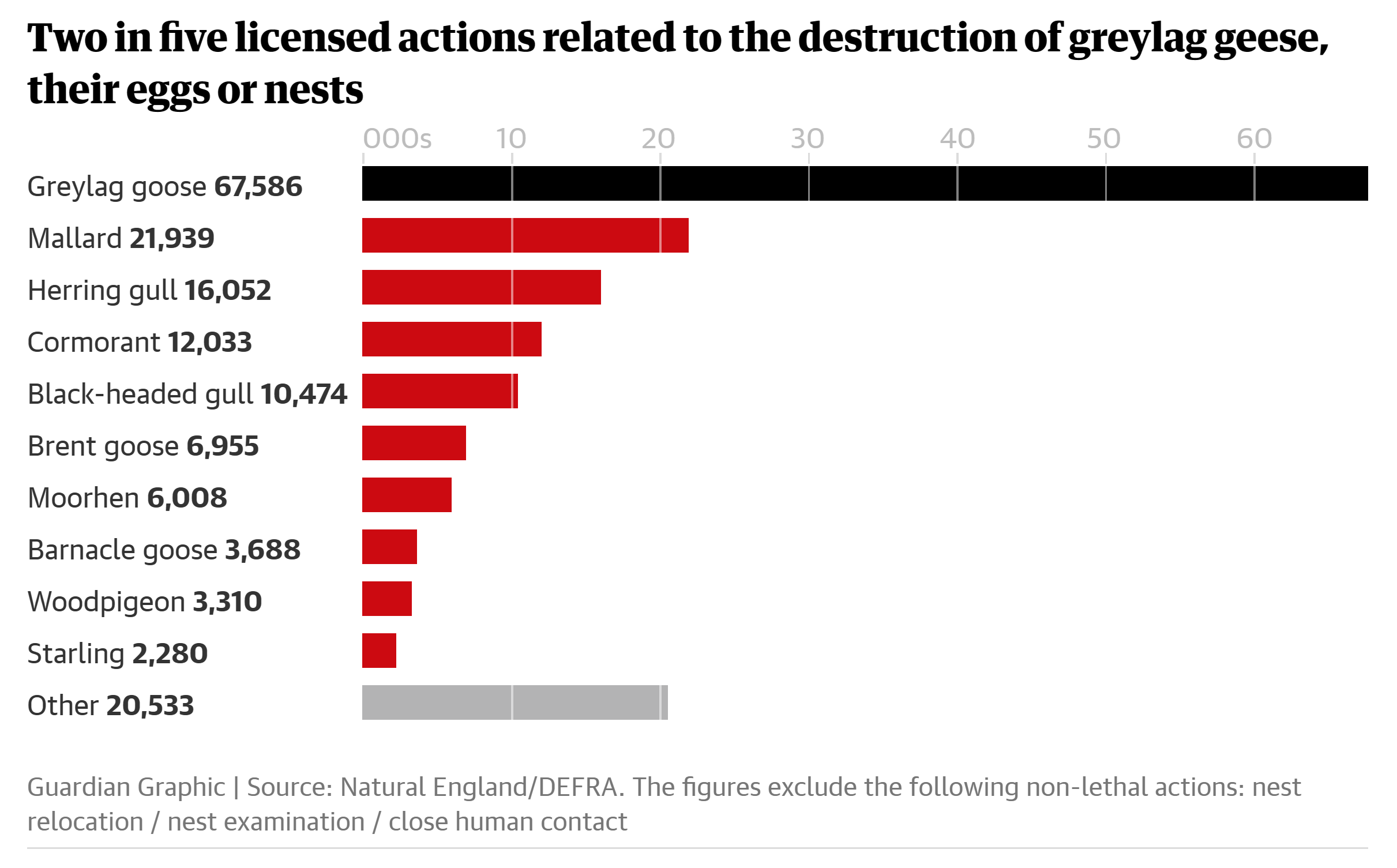 source: https://www.theguardian.com/environment/2019/feb/22/conservation-body-issues-170000-wild-bird-kill-permits-in-five-years
The labels are on the axis but, could it be a bit better? I think so, this is my makeover made with Excel: