Skip to content

047: Switching Encoding

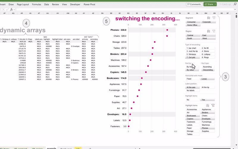
Excel charts with Dynamic Arrays 047: Switching Encoding The term encoding in data visualization can refer to “packaging” quantitative information into visual elements like lines or points to facilitate analysts or general audiences in grasping… 047: Switching Encoding

048: Swapping Contexts

Excel charts with Dynamic Arrays 048: Swapping Contexts Numbers or metrics shine when they are put into context. I believe we are “comparative creatures”, always comparing and judging stuff. Another example below for teaching colleagues… 048: Swapping Contexts

052: Essential Sorting

Excel charts with Dynamic Arrays 052: Essential Sorting Inspired by the following graphic made by The New York Times: Source: https://www.nytimes.com/2020/09/24/learning/whats-going-on-in-this-graph-essential-workers.html I decided to make a humble replica with mighty Excel, the original graphic was… 052: Essential Sorting