How to make
cycle plots
with Power BI
First of all, cycle plots are also known as: seasonal sub-series graphs, month plot, sub-series plot, or seasonality chart.
Note: Naomi Robbins added on the comments section of this YouTube video that “Cycle plots were introduced by Bell Labs in the following paper: W.S. Cleveland and I. J. Terpenning. Graphical Methods for Seasonal Adjustment, Journal of the American Statistical Association, 77: 52-62, 1982. They were available in the S language long before R existed. They are also called month plots and are available in base R with the monthplot function.” In addition, Naomi wrote this introduction to cycle plots to Stephen Few’s consultancy website: Perceptual Edge and it is highly recommend to read.
Along with that introduction by Naomi Robbins, I learned more about cycle plots after reading these two editions of the same amazing book:
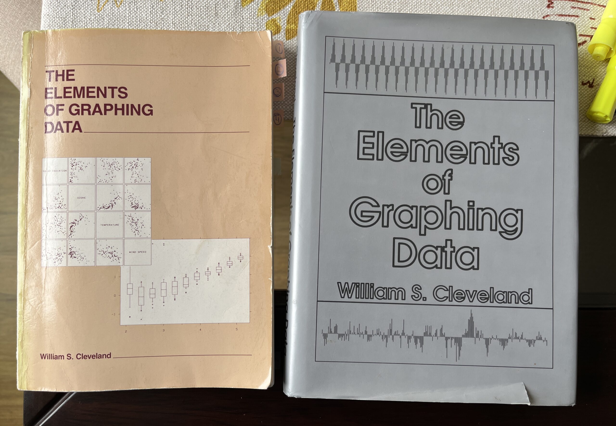
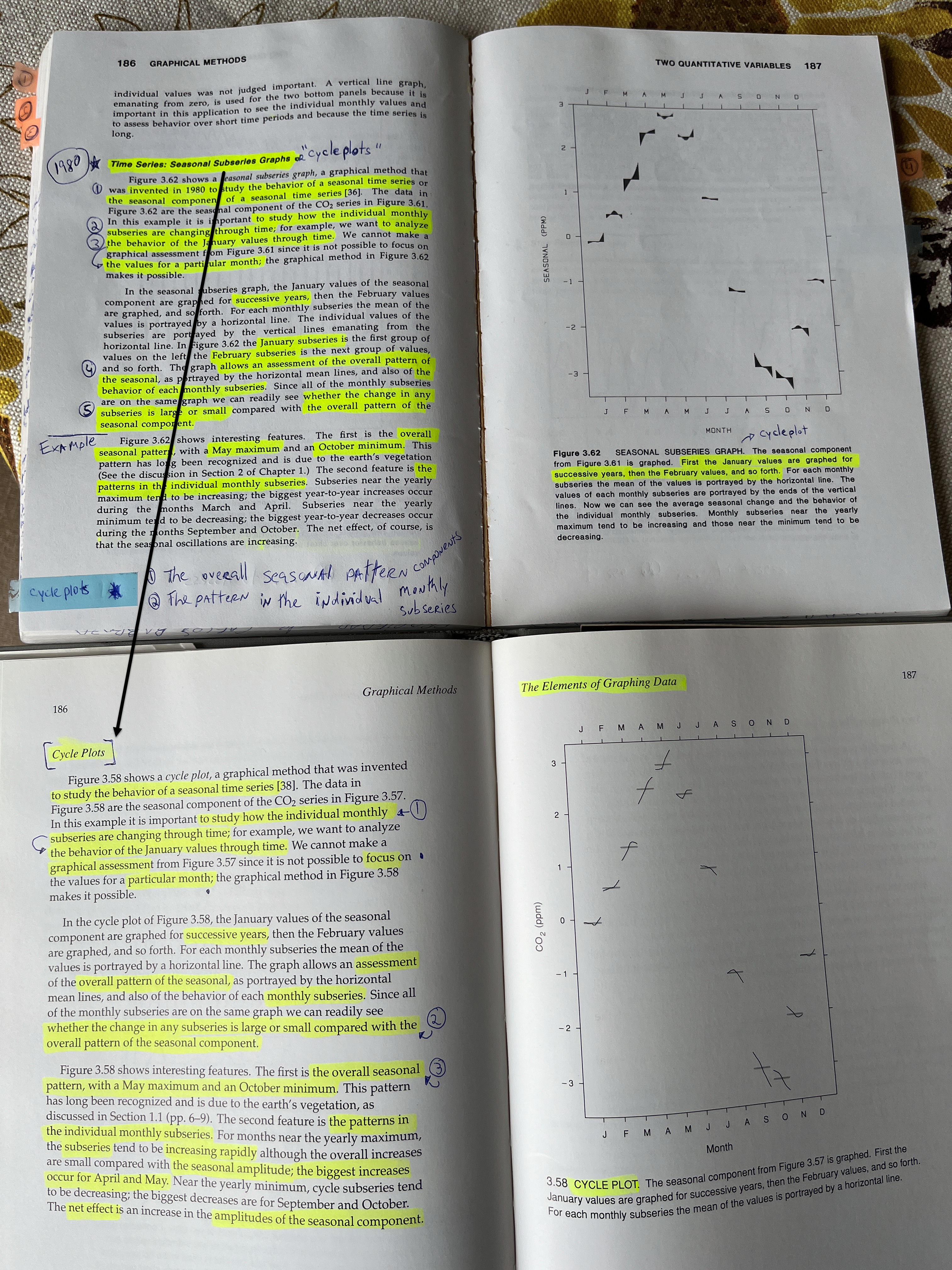
In the image above, the book on the left its William Cleveland’s first edition to his book: The Elements of Graphing Data published in 1985 and the book on the right, its his revised edition published 9 years later in 1994. I recently (on July 2024) purchased the first edition because I wanted to see how the author changed, developed and progressed between the two editions of the book and wow, surprisingly I came to find out that William Cleveland changed the name of a graph that him and his colleagues at Bell Labs invented: the “Seasonal Sub-series Graphs” to “Cycle plots”, see image below. Now I understand why, when I talk to other data visualization professionals we call the same chart with different names…
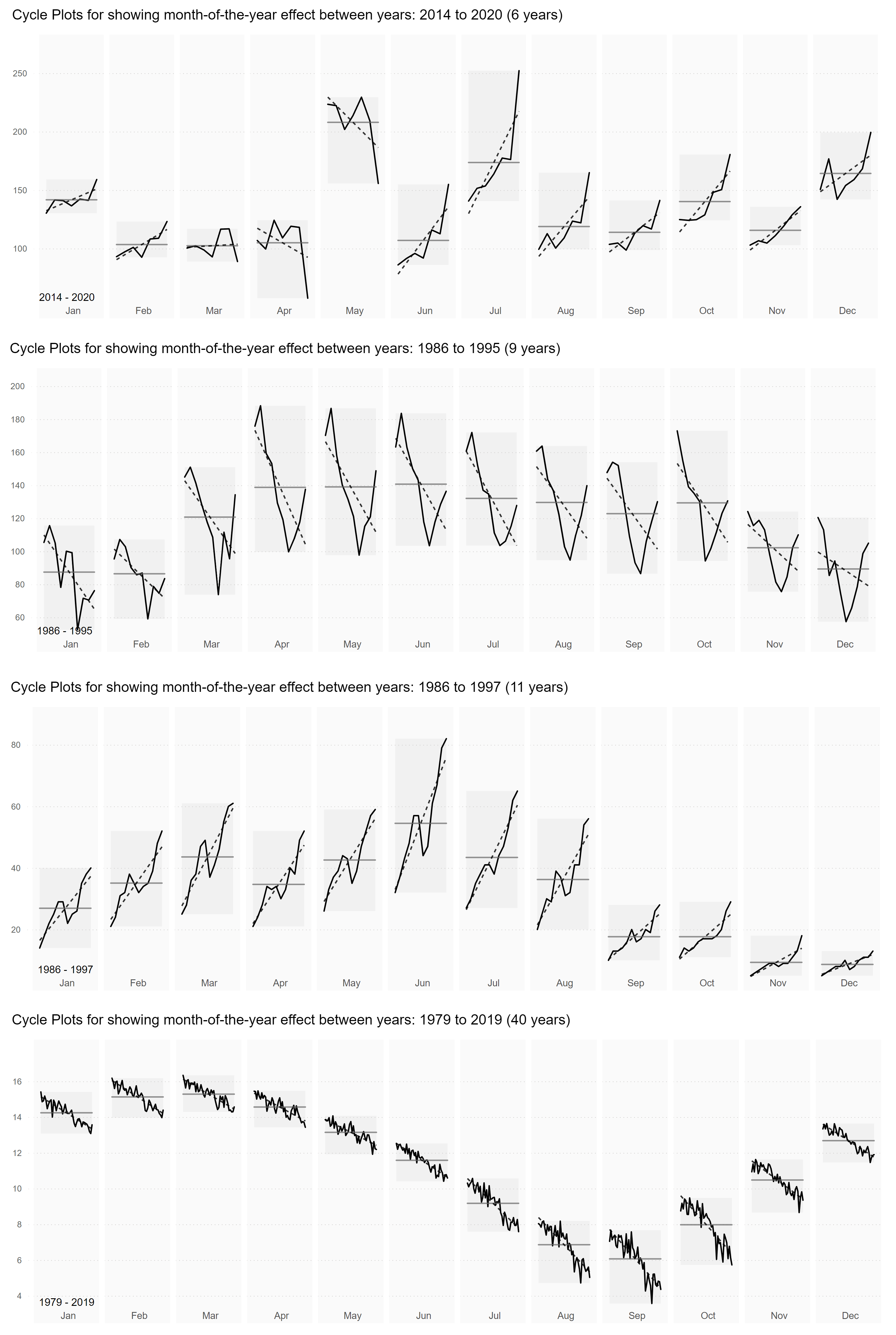
My understanding on cycle plots is the following: they are commonly used to show the behavior of seasonality in time-series data, for example, day-of-week, week-of-year, month-of-year, or quarter-of-year. Most frequently you see cycle plots showing clearly the month-of-year effect in datasets. By month-of-year, it is meant by studying how the individual monthly sub-series are changing through time, for example how January or February or any other particular month values are changing throughout the years. Note: for a cycle plot to be implemented you need to have at least three or more years of data (with two years, it may look like a small multiples slope chart, with three or more years a cycle plot begins to become more apparent).
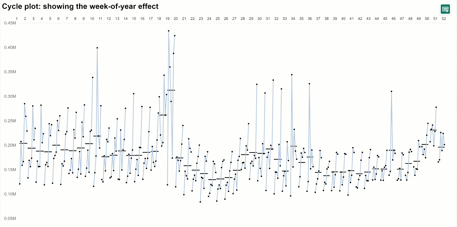
The graphical arrangement of the cycle plots is dependent on the period context. For example, if showing the month-of-year effect, the cycle plot is organized with 12 multiples (representing the 12 months in a year) horizontally in one row. The January values are graphed for successive years, then the February values and so on. If showing quarter-of-year, then it is organized with 4 multiples and if its showing day-of-week effect, then it is with 7 multiples. A complex but worthy scenario is checking out is a week-of-year cycle plot because you would need to how 52 or 53 multiples arranged horizontally. Unfortunately, not many data visualization tools are capable of plotting this setup, but there is one: Cycle Plots for Power BI by Nova Silva, and I once used them to create a week-of-year cycle plot and below you can see an GIF image:
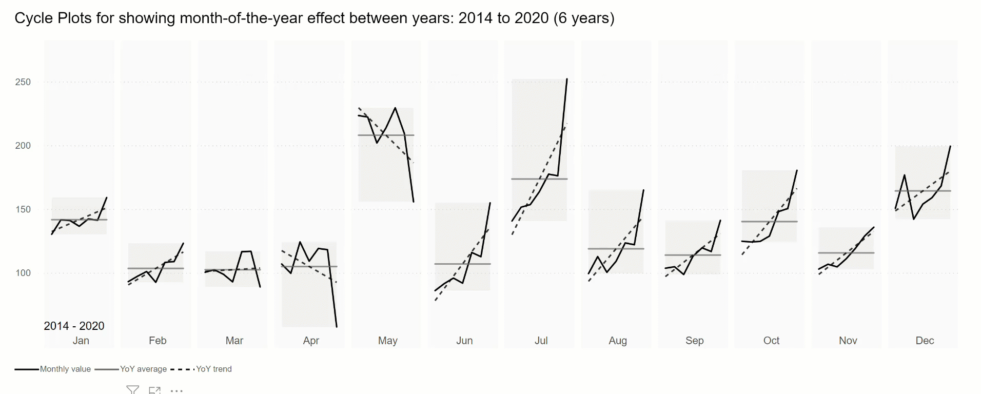
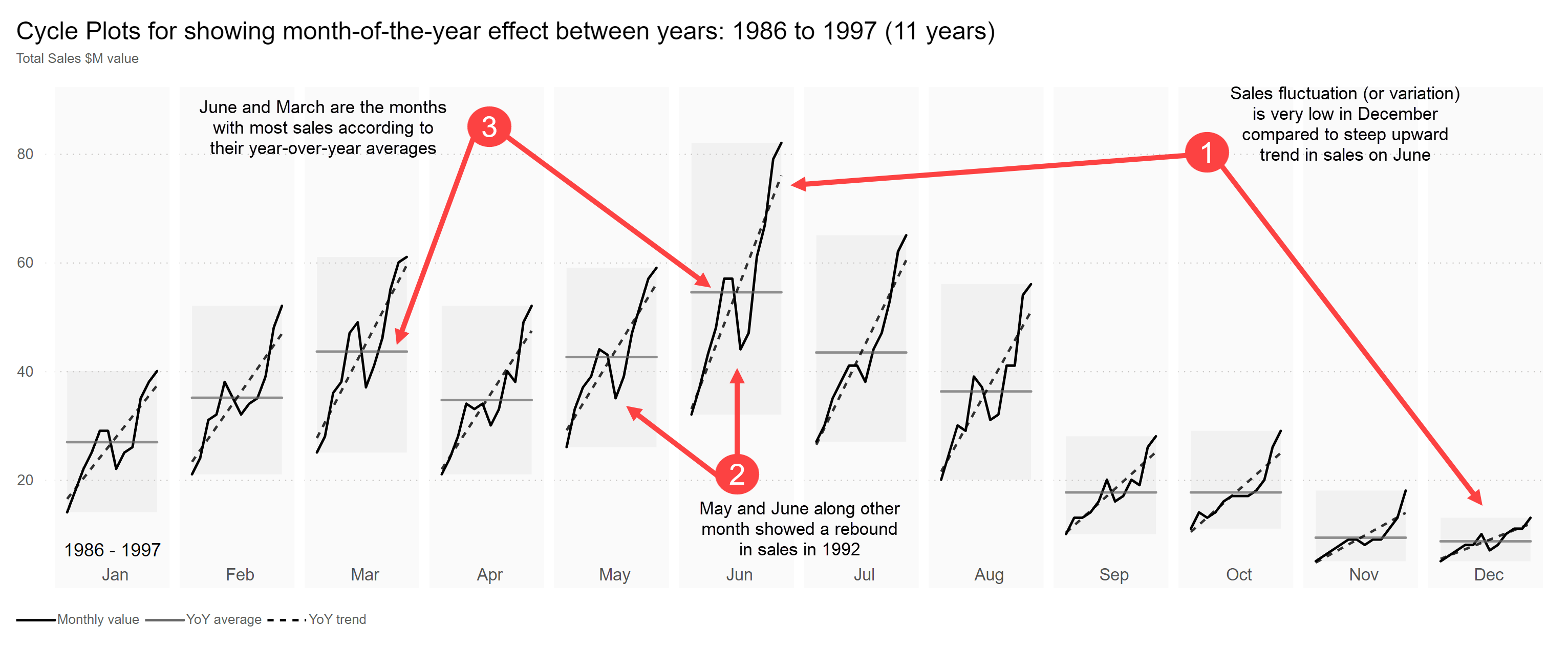
In addition, since cycles plots allow the visual assessment of the overall pattern of seasonality, it can also reveal the behavior or patterns in the individual sub-series components. For example, when showing the month-of-year effect, it is possible to see how the trend and fluctuation (variation) in any of the monthly sub-series; is either large or small or upward or downward compared to the overall seasonal pattern of the cycle plot. Also, it is possible to detect peaks and rebounds on the individual sub-series. In the image below, it’s possible to see which months are the maximum or minimum months by their year-over-year average along with, which months are increasing or decreasing on a year-over-year trend basis and lastly, which months have rebounds and peaks through time (years).
Now cycle plots (or seasonal sub-series graphs) can answer questions like:
- How has the data changed on each month over the past six years?
- Which months of the year are increasing year-over-year basis in the last 5 years?
- Which months of the year are the highest and lowest performers?
- Which months of the year are trending downward or upward?
By answering these questions, it is possible to detect the seasonality, identify cyclic patterns and consequentially, improve decision-making and forecasting analysis.
Let’s proceed with making a cycle plot in Power BI, natively:
Remember: a seasonal sub-series graph or cycle plot can unveil nuanced perspectives, unknown unknowns, and even, multiple truths thru a single and clever layout, showing a great deal of information in a small space without information overload, along with prompting to ask meaningful questions in search of understanding the behavior and impact of cyclical patterns on seasonal time series datasets. And with it’s “big picture” view, it can reveal the evolution of the long-term trend and seasonal components of the data.
Let’s make this graph more popular because it was presented 30 years ago and it is still unknown for many decision makers out there, and only few data visualization tools offer the possibility to develop them. Huge thanks to Miguel Myers and Matthew Lee for allowing us to build cycle plots, natively in Power BI.
References:
– The Elements of Graphing Data by William Cleveland, first edition published in 1985.
– The Elements of Graphing Data by William Cleveland, revised edition published in 1994.
– Data At Work by Jorge Camões
– Cycle Graphs with Kennedy Elliott (Ep. 17) – YouTube video
– https://www.perceptualedge.com/articles/guests/intro_to_cycle_plots.pdf
– https://canonicalized.com/cycle-plots-tableau/
– https://www.tableau.com/sites/default/files/media/visualizingtimebeyondthelinechart_final.pdf
– https://earthobservatory.nasa.gov/images/82094/2013-arctic-sea-ice-minimum
– https://simplexct.com/to-find-seasonality-use-cycle-plots
– https://visuals.novasilva.com/shop/pbi-visuals/cycle-plot-for-power-bi/
– Visualización Avanzada y Nativa en Power BI | Invitado: Claudio Trombini – livestream
Thank you for reading/watching.
[wpedon id=”8665″ align=”center”]