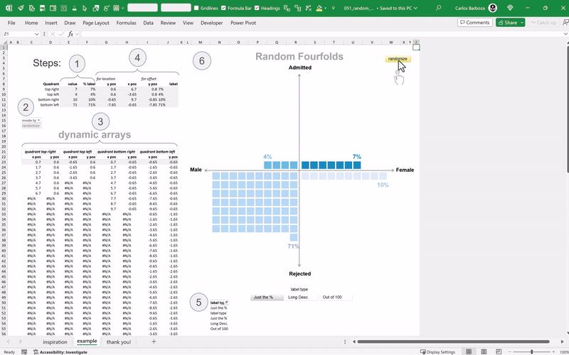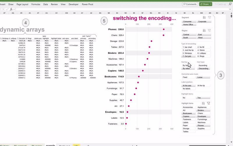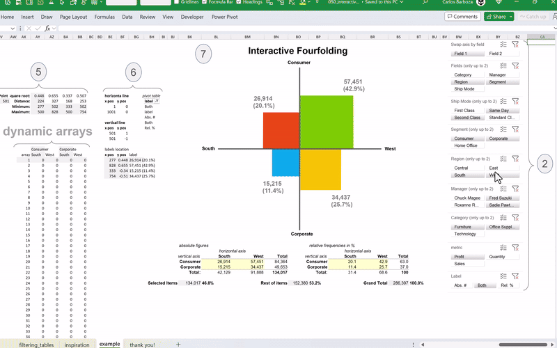
050: Interactive Fourfolding
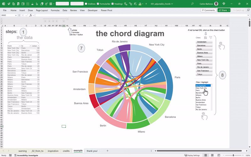
Excel charts with Dynamic Arrays 050: Interactive Fourfolding Taking the torch here; an interactive extension and emulation of the amazing work of Andrés Rojas Moncada who translated to dynamic arrays the works of Hicham Bou… 050: Interactive Fourfolding