The GOAT in data visualization:
It depends
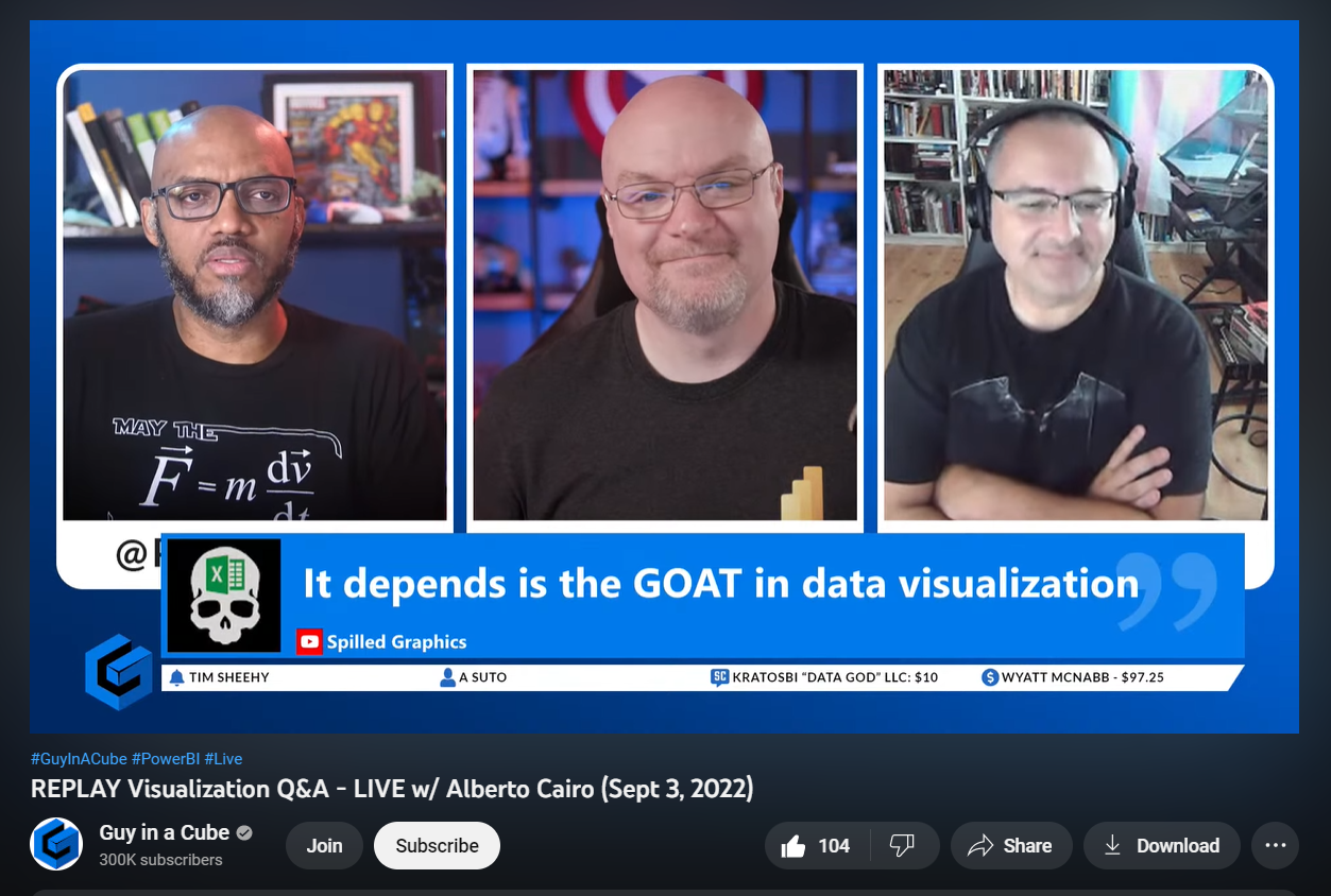
An amazing interview by the folks from Guy in a Cube: Patrick Leblanc and Adam Saxton where they had a hilarious but highly informative conversation with living legend & data graphics veteran: Alberto Cairo. On this interview around minute 24, I posted on the chat of the live, the following message “It depends, is the GOAT (Greatest Of All Time) in data visualization” and it got displayed on screen, wow, thanks!
Though, Alberto started sharing his wisdom from minute 21, let’s go:
And these are my notes from this interview:
-
-
- If your goal is to communicate a clear idea through your writing, it’s always good to test that idea after you have written something to see whether the message has gone through.
- A graphic is good if it communicates what it intends to communicate.
- Talk to people & hear what they need.
- There’s a lot of subjectivity in data visualization, and you would not know if (the graphic) will work out in the end.
- Recommended books: Emotional Design and The Design of Everyday Things both by Donald Norman.
- Things that look good also work better (in general) because you put people in a good mood to feel prompted to use it.
- Aesthetics in a graphic lead to more functionality by virtue of being attractive.
- The uniqueness of a graphic can convey something that makes it more appealing, more attractive, more readable.
- Ask people what they need indirectly, because usually people don’t know directly what they need.
- Don’t talk to people, talk with people.
- You need to get out of the office and talk to the people that’s going to use whatever you create for them.
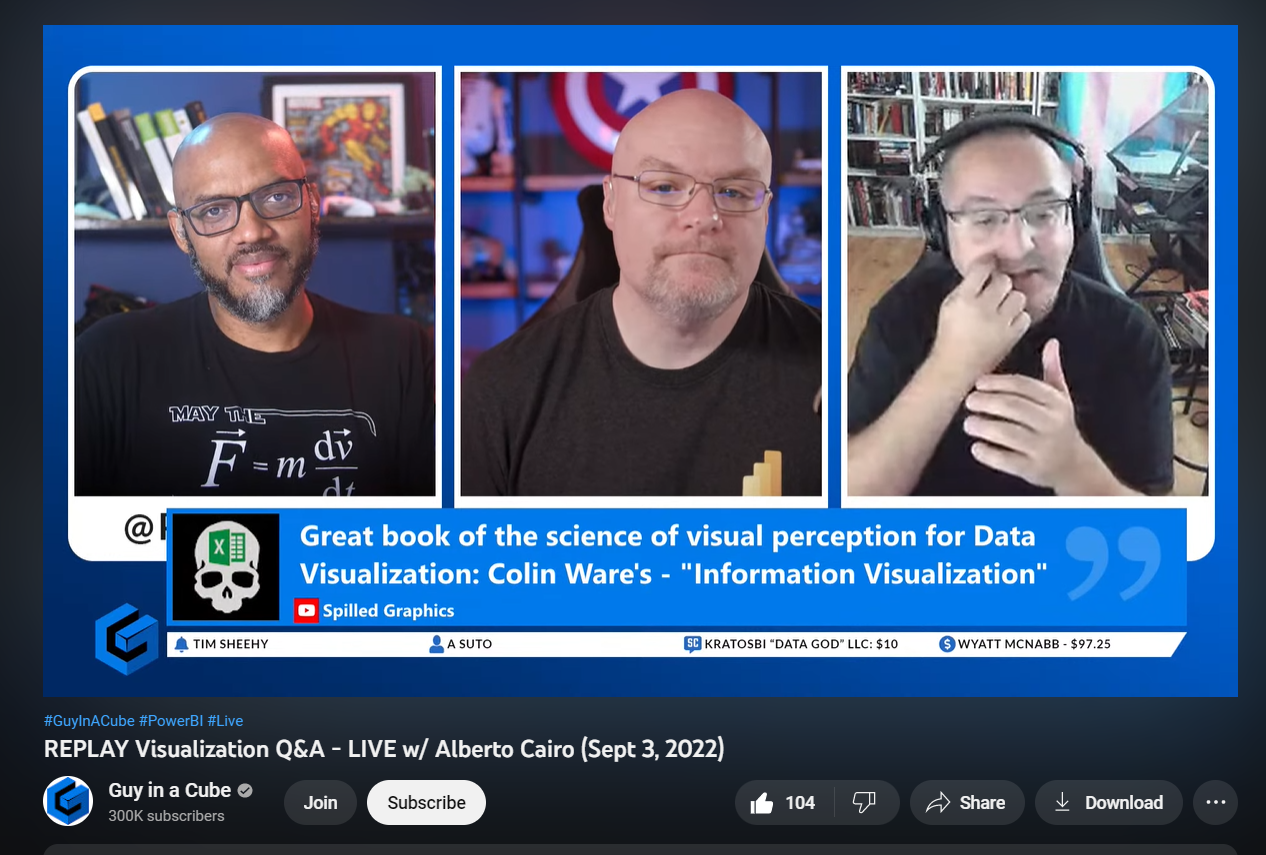
- Recommended book by me (wow, thanks Patrick & Adam): Information Visualization by Colin Ware.
-
Continuing the notes:
-
-
- To be a good data visualization designer, first you need to be a good data visualization reader.
- Whenever you see a graphic, reverse engineer the design of the graphic. “Why do they use the color palette, the title, the legends, etc.”
- To become a good writer, you need to read. Understand the work of what you’re reading.
- Recommended book: Steal like Artist by Austin Kleon.
- Learn from the best and learn from other areas and expand your horizons. You will eventually find a way to bring that into your work.
- Data Visualization is the representation of knowledge.
- (In data graphics) if something works, it’s good.
- There’s value in standard because they can provide consistency.
- Data visualization design is a conversation, and you need to observe how people operate with visualization in the real world.
- You get better at a craft by practicing the craft.
- You cannot avoid bias in design.
- People consume information in many ways.
- Testing is sacrosanct.
- When you break too much what’s current you get rejection because people don’t like sudden change. Unless sudden change is fully justified.
- The ME factor, where am I in the data. We like to see ourselves and this drive engagement and adoption for your graphics.
-
And that’s it for today, thank you Patrick and Adam for this amazing conversation!
See you tomorrow.