Long Live Parallel Coordinates
I once read from Edward Tufte that “graphical excellence is nearly always multivariate” from his book The Visual Display of Quantitative Information (page 51):
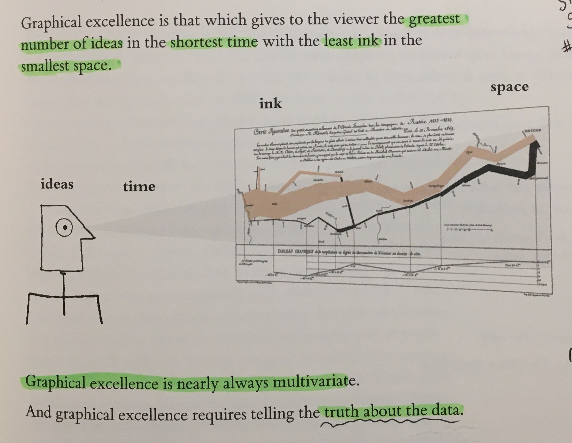
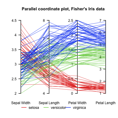
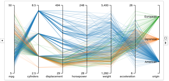
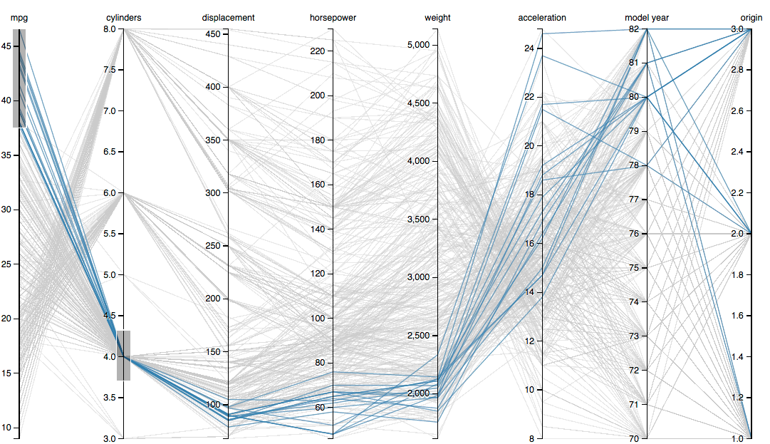
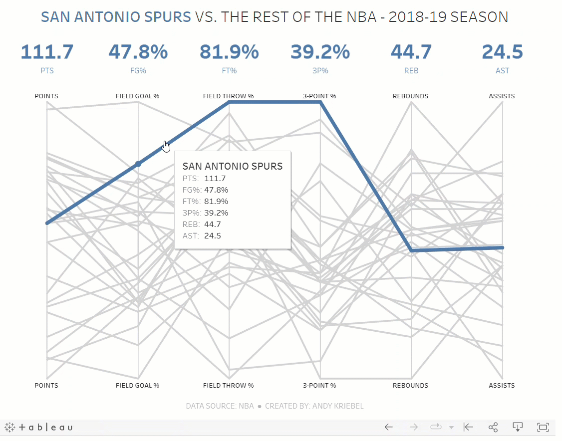
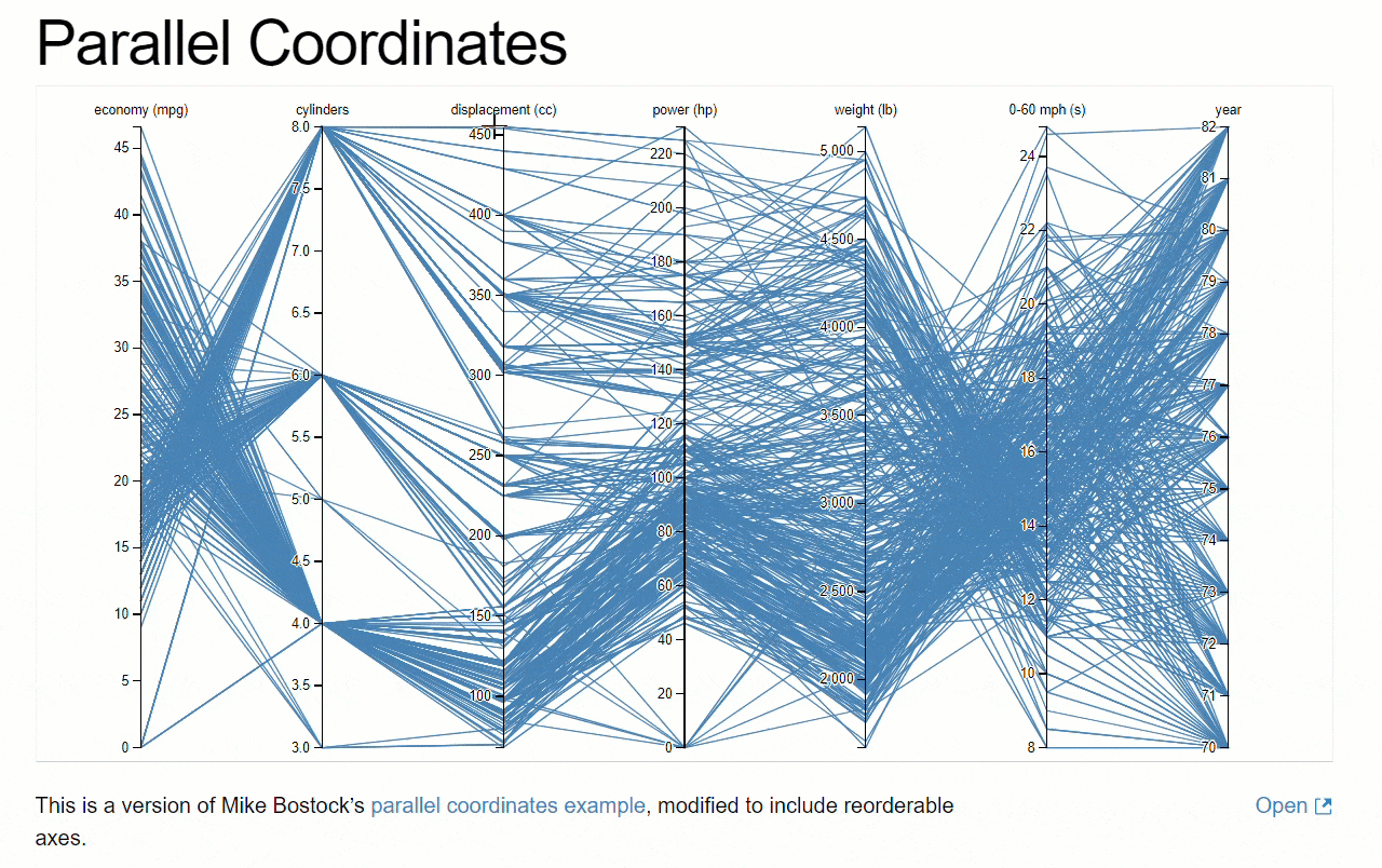
And from my experience in the “data-analysis battles”, I believe this is true. A notable example of that statement by Tufte is the graphic method of parallel coordinates.
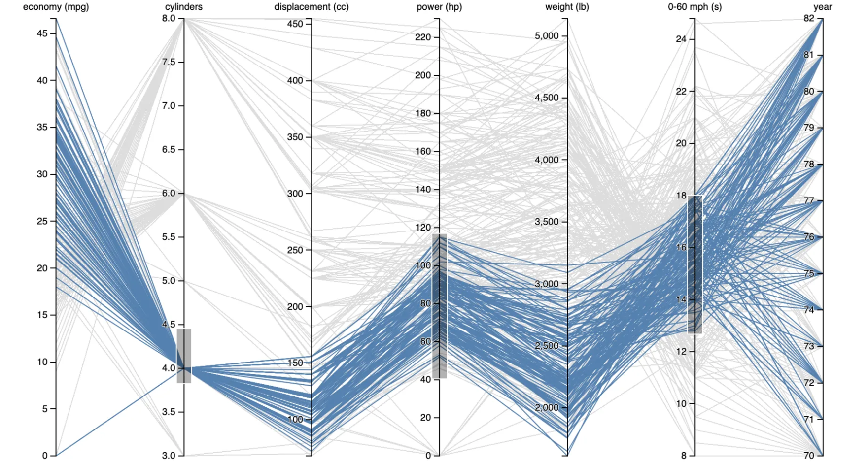
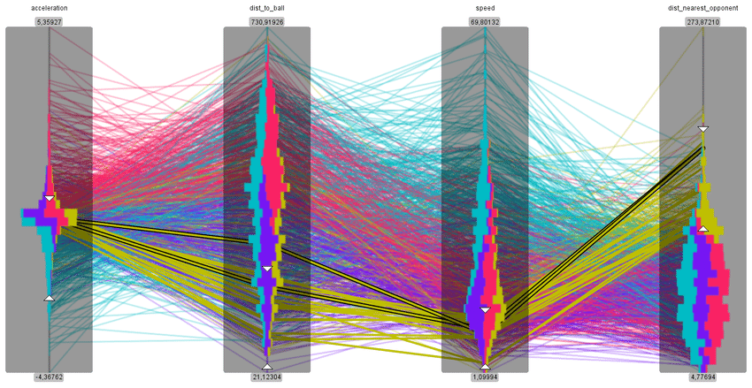
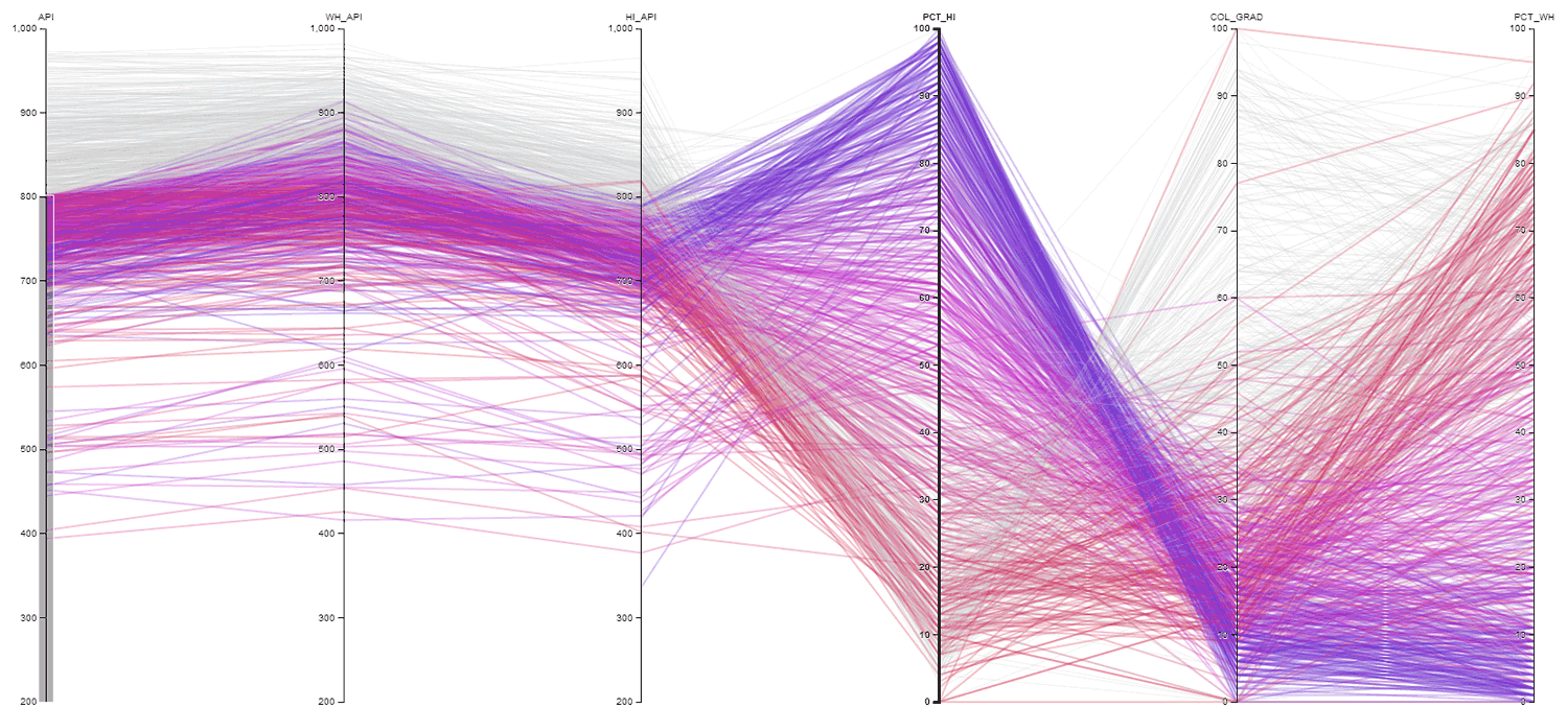
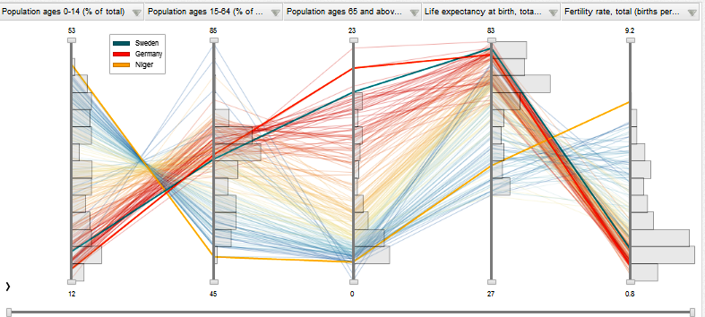
The following are examples of this method:
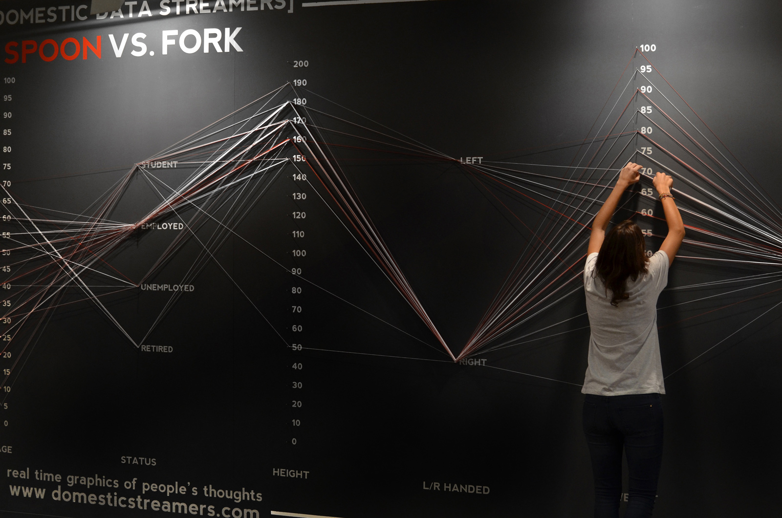
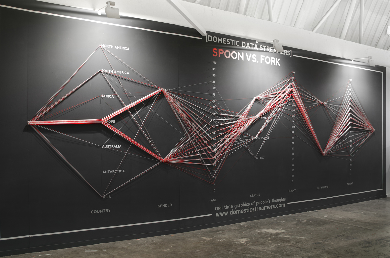
What about seeing a parallel coordinate in real life?
If you would like to learn more parallel coordinates check these two amazing videos by DataVis Bob:
And this follow-up video:
Thank you DataVis Bob!
Finally, now the question is: can we implement them in Power BI: oh yes, oh yes! I’ll be posting an article on the Power BI section of this blog, stay tuned.