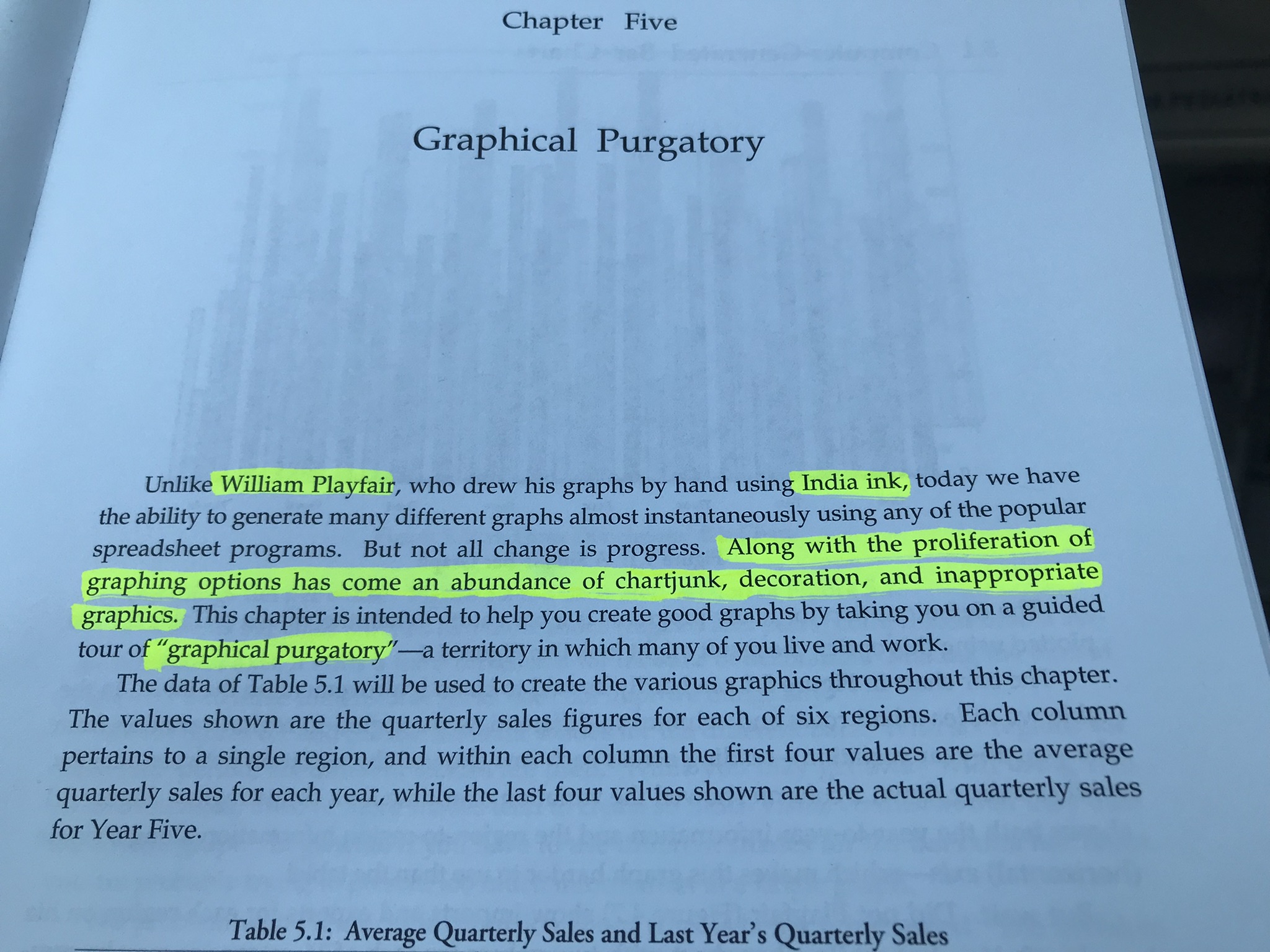
Graphical Purgatory?
Today, I learned the term: Graphical Purgatory from this amazing book:
And on chapter 5, it had the following sentence:
“Along with proliferation of graphing options has come an abundance of chart junk, decoration, and inappropriate graphics.”
Is this true? I highly think so. And we can avoid it.
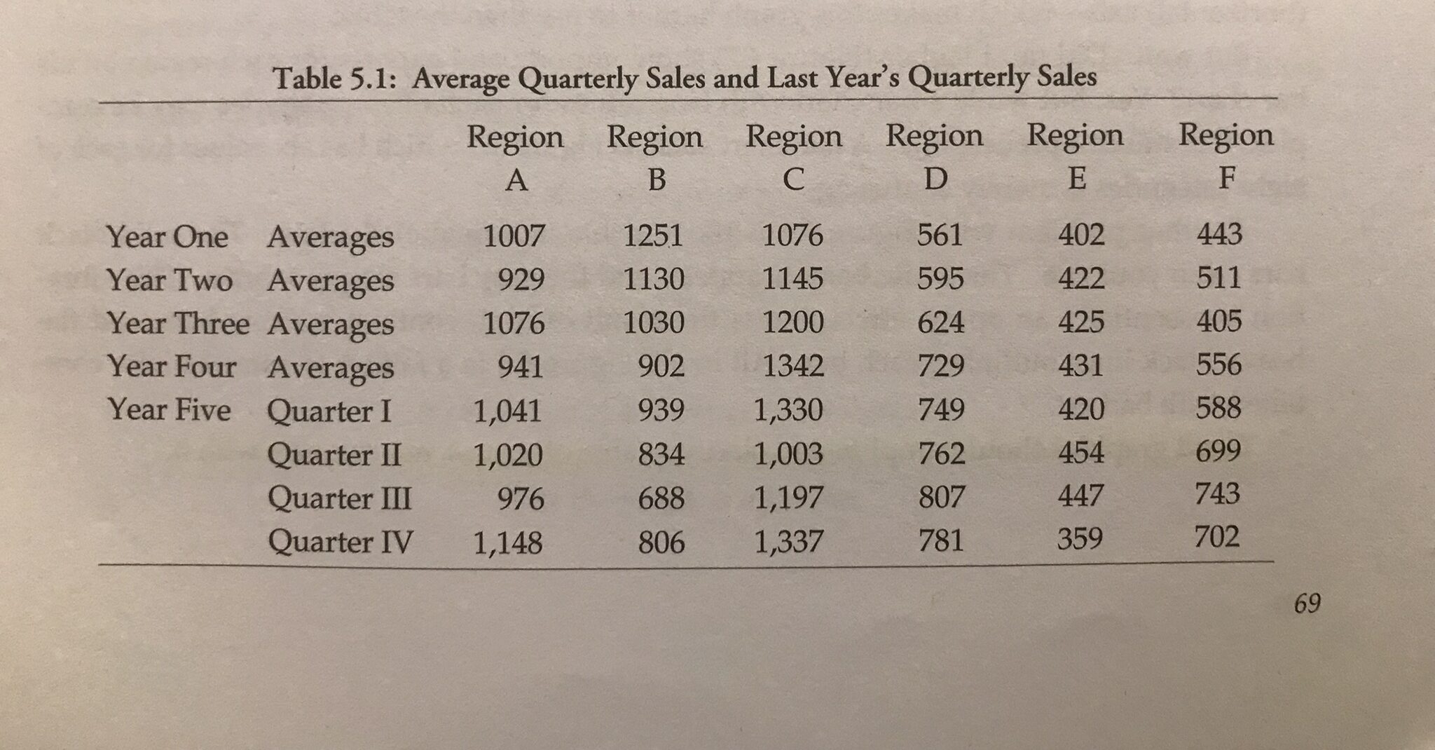
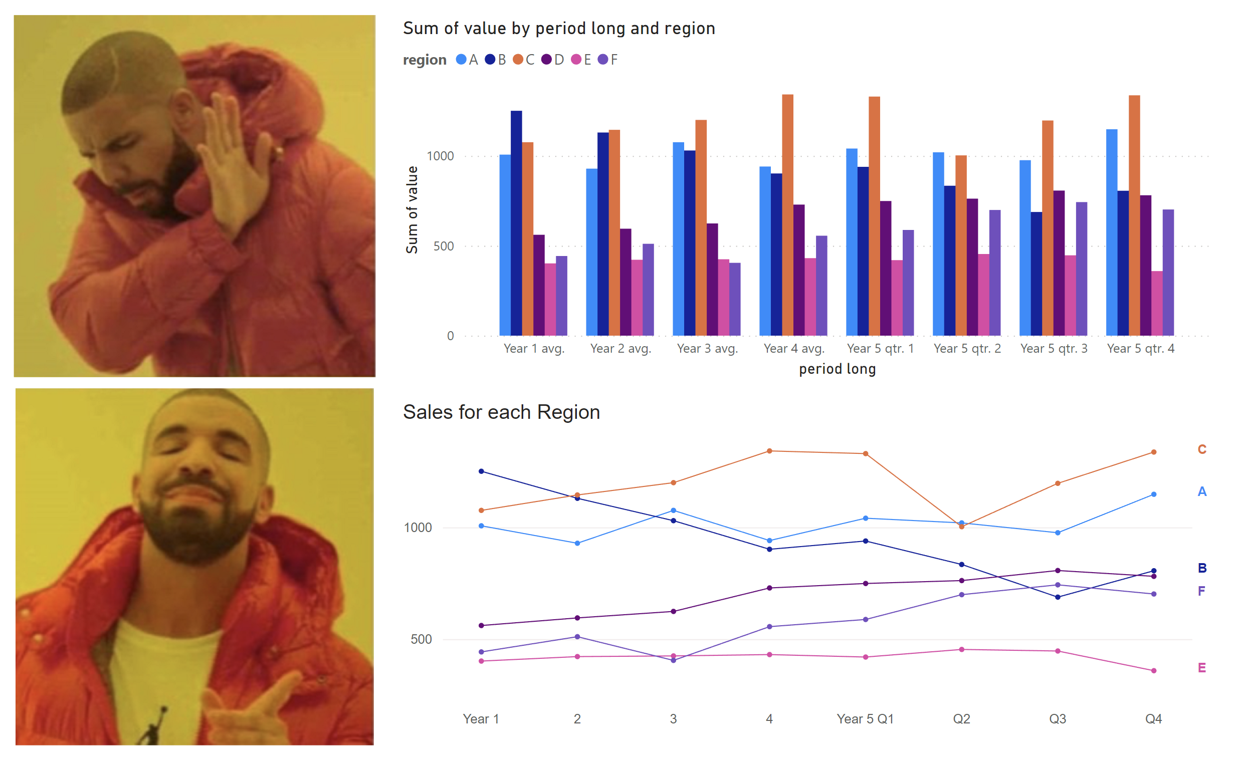
Let’s see the example data that they used for this chapter:
And now, let’s see the first example they showed when plotting this data:
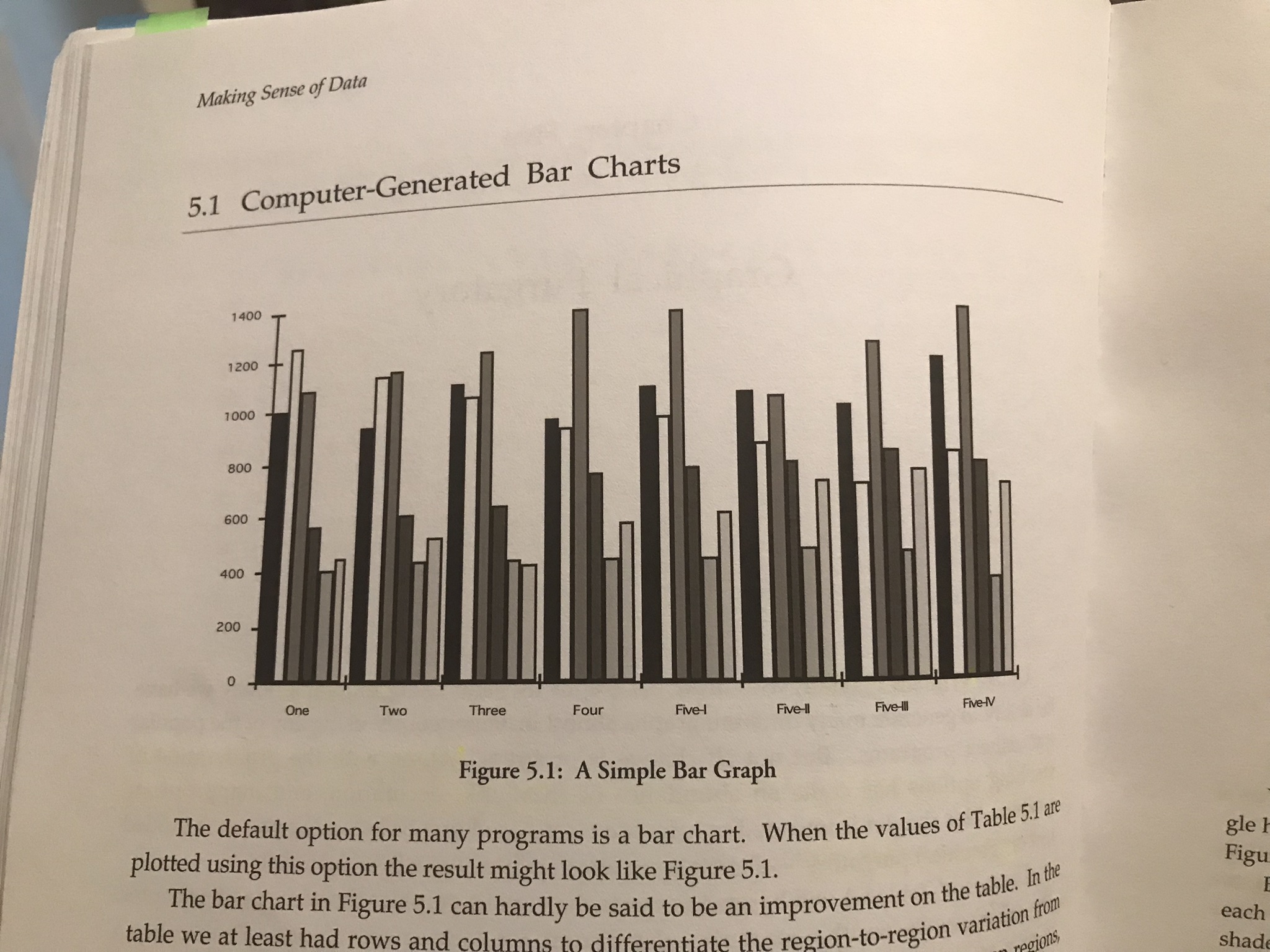
Yikes! Can we do better? Of course, we can.
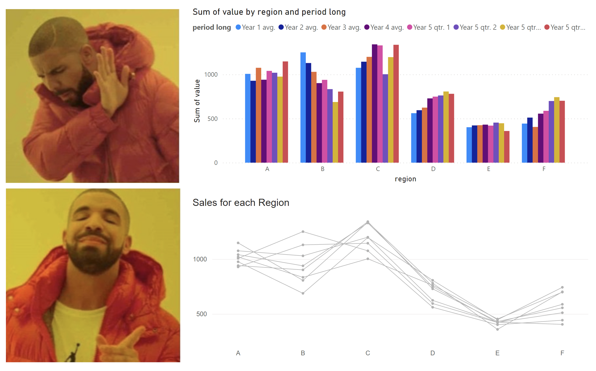
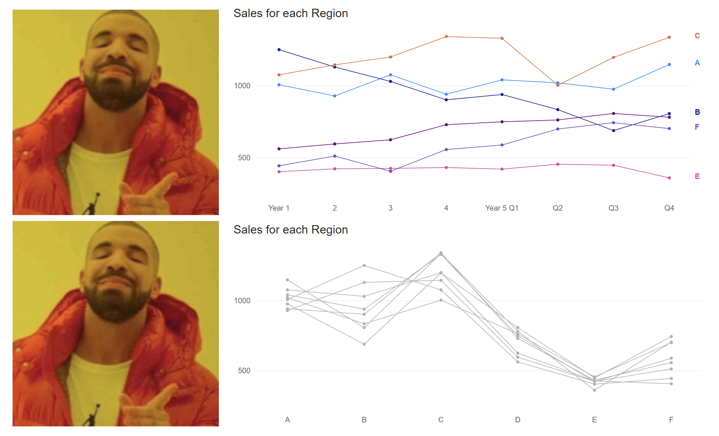
Here’s are my make overs inspired from the examples in the chapter of this book, using Power BI:
Lessons learned from reading chapter 5 from Making Sense of Data:
-
-
- Good graphics should amplify and clarify a table of values, not compete with it.
- There are two types of confusion: one is confusion about what is being represented and the other type is decorated confusion.
- If the graph is not easier to understand than the table of numbers, then the graph is a failure.
- There are two types of ink: one is used for decoration and the other one to represent the data.
- When ornamentation overwhelms the message, the result is pure chart junk.
- It is very easy for the decoration to overwhelm the data.
- Decoration is not analysis.
-
Last, but not least, the following image is from the same chapter and it’s on radar plots:
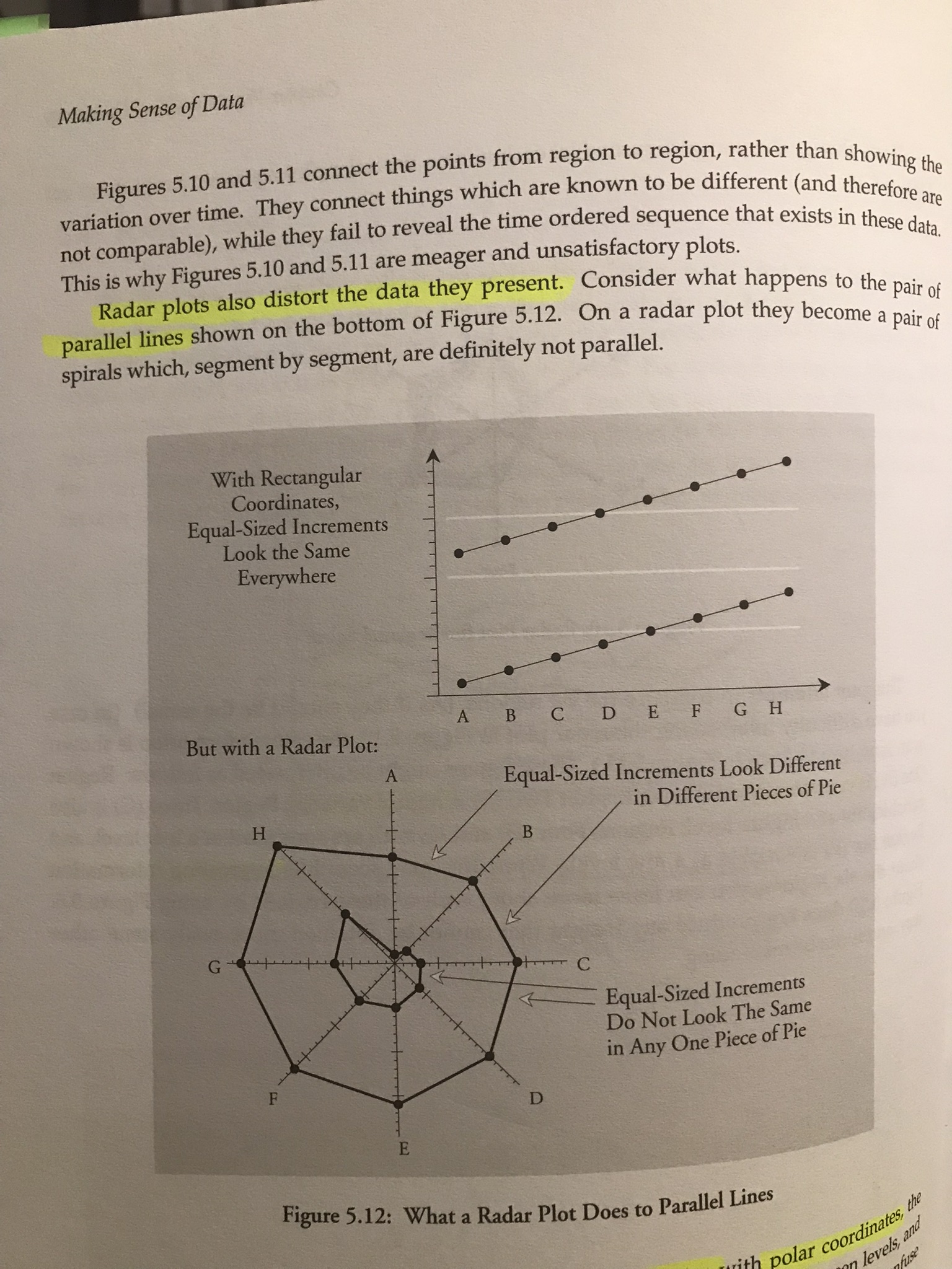
I’m still mind-blown by the difference. Avoid radar charts.
And that’s it for today, see you tomorrow.