reorganizing
other vlog-posts 021 Python for Excel, natively? 020 YouTube channels I watch 019 blogs & websites I read 018 writer’s block is a myth 017 Graphical purgatory? 016 Graphics in journalism 015 Data At Work… reorganizing
other vlog-posts 021 Python for Excel, natively? 020 YouTube channels I watch 019 blogs & websites I read 018 writer’s block is a myth 017 Graphical purgatory? 016 Graphics in journalism 015 Data At Work… reorganizing
YouTube channels I watch Elements of DAX Karina Adcock Kasper On BI Leila Gharani MyOnlineTrainingHub Goodly SQLBI Microsoft Hates Greg How to Power BI Havens Consulting Enterprise DNA BI Gorilla Zebra BI
blogs & websites I read Excel Unusual Jorge Camoes Excel Charts Jorge Camoes Wise Vis Jon Peltier Tech Excel Charts Perceptual Edge Stephen Few’s Blog Bacon Bits by DataPig Analytics Made Skeezy Excel Hero Blog… blogs & websites I read
Ok, the best feature for me on the Power BI November 2022 update is: Show Values of Selected Field. But this awesome feature with relevant caveat or warning. Let’s see Parvinder Chana‘s video on this:… Show Values of Selected Field
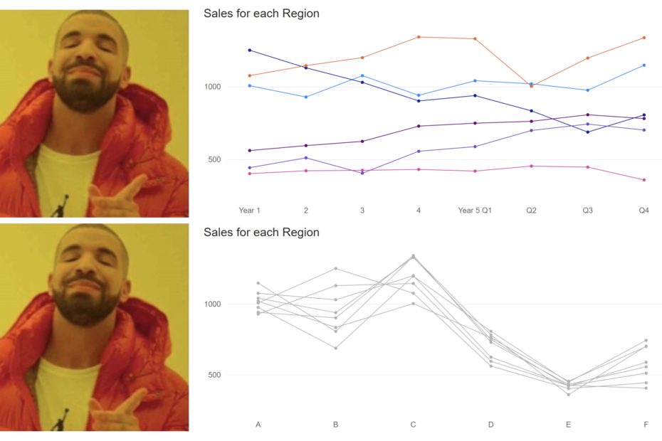
Graphical Purgatory? Today, I learned the term: Graphical Purgatory from this amazing book: And on chapter 5, it had the following sentence: “Along with proliferation of graphing options has come an abundance of chart junk,… Graphical Purgatory?
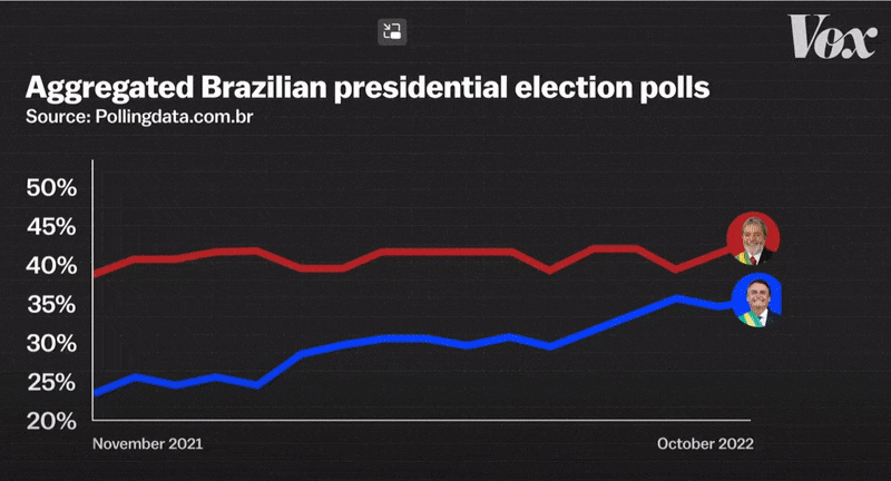
Graphics in journalism 01: Brazil’s Lula Yesterday, I watched the following video from VOX‘s YouTube channel, and it contained some interesting graphics that displayed some of the troubles of Brazil’s in the last 20 to… Graphics in journalism 01: Brazil’s Lula
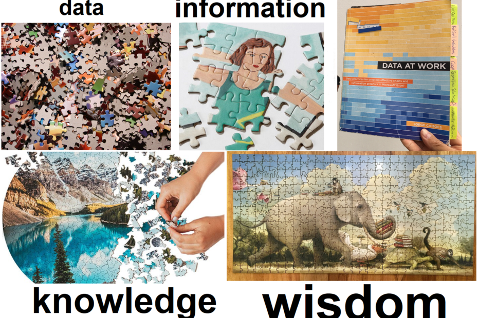
Data At Work book 01 If you are into data analysis, then the following book (below) is simply a must-have in your library: On page 108, I came across an interesting “visual analogy” about data… Data At Work book 01

The GOAT in data visualization: It depends An amazing interview by the folks from Guy in a Cube: Patrick Leblanc and Adam Saxton where they had a hilarious but highly informative conversation with living legend… The GOAT in data visualization: It depends

On Gestalt Common Fate principle The principle of Common Fate states that elements that are moving together tend to be perceived as a unified group. Let’s see the following example: And now, let’s see this… On Gestalt Common Fate principle
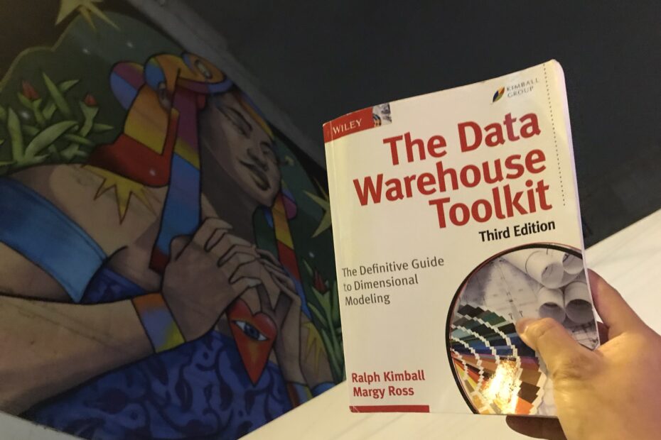
Placing understandability high Reading Ralph Kimball’s book: The Data Warehouse Toolkit: The Definitive Guide to Dimensional Modeling is always delightful and insightful. And here’s another great advice on data modeling: “…the irresistible force in designing… Placing understandability high