Excel charts
with Dynamic Arrays 054:
Beeswarm Histodots
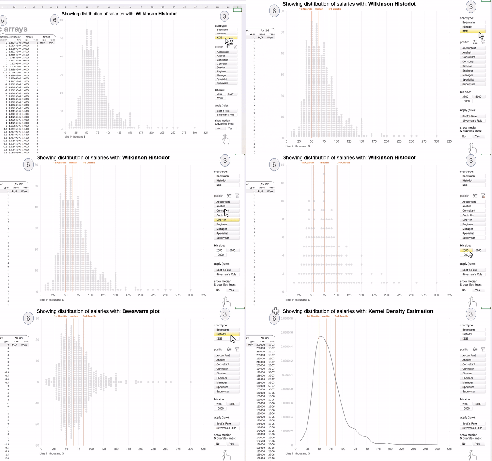
A releasable version for everybody on three more ways of showing distributions with: Wilkinson Histodots, Beeswarm plot or Kernel Density Estimation on job salaries across position. But first things first…
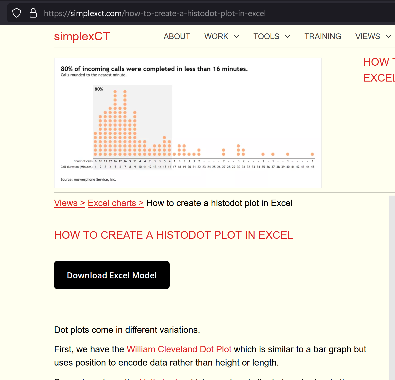
It all got inspired by an amazing blog-post by Hicham Bou Habib on Wilkinson histodots in Excel: (click on image to go the article)
Which got me intrigued on how it can be accomplished with dynamic arrays. Then Enrique Ruiz made an fantastic tutorial on how to make Beeswarm plots in Excel and this got me re-inspired:
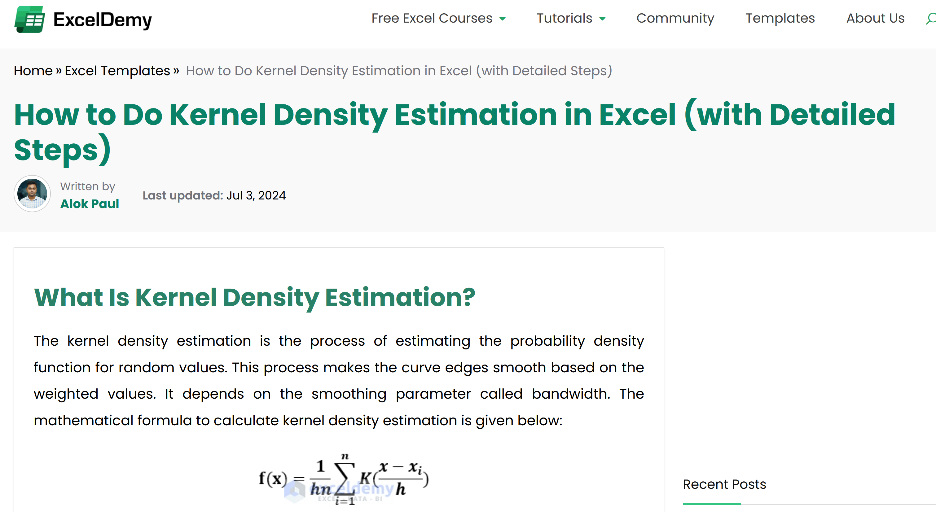
On Enrique’s tutorial, he mentioned an amazing tutorial made by Alok Paul on how to obtain the Kernel Density Estimation in Excel: (click on image to go the article)
Then, I remembered Bhavya Gupta amazing tutorial on running count using dynamic arrays: (click on image to go the LinkedIn post)
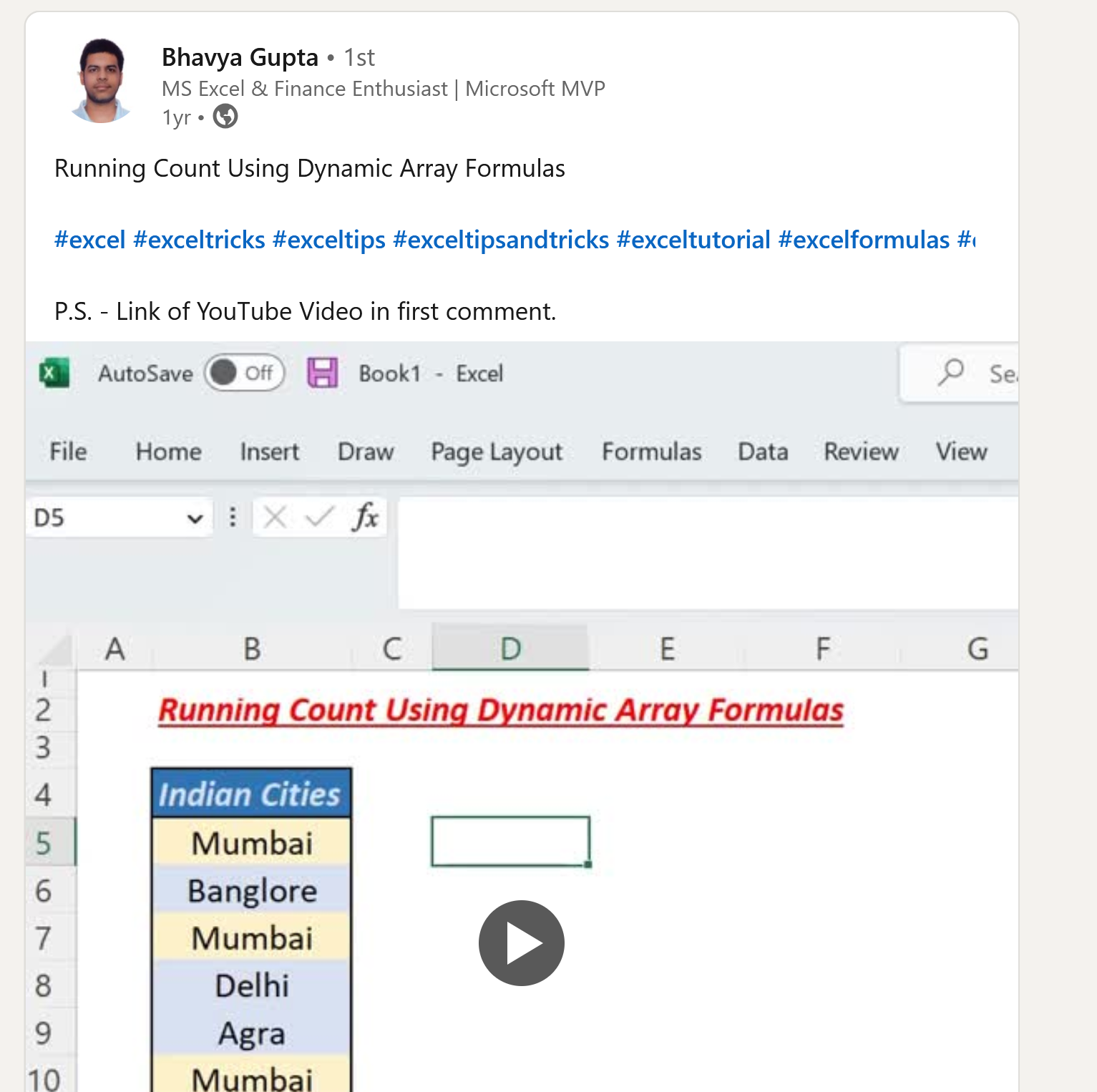
And there; Aditya Kumar Darak 🇮🇳 proposed an interesting and elegant solution to running counts but I adapted his logic with the SCAN function.
To add, I decided to test and of course, add, Mark Proctor‘s LAMBDA function for using Table slicers for user interactivity: (click on image to go the article)

Along with Mike “excelisfun” Girvin‘s formula and logic of filtering by list with Mark’s LAMBDA:
Consider the GIF below, a consolidation of all these tutorials. Thank you all, Thank you Maestros.

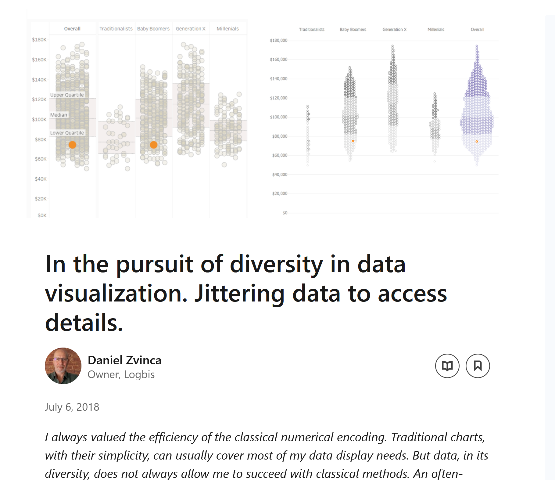
Now off, to continue reading Daniel Zvinca‘s article: “The pursuit of diversity in data visualization.” (click on image to go the article)
and how (potentially) we can add his “Stingray plot” of his on this consolidation…. we’ll see.
