Excel charts
with Dynamic Arrays 046:
Plotting Dice Rolls
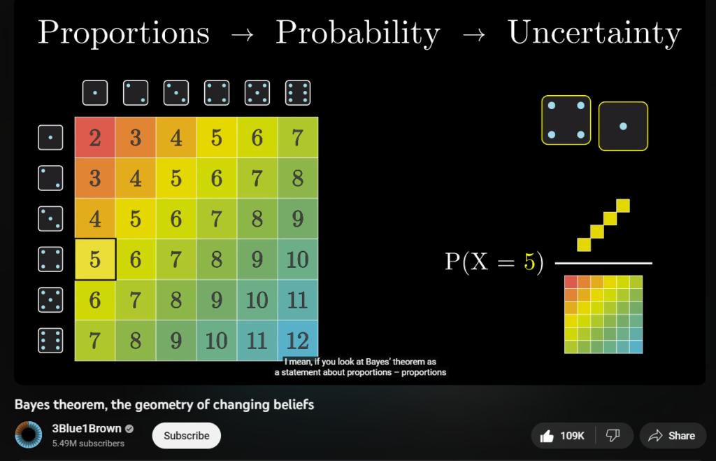
Inspired by the following video below, made by YouTube channel: 3blue1brown
On minute 12 the image below appeared:

Let’s emulate it with Excel:
For comments, questions or feedback, please feel free to leave them on comments section of the video above on YouTube. And, if you would like to get a copy of the file, you can download it from the button below.
And don’t forget time is…

source: unknown, my apologies.
p.s. I hope after you checked out the video tutorial(s) of this vlog-post, you may end up perceiving the following:
- Some charts or graphs that were previously thought as impossible in Excel are now possible because of Excel new functions.
- With the new calculation engine and spilled ranges, Excel might become more ubiquitous for interactive data visualization.
- The good old Excel charts combined with dynamic arrays can extend Excel’s flexibility for developing effective interactive graphs.
- With interactive Excel charts you can make insights more accessible to a much broader audience.
- With Excel’s new functions and clever workarounds, you can expand its graphic library of native charts.
- And finally, may this new way of thinking of dynamic arrays be brought to new situations, challenges and visualization business problems.