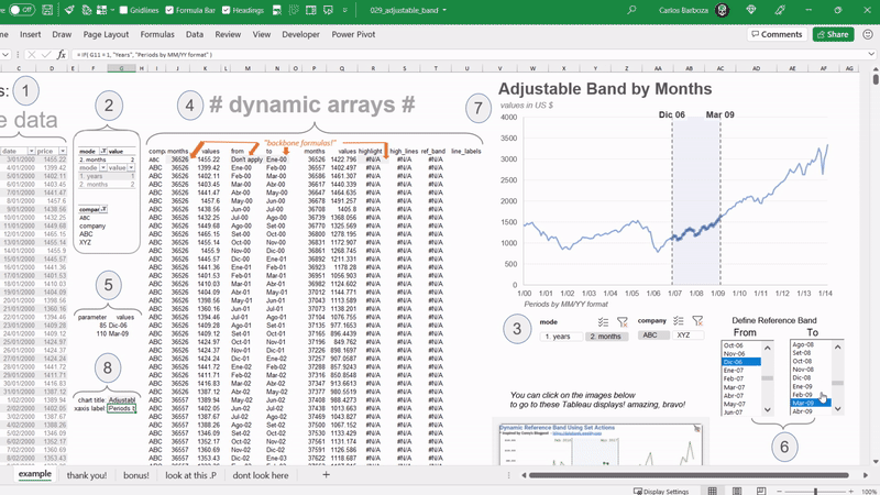
Reference bands in data graphics are especially important because they can serve as – guidance – for your audience as well as tools for – focus – in specific data points on your visualizations or… Excel charts 😁.
Below its a simple example but…. with # Dynamic Arrays # we can make it more interactive by combining the spill range results with Form Controls: List Boxes…🤯 and also have the possibility to switch the timeframe (x-axis) of the chart by seeing the data on from daily average by years to the daily average by monthly period.
Many thanks to the works of Rajeev Pandey and Corey Jones, because their #Tableau visualizations, served immensely as inspiration to pull this one. You can find Rajeev’s viz here 👉 https://lnkd.in/g8w9jFPh and Corey´s viz here 👉 https://lnkd.in/gbusJXtD Thank you both!
Track ID: MK – Burning (MK 14 Remix)
Now, how do we build this?