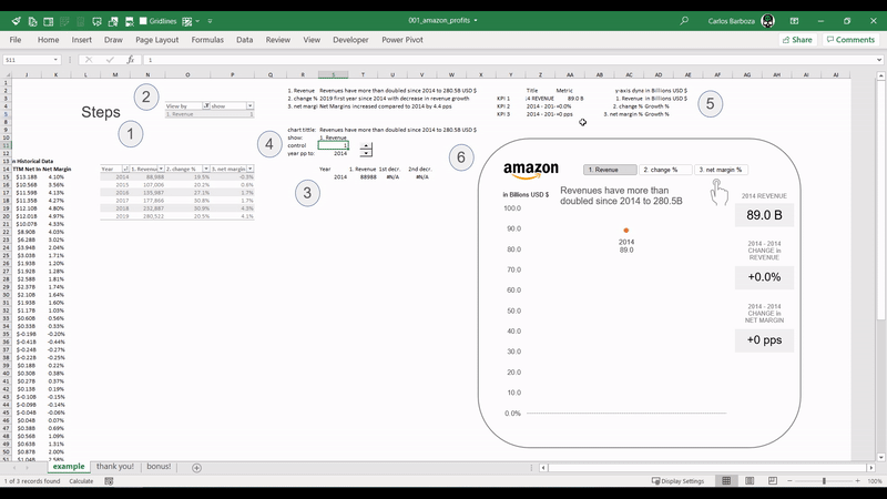
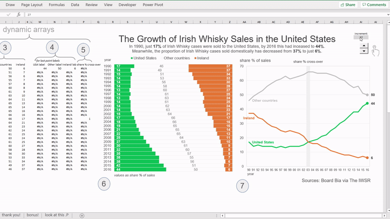
A visualization replica made in Excel inspired from the amazing Tableau viz of Klaus Schulte on “Amazons Profitable Growth.” Click here to view the original visualization.
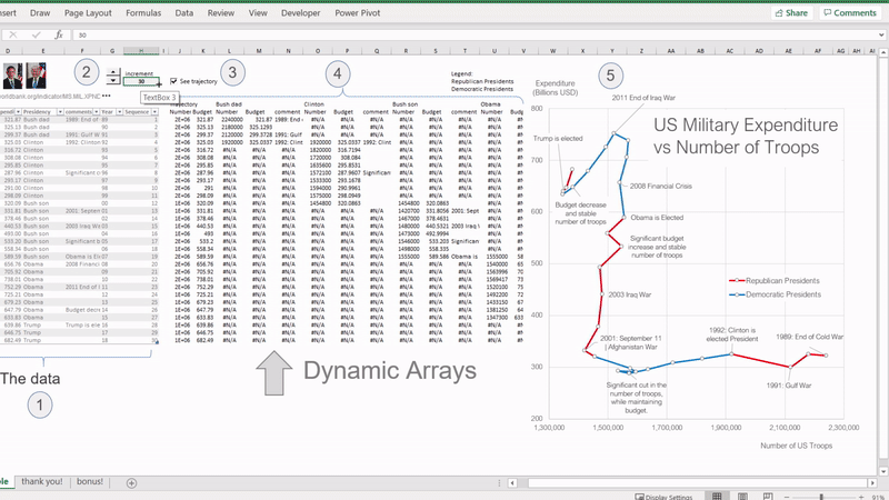
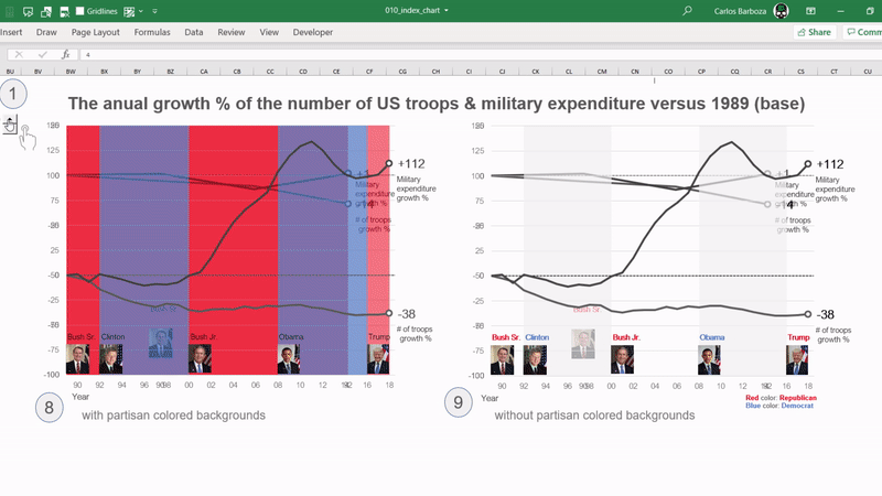
Excel´s new # Dynamics Arrays Spill Ranges # for adding a bit of interactivity on a connected scatter plot inspired from Jorge Camoes amazing visualization: US Military Expenditure vs. Number of Troops.
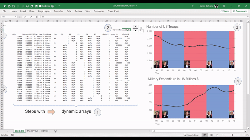
In Excel you can add a custom shape to your marker (in line charts or scatter plots) or you can also add an image. You can also replace the dot marker with the photo of the respective US President according to his era or period.
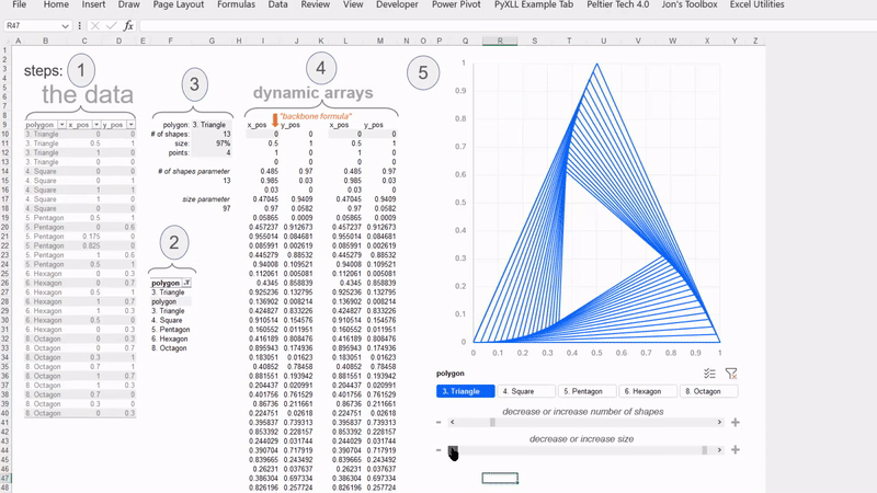
Dedicated to St. Patrick’s Day! on spotlight is the SEQUENCE function, where it could assist on storytelling your data by making your charts to have “motion”. As they say, “motion creates emotion…”
This is a 3rd variation of Jorge Camões’ chart of “US # of Troops vs. Military spending” using the Index chart. This type of chart helps to compare values which are vastly apart and also, understand variation with respect to a bench mark: this case year 1989. Special thanks to Robert Mundigl for the discussion and proposal to make this chart possible.
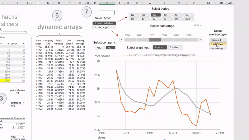
With Excel´s Dynamic Arrays, you can analyze data by time intervals: last 7 days, last month, last 3 years, 10 years maybe? and/or maybe see the index variation % (switching the charts), also you can add last 7-day-moving average or 5-day centered moving average. All possible with a bit of dynamic arrays and slicers (including time slicers assisted with #DAX ).
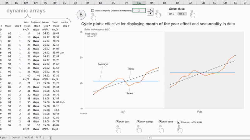
Cycle plots are particularly useful because it can show a great deal of information in a small space, prompting to ask a lot of meaningful questions in search of understanding the impact of month of year and the behavior of seasonal time series or the cyclical patterns over time in #data. You are seeing up yo 12 years of data without information overload.
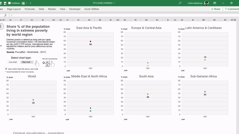
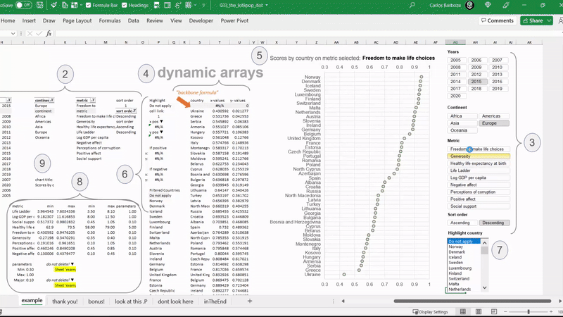
Small Multiples, Step Lines & #Excel´s #Dynamic Arrays # for plotting the continuous decrease in all regions of the share % population living in extreme poverty, according to the World Bank.
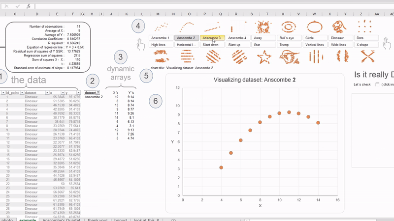
Dynamic Arrays meets Anscombe´s Quartet, The Datasaurus Dozen and DataTrump from Alberto Cairo. In data visualization, very often you come across this mantra: “always visualize your data” by Alberto Cairo. The summary statistics of all these visuals remain the same! (except “DataTrump”) It´s impressive!
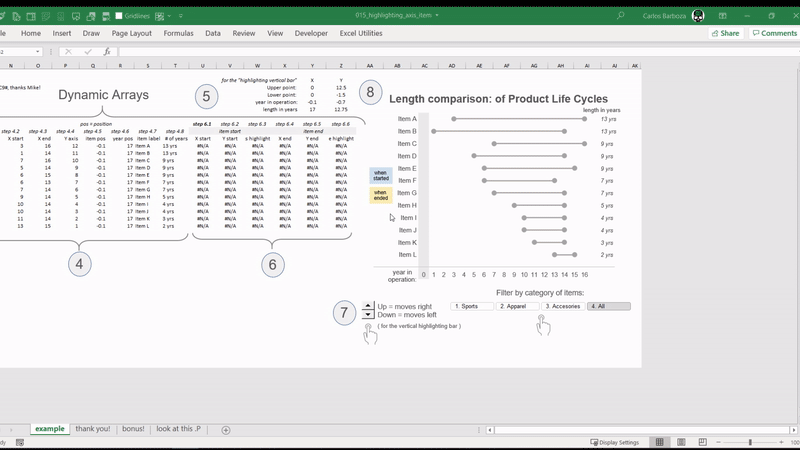
A filterable dot plot for comparing the different length in years of several products’ life cyles and highlighting the axis items when the item or product began and when it ended being offered to the market. Special thanks to Mike Girvin from ExcelisFun YouTube channel !
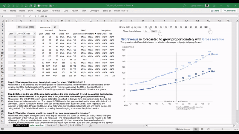
at SWD = Storytelling with Data site lead by Cole Nussbaumer Knaflic, there are countless opportunities for you to learn about data visualization. This is my first proposal for a interesting exercise on the discussion of data tables in a chart.
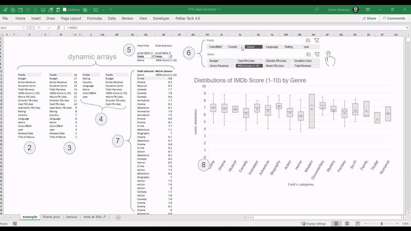
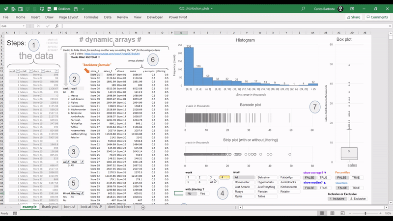
Excel´s native box plots are not the best, but maybe combined with # Dynamic Arrays #, they can serve to rapidly explore the distributions of your data.
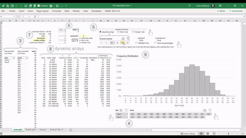
With # Dynamic Arrays #, it´s possible to adjust dynamically the bins of a histogram. In this example, they re-adjust them really fast with more than 30,000 records on a spreadsheet.
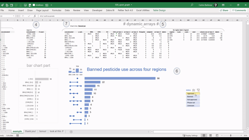
With scatter plots in Excel combined with Dynamic Arrays, it´s possible to build an interactive UpSet plot. Here you have a replica made in Excel inspired from the amazing #Tableau viz of Chris Love. You can find Chris´visualization on this link: https://lnkd.in/d4BX63h
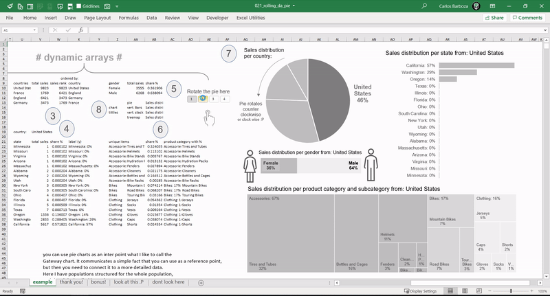
With the MOD and SEQUENCE functions it´s possible to rotate a pie chart. When done properly it can offer the possibility to be the “Gateway chart”, meaning it can be used as an entry point, allowing you to communicate a simple fact that you can use as a reference point, but then connect it to more detailed data. Many thanks to Jorge Camões, for teaching me this.
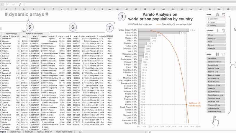
Combining Dynamic Arrays with the Pareto Principle 80/20, but with a different touch: a “vertical Pareto” for improved readability on the category labels. In data visualization aiming for legibility is key. Many thanks to Jon Peltier (The Da Vinci of Excel Charts) for blogging 11 years ago about building vertical Paretos.
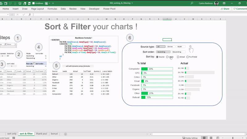
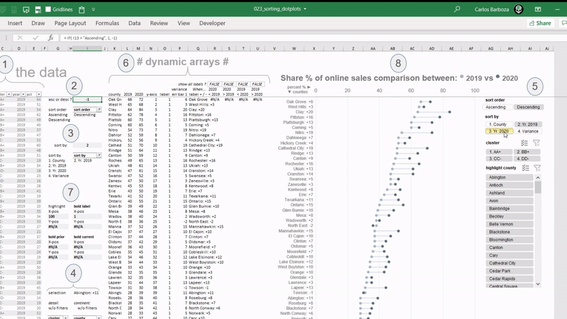
The SORTBY function makes it possible to sort your charts on ascending or descending order either on a metric or field value. Here is a simple model where you can SORT the dot plots either by the current year, prior year, or the variance between the two, along with also analyzing and comparing the share % of online sales between the two years by US counties.
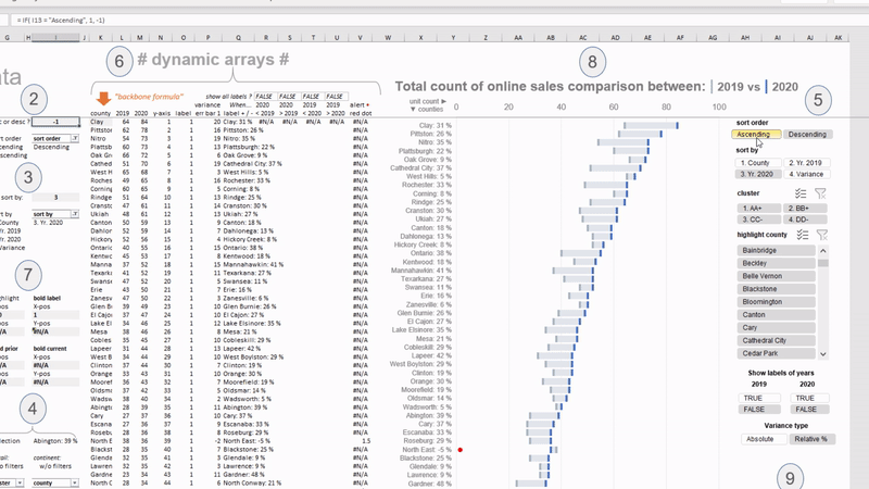
Like dot plots which aim to emphasize the variation between two values, here you have what´s called “floating delta bars”. The setup is identical to graph “023: Sorting Dot Plots” but on this example, you can now switch the variation calculation on the concatenated category labels between absolute or relative %.
Dynamic Arrays are like rubber bands, and the coolest thing is that you can control it´s elasticity. They can serve you very well when measuring the distribution of your data. In this example, all charts: histogram, barcode plot, strip plot or jitter plot and the box plot are pulling the data dynamically and interactively with pivot table slicers.
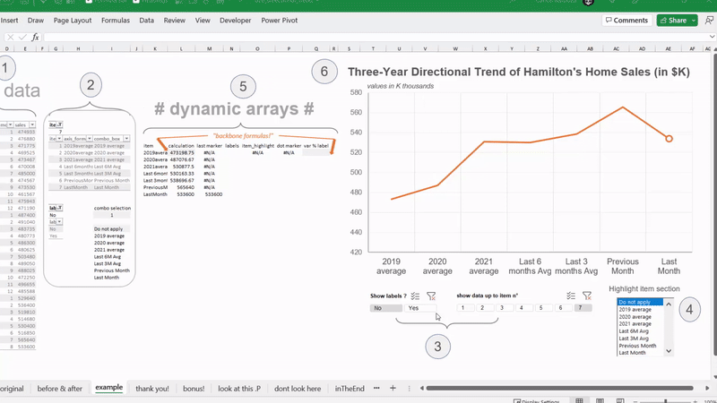
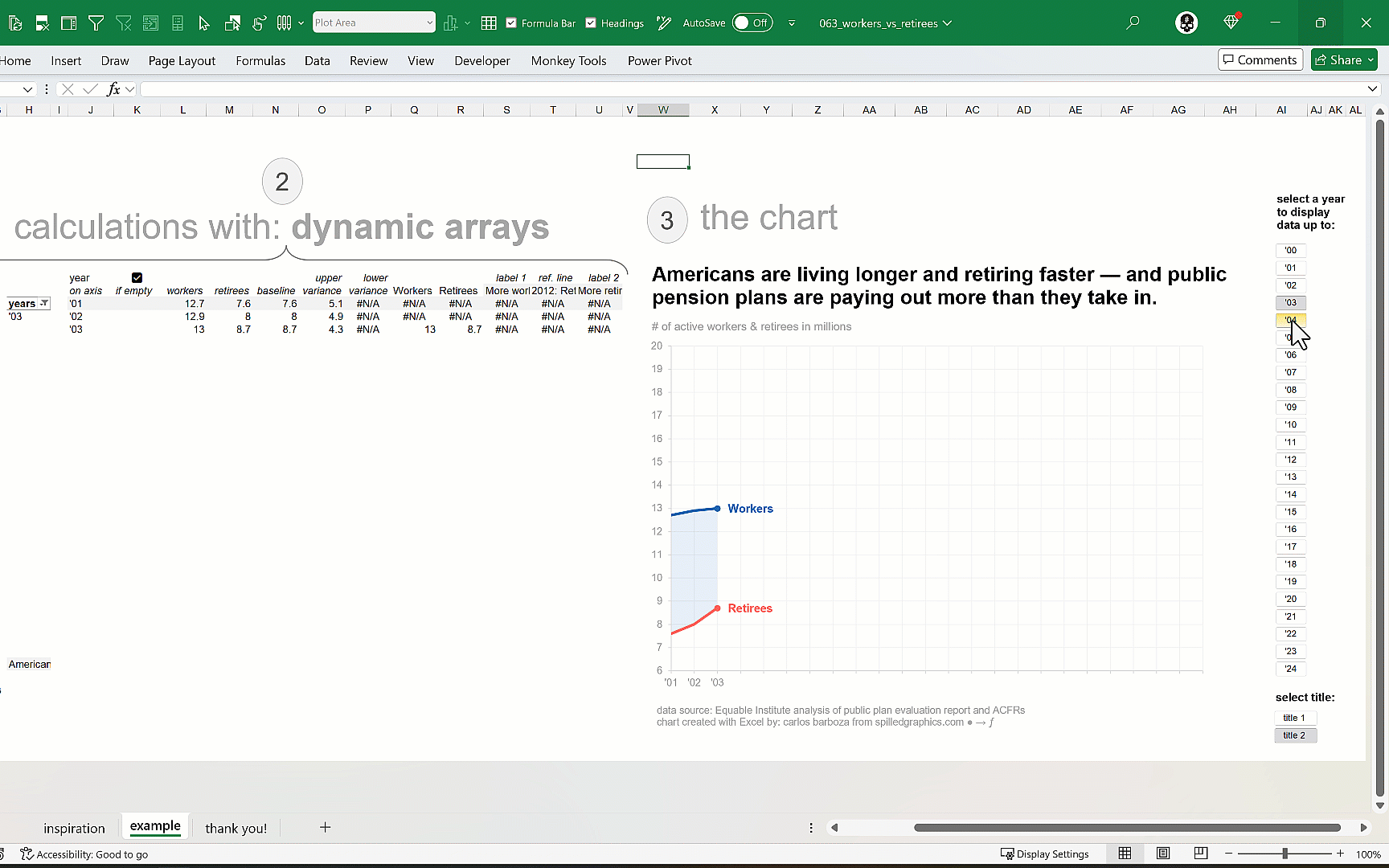
A trend can be a measure of variance over a defined time interval, typically with time periods such as months or years. In this case, a directional trend is a simple analysis approach to imply a relative direction of performance. The main attribute of this technique is that is a set of calculated values as opposed to actual data values.
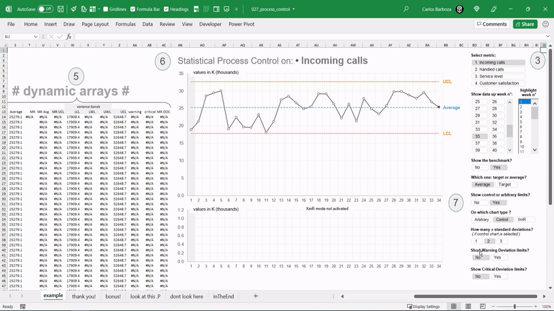
“The Voice of the Process” as Donald J. Wheeler said on his book: Understanding Variation. This graph is known as the “SPC plot” (SPC standing for Statistical Process Control) or also as the “XmR chart” (X-Individual Moving Range chart). Here’s a simple model using dynamic arrays in Excel.
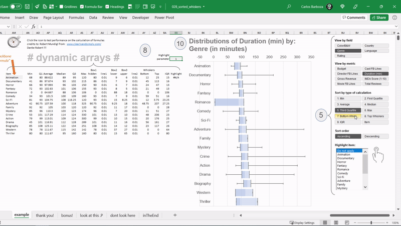
It can be particularly useful to sort your horizontal boxplots by a specific calculation, say the min, or the max, median, or the quartile, IQR? or by the categorial axis itself? in either ascending or descending order. This sorting capability can assist your Excel charts for good interactivity when exploring the data.
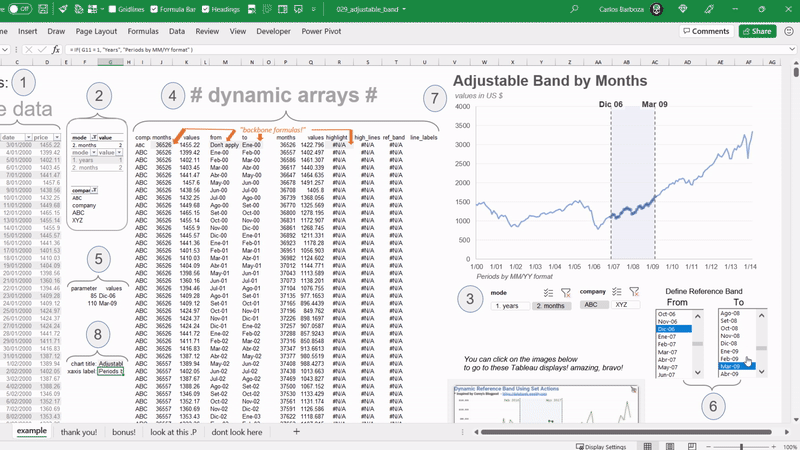
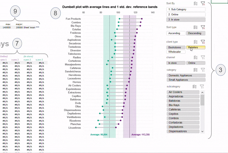
Reference bands in data graphics are very important because they can serve as — guidance — for your audience as well as tools for — focus — in specific data points. With # Dynamic Arrays # we can make these bands to be interactive.
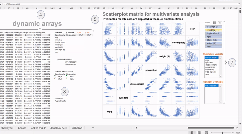
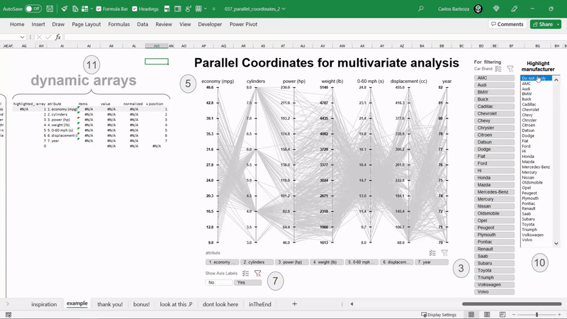
For displaying potential correlations, patterns, or outliers between several quantitative variables simultaneously. The strength of this graphic is its interactive focus + context (fisheye) visualization technique which supports searching for patterns in the big picture and dynamically investigating the details without losing context.
This is the translation of an amazing blogpost and outstanding work from Hicham Bou Habib. His post on this invaluable chart type led me to recreate it with dynamic arrays so it can be interactive. You can select specific variables, along with highlighting or “brushing” on what’s been filtered on the visual. Please do check out his blog here: https://lnkd.in/dESYZ5et
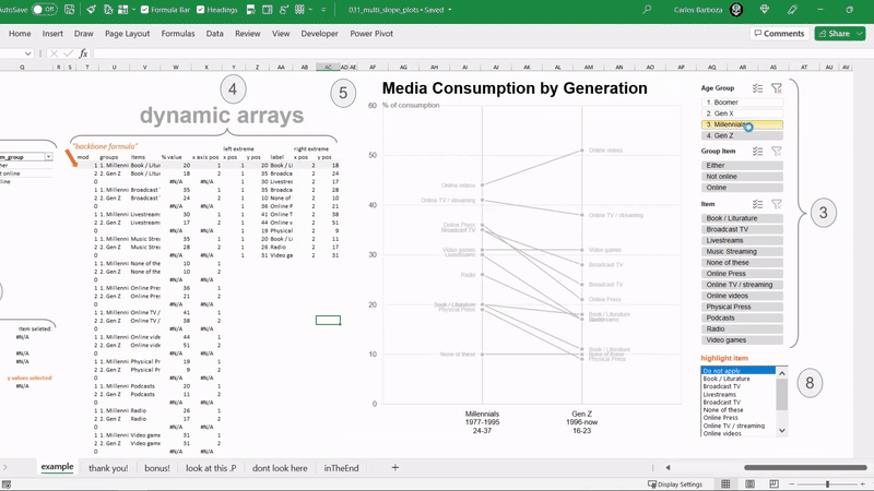
Slope Graphs help to reveal rank, magnitudes of values and changes over time. Additionally, parallel vertical axes automatically encode ranking for comparing the before & after and the lines serving to connect the ranks together. Finally, it is efficient with data-ink ratio and displays multiple insights in a simple line graph.
Another translation of amazing work by Hicham Bou Habib on Dot Plots. His blog-post on this chart type led me to recreate it with dynamic arrays so it can be interactive. Please do check it out here: https://lnkd.in/ex2ZG6rg -||- My contribution has been only to “translate” those formulas to Dynamic Arrays.
Visualized distributions can lead to useful insights for decision making. Some prefer jitter plots other box plots, but how about the two in 1 with the option of switching on/off either? With Dynamic Arrays, we can go a step further and make it interactive.
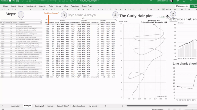
A connected scatter plot showing Revenue on X-axis, Profits on the Y-axis and a third dimension: Time in Years. You can consider this a line chart. And its strength is that it can show 3 variables at the same time. Combined with the FILTER function, we can make it interactive.
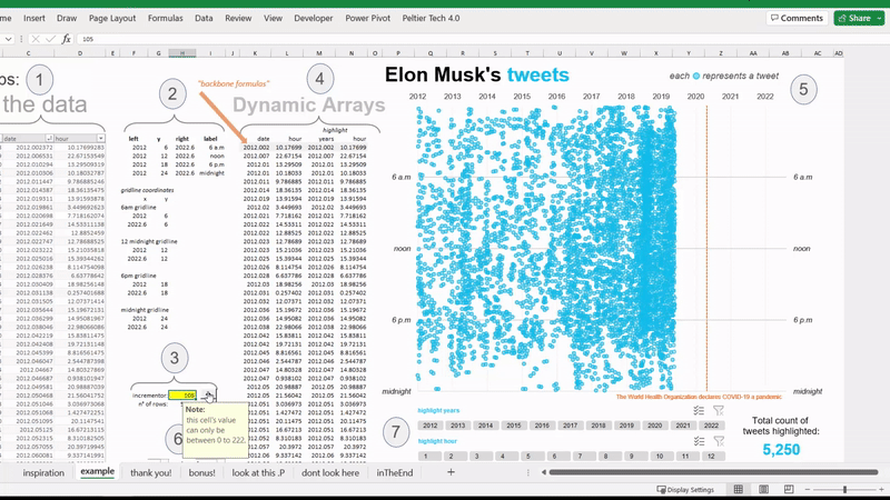
As seen on the Wall Street Journal, a simple replica of a highly data-dense graphic plotting 11,000 tweets from Elon Musk since 2012. With dynamic arrays, we can make it interactive for data storytelling along with the option of highlighting a selected collection of points so it can isolate the sections that you’re interested in while filtering out the noise.
While they may appear confusing at first sight, they are powerful for understanding multi-variate datasets and can reveal so much on a closer inspection. They are ideal for comparing many variables together and seeing the relationships between them. And with Dynamic Arrays we can make it interactive.
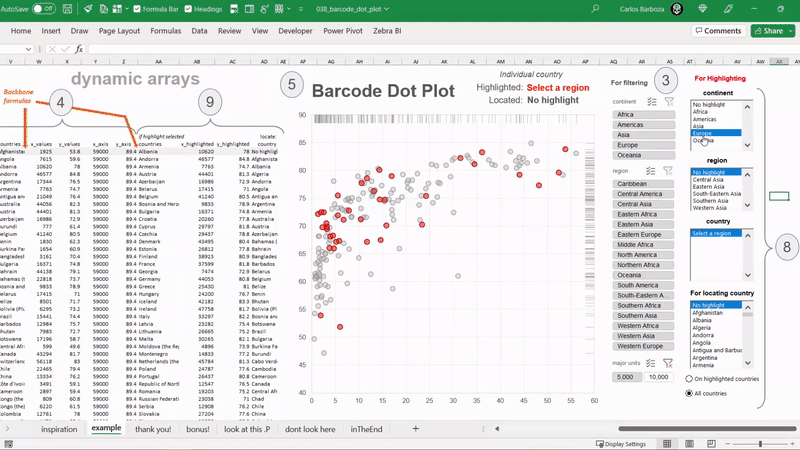
Pivot Table Slicers, Form Controls and Dynamic Arrays to produce a Barcode Dot Plot. With the option to “brush” or highlight (in red) a specific group or individual dot(s). With dynamic arrays, interactivity can be added for both exploratory data analysis and/or data storytelling.
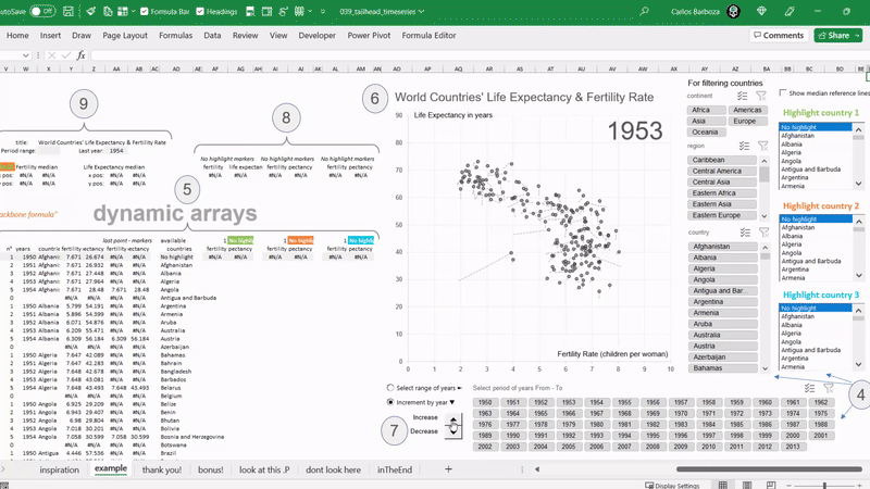
Another example of connected scatter plots where the life expectancies and fertility rates of 201 countries in 64 years are being plotted. An unusual way for charting time series, but the strength of this graph is its capacity to show 3 variables all at once: life expectancy, fertility rate and time (years). With dynamic arrays, we can make it interactive for the user / audience.
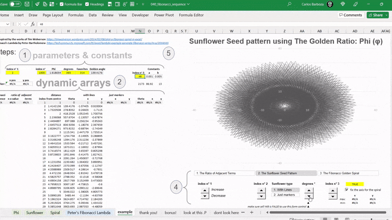
Fibonacci Sequence meets Dynamic Arrays + the Sunflower Seed Pattern + The Golden Ratio: Phi φ. Consider this example a translation and consolidation of the works of Tim Wolverson and Peter Bartholomew ‘s FIBONACCI Lambda. Without Peter’s fascinating LAMBDA function, this wouldn’t have been possible. To both of you, thank you.
An atypical dumbbell plot because it’s not common to add reference bands to this graphic method, yet adding an average reference line with 1 standard deviation band can add context and perspective to indicate the extent of deviation for a group as a whole. And with dynamic arrays we can make it, interactive. Huge thanks to Bolaji Olatunde he helped me in getting the bands accurately.
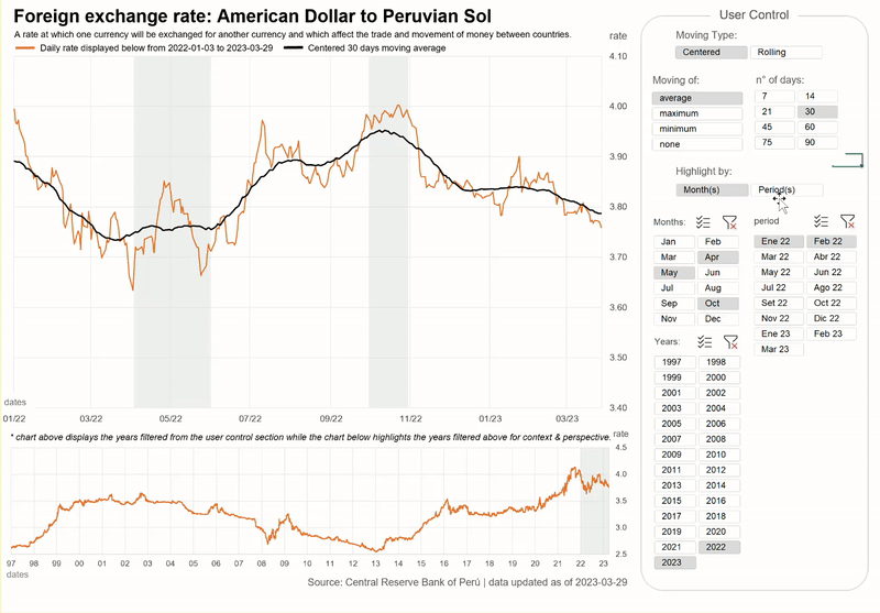
Non-adjacent reference bands for time series analysis where we can potentially compare and contrast variation in two or more time periods or cycles. The grey color on the background visually aids the eye to focus on the periods “highlighted”. Huge thanks to Jon Peltier for helping optimize the centered and rolling formulas of the upper chart.
Brushing or “highlighting” allows you mark data values in a chart using color, enabling the user to see more detail, compare and contrast observations, gain context and perspective, generate compelling questions… can brushing be done with #Excel ? Oh yes, Oh yes.
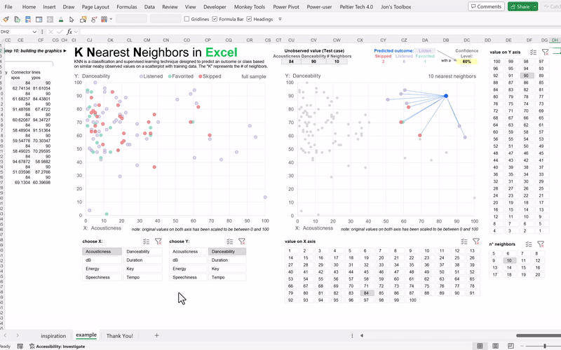
We can use Excel to learn how machine learning algorithms work under the hood. Consider this example, a humble translation to dynamic arrays from the amazing explanation of this technique by Josh Maccarty from the Maven Analytics team. His course on demystifying machine learning using Excel is a must see, more info here. Interactivity has been added for the audience to switch the variables, test values or # of neighbors with pivot table slicers.
Excel’s intuitive interface can make the learning of mathematics more fun and as a teaching tool is wonderful because we can potentially understand abstract concepts explained on spreadsheet. An interactive emulation to the fascinating work of Andrés Rojas Moncada – his explanation for making this possible was impeccable, be sure to check it out here.
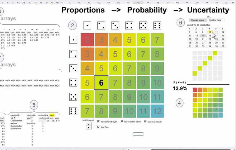
An emulation from the amazing visualization of an awesome video about “Bayes theorem, the geometry of changing beliefs” link to video: here from YouTube channel: 3Blue1Brown – the visualization appears on minute 12, my goodness. Two pivot table slicers have been added for a bit of interactivity.
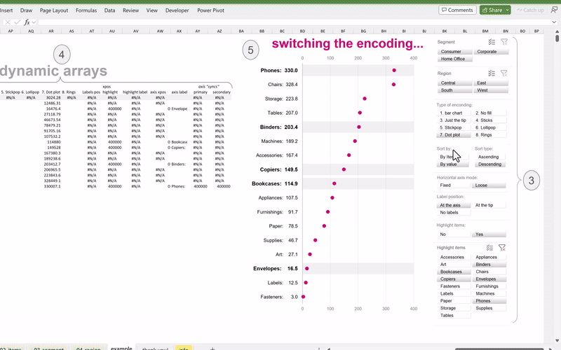
A simple interactive example for educational purposes to educate others on different types of encodings along with some interactivity like, switching the encoding, highlighting items of interest, changing the placement of the data labels, filtering the data (with pivot table slicers!), sorting the axis by the items or values in ascending or descending order, and also “losing” or fixing the scale of the horizontal axis.
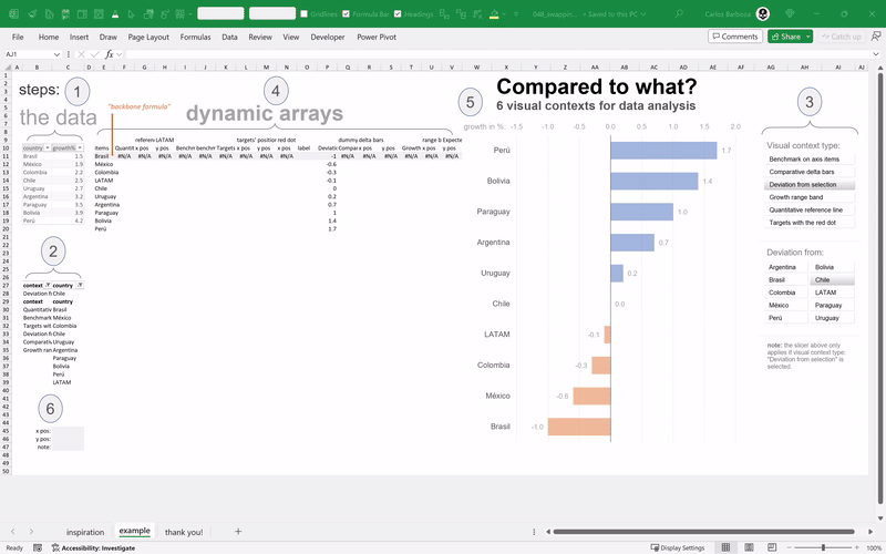
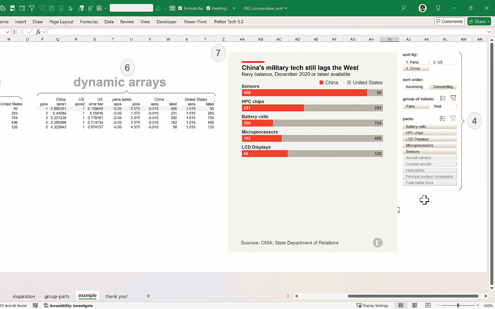
Numbers or metrics shine when they are put into context. I believe we are “comparative creatures”, always comparing and judging stuff. Another example for teaching colleagues and clients how put numbers in perspective using 6 different visual techniques.
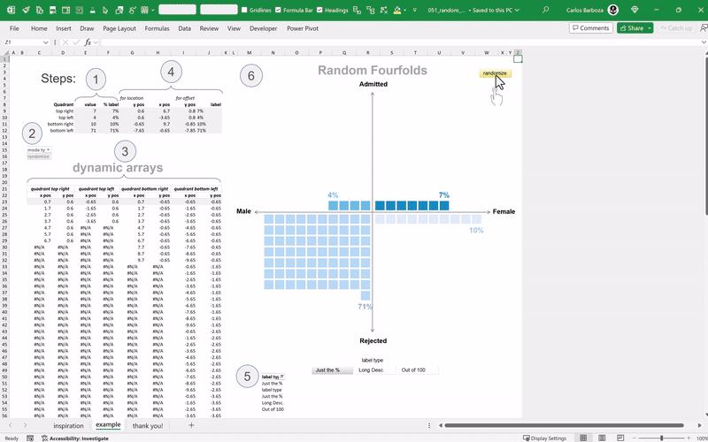
A variant using a scatterplot for plotting a randomized fourfold display. Inspired from the amazing work of Hicham Bou Habib on making fourfold displays with Excel. Please be sure to check out his gallery of Excel charts here. It is a source of inspiration for my persona and a “virtual” temple of reflection on caring about the functional aspect of data graphics.
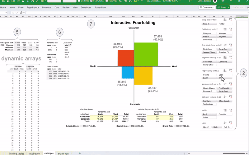
An interactive extension and emulation of the amazing work of Andrés Rojas Moncada who translated to dynamic arrays the works of Hicham Bou Habib for making a fourfold chart in Excel. My contribution: taking Andres’ work and adding interactivity by switching the fields of interest, filtering the data based on items of the fields selected, swapping the axis, switching the metric and adjusting the detail of the data labels.
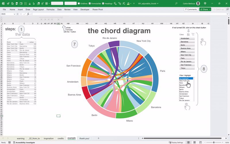
An interesting visualization for seeing the flows or connections between several entities. An example: think of seeing the traffic flow of people between the airports of major cities in a circular format. Now, this is just a humble translation to dynamic arrays from the amazing and mind-blowing work of The Frankens Team. You can find the original work here.
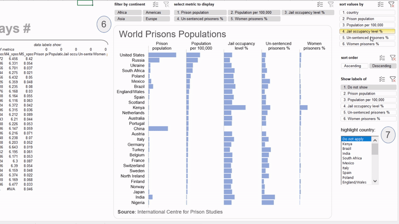
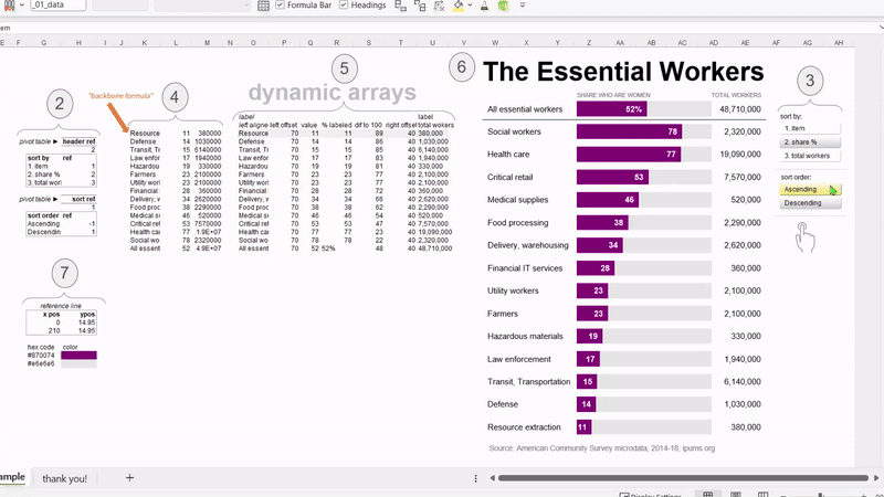
A humble user-configurable replica since the original graphic was interesting, but let’s add some interaction like sorting the axis items or the values displayed. All credits to Excel functions: SORTBY and VSTACK for this to be possible as you will notice that the first item of the graph stays put (“All essential workers”) while the rest can be sorted by pivot table slicers.
A consolidation of math graphics in Excel developed by Hicham Bou Habib. His blog and Excel chart gallery is a must see. If you would like to learn about elegant data graphics that aid in decision making, please wait no further. I decided to put together all his math in Excel examples and contribute, as always, with adding a bit of interaction.
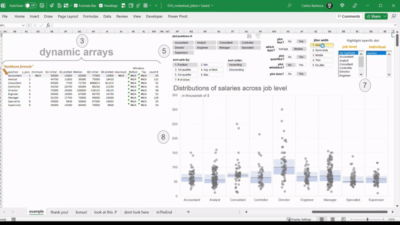
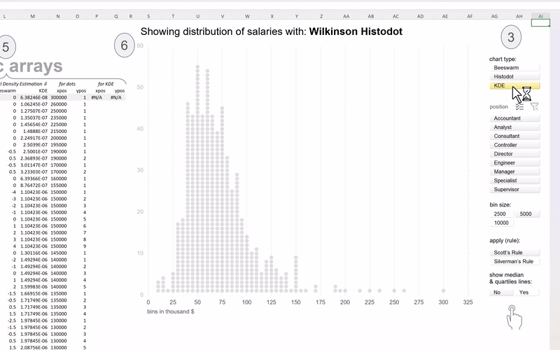
Wilkinson Histodots, Beeswarm plot or Kernel Density Estimation all in one to view and interact with the distribution of salaries across job positions. Special thanks to all the individuals and their tutorials that inspired this example along with Excel function SCAN and BYROW for making this interactive with pivot table slicers.
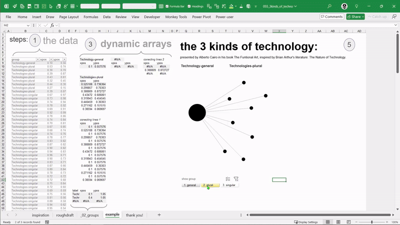
a replica from a fantastic diagram presented in Alberto Cairo’s seminal book: The Functional Art (page 22) inspired from Brian Arthur’s book: The Nature of Technology, explaining graphically the three kinds of technology: general, plural and singular. With dynamic arrays and a pivot table slicer we can make it a bit interactive.
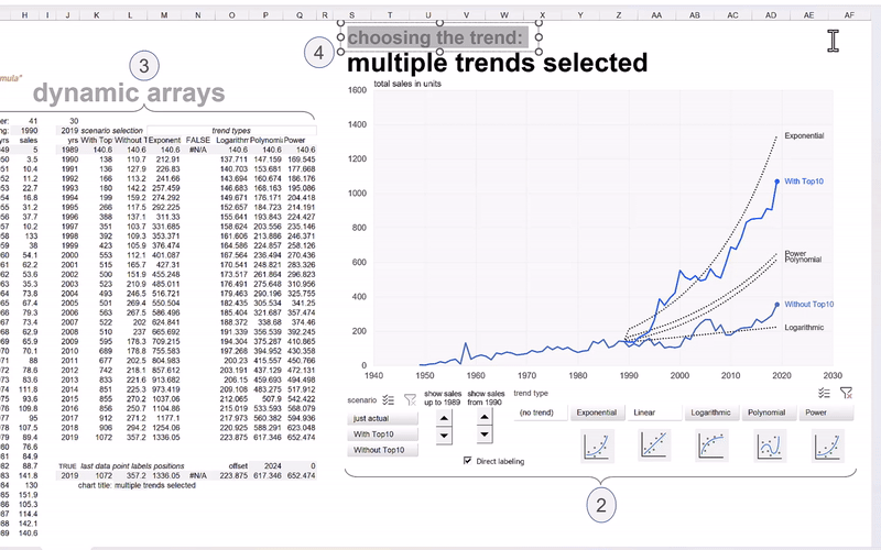
Dynamic arrays meet the native (but static) trend-line options that you can add to line charts or scatter plots. But with the new calculation engine of Excel, you can make the different types of trend-lines: exponential, linear, logarithmic, polynomial or power, to be all; dynamic. And, with a bit of interactivity using pivot table slicers and form controls, you can reveal or present the figures as you move forward in time.
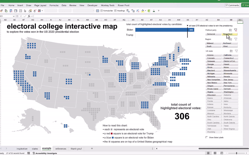
Another replica made with mighty Excel from an interesting visualization of the US elections of 2020 made by the French newspaper Le Monde. With dynamic arrays, we can add a bit of highlighting action with slicers so you can focus of the states that voted for Biden versus Trump in 2020, along with highlighting the states by region or maybe individually by state. Additionally, dynamic labeling according the selection by the slicers.
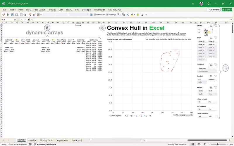
In mathematics, the convex hull is the smallest convex shape containing a set of points. With the LAMBDA function, we can make the calculations of the convex hulls to be: dynamic. Huge thanks to Bo Rydobon for building the formula, to Roberto Mensa for this formula in producing the filled areas for the convex hulls and Robert Mundigl for his idea on tooltips in mighty Excel. And the works of Andy Pope for the inspiration.
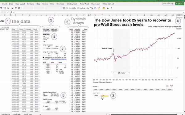
Dynamic Arrays meet a wonderful but, not so common function; the LOG10 for switching the scale on a line chart. When used wisely, log scales can unhide or emphasize hidden patterns that you may not see easily with a linear scale. A great example for this is the Dow Jones index since year 1900. With a bit of interaction, you can switch from linear to log scale to see the skewness of a data, the multiplicative rates of change, and it will show more clearly the Wall St. crash on 1929, at-a-glance.
The versatile scatter-plot in Excel is almighty. It can allow us to chart many things at once. Combined with Dynamic arrays we can proceed with making interactive visualizations using pivot table slicers. This opens the door to so many possibilities and on this example, you have 10 ways for displaying a small dataset. Long live the scatter plot, and long life to dynamic arrays and spilled ranges in Excel.
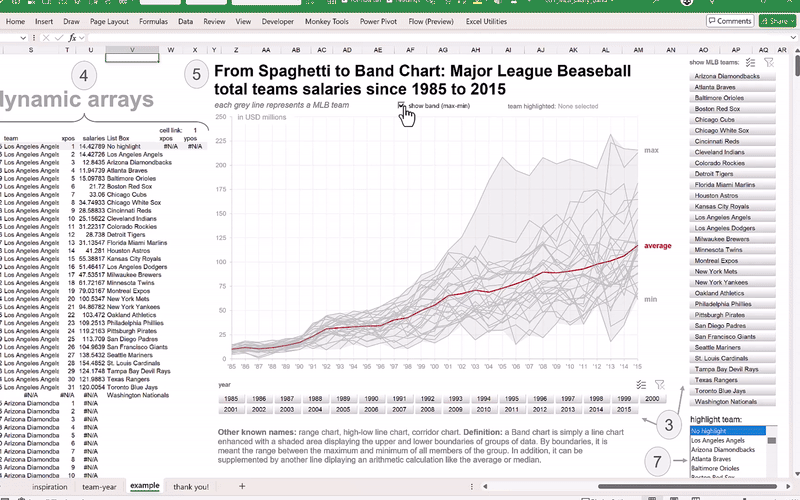
A basic line chart enhanced with a shaded area displaying the upper and lower boundaries of a group of data or the range between the maximum and minimum of all members of the group. With dynamic arrays, interactive highlighting can be added to this informative graph. Many thanks to my friend Robert Mundigl for the inspiration of this replica. His blog-post on this underrated chart type is a must read.
You can learn a lot from emulating the work of others. It is always a good exercise assessing and reflecting on the design decisions from the charts from The Economist. Many thanks to Maestra Leila Gharani for the inspiration of this replica. Her tutorial served as the basis to proceed with making this interactive version. With dynamic arrays, a sacrosanct feature in interactive data visualization can be added: the ability to sort the data.
Dedicated to the best Excel function of all: LET and to the finesse charting from 240 years ago by William Playfair when he published his balance of trade chart in 1786! — combined with dynamic arrays and couple pivot table slicers: its possible to turn a static chart into an interactive visualization, where the technique of “revealing the data” step-by-step can be effective when presenting many variables and graphical elements at-a-glance.
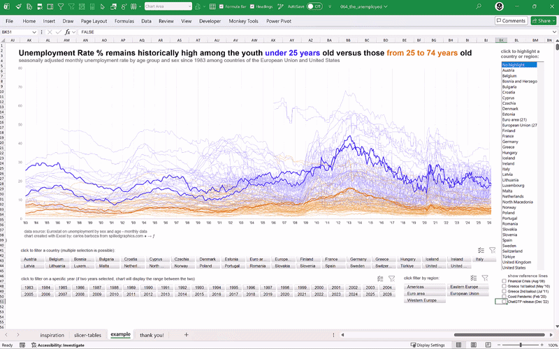
About 150 lines plotted or roughly 80,000 data points on one single Excel line chart which can cause visual noise. Highlighting becomes handy to compare the highlighted item versus its peers, helping to gain context on the short term, and perspective on the long term. Note: original chart made by Jorge Camões on his masterpiece book: Data At Work (pages 340-341)