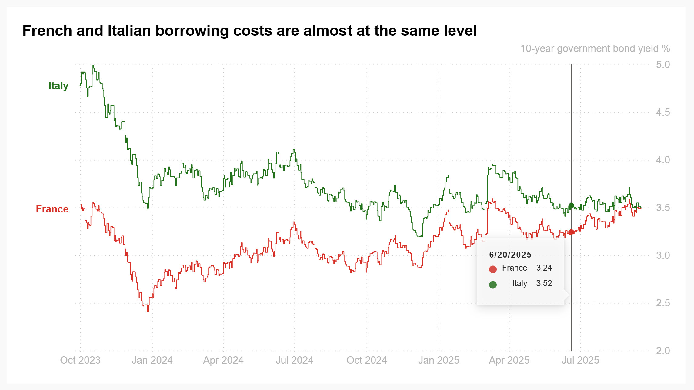
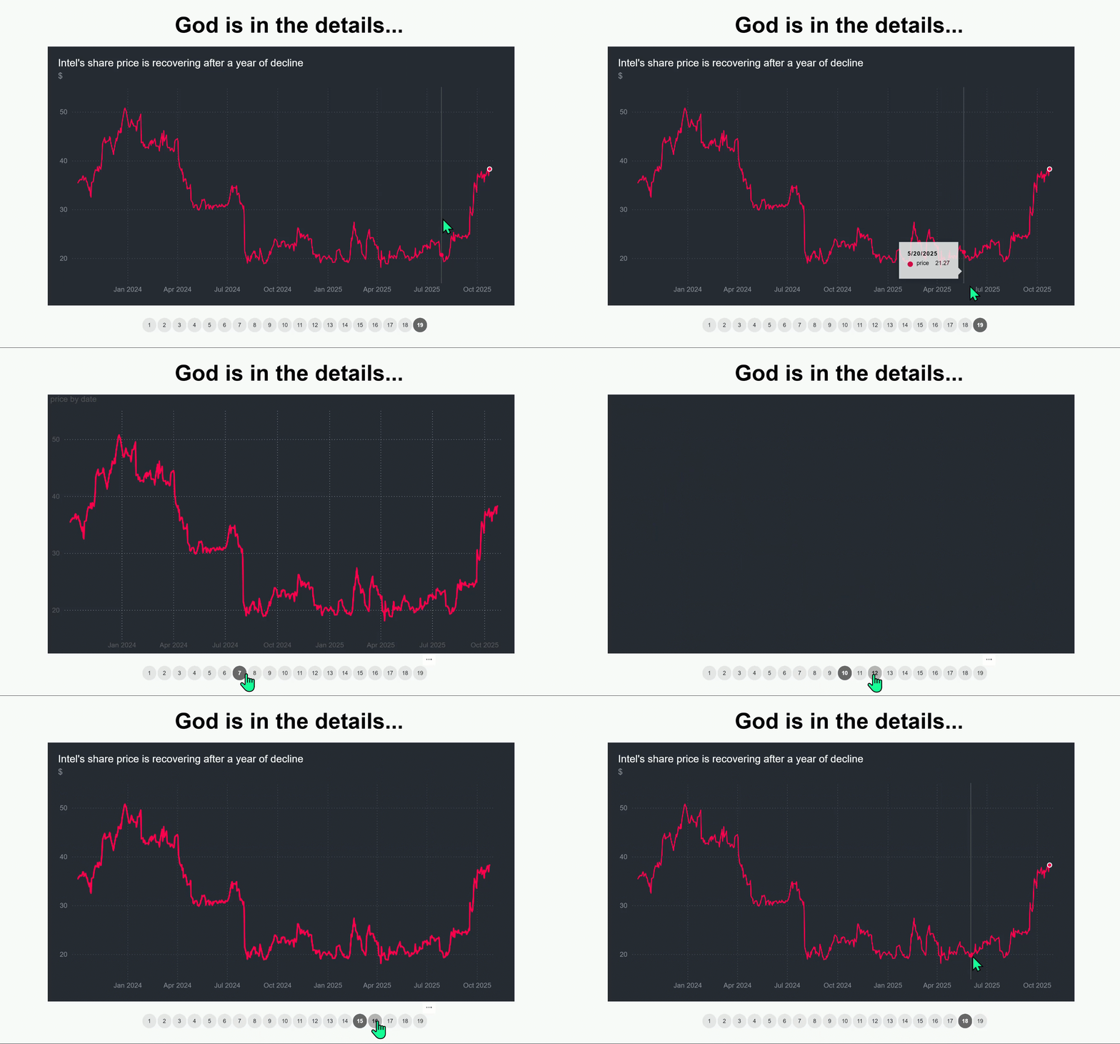
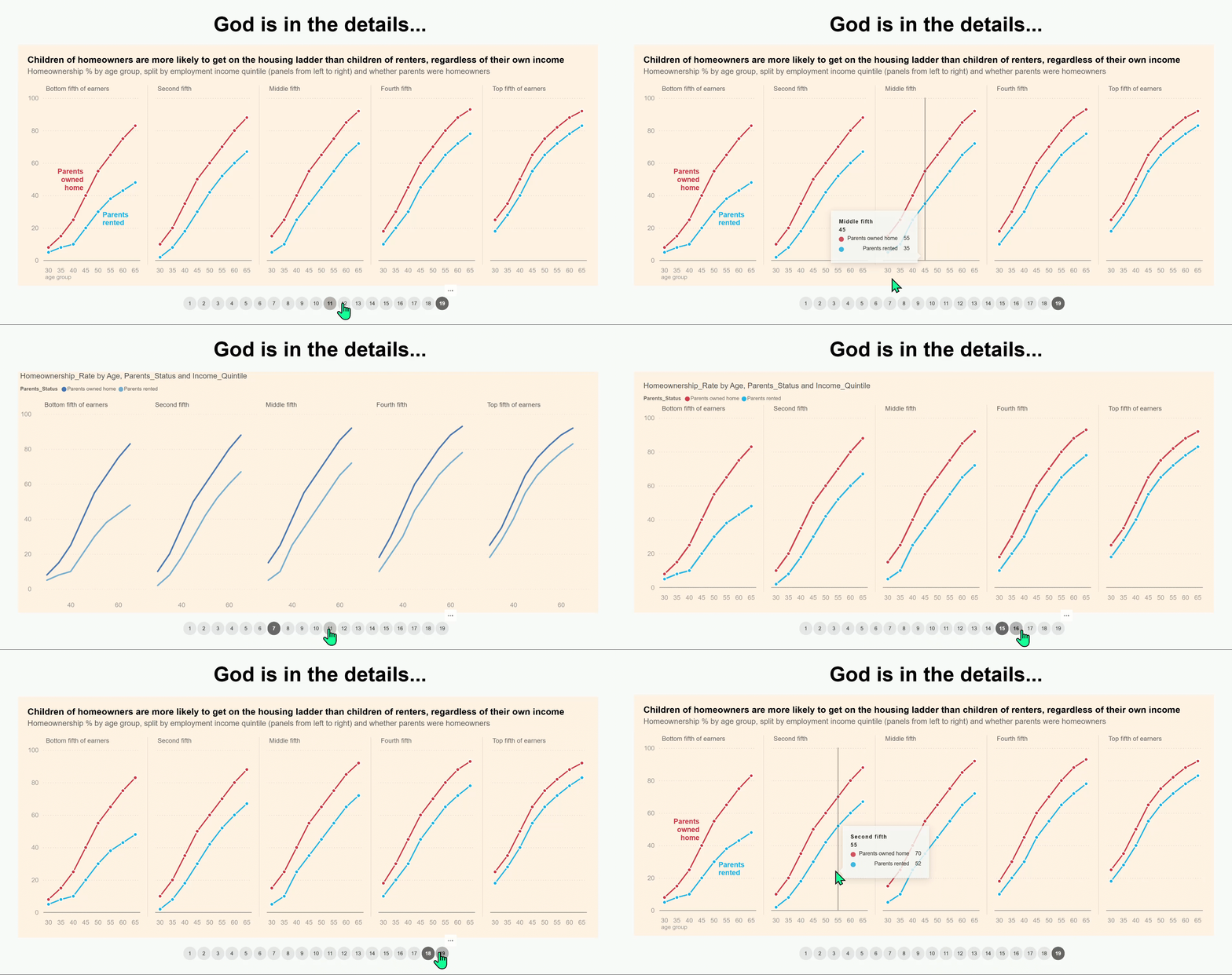
The first example of this new section of: Enhancing the defaults on Power BI visuals. Inspired by the visualization work of journalist: Dhara Ranasinghe from Reuters. Compared to the original version, vertical gridlines are added and direct labeling is applied, along with switching the vertical y axis to the right. At times, when many data points are plotted, the most recent values and up-to-date data are, of most relevance.