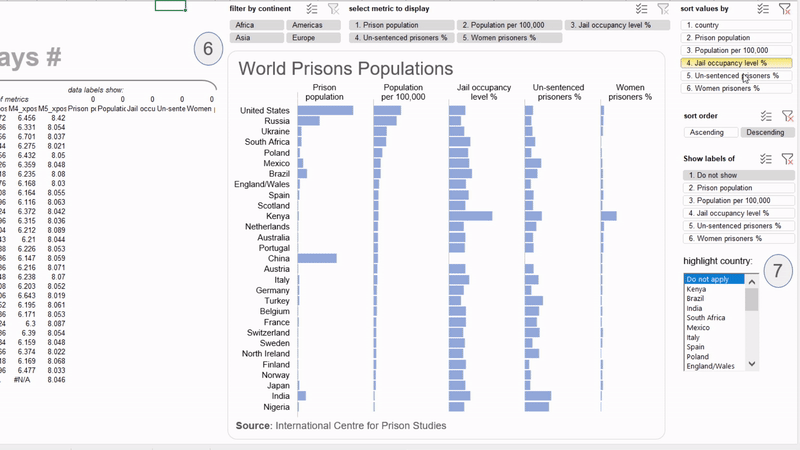
Skip to content

054: Beeswarm Histodots

Excel charts with Dynamic Arrays 054: Beeswarm Histodots A releasable version for everybody on three more ways of showing distributions with: Wilkinson Histodots, Beeswarm plot or Kernel Density Estimation on job salaries across position. But… 054: Beeswarm Histodots

055: US election map

Excel charts with Dynamic Arrays 055: US election map What you see above is just a humble replica from an interesting visualization of the US elections of 2020 by French newspaper Le Monde. And this… 055: US election map

051: Adjustable Chords

Excel charts with Dynamic Arrays 051: Adjustable Chords Ok, this emulation was quite a journey because it’s an interesting visualization for seeing the flows or connections between several entities. A simple example: think of seeing… 051: Adjustable Chords

030: Dynamic Table Lens

Excel charts with Dynamic Arrays 030: Dynamic Table Lens Table Lens for displaying potential correlations, patterns, or outliers between several quantitative variables simultaneously. The strength of this graphic is its interactive focus + context (fisheye)… 030: Dynamic Table Lens

031: Scatterplot Matrix

Excel charts with Dynamic Arrays 031: Scatterplot Matrix This is the translation of an amazing blogpost and outstanding work from Hicham Bou Habib CCIM, MRICS. His post on this invaluable chart type led me to… 031: Scatterplot Matrix

049: Random Wafflefolds

Excel charts with Dynamic Arrays 049: Random Wafflefolds Consider the following below a variant using a scatterplot for plotting a randomized fourfold display. Inspired from the amazing work of Hicham Bou Habib on making fourfold… 049: Random Wafflefolds