my Power BI wishlist
wish 001: The Global Multiple, synchronized vertical line tool tips on small multiples, data labels when mouse overing
.
I came across this amazing graphic (on video above) on the The Economist website, and these three ideas came up for the Power BI Core Visuals:
1. When small multiples is set up, maybe an option within the visual to active a “global multiple” and with a sub-option to place it on the top or right, and then followed by the other multiples according to the dimension breaking down the visual with small multiples. Like in the video below, you have a global multiple on top for the global excess figures. And then below that, by the world 6 regions. If you would like, you could vote for this idea here. (many thanks to Christoffer Struve Sømod for letting me know that you can summit ideas to the PowerBI – Fabric design team.
2. The synchronized vertical lines with markers and their corresponding data labels when you mouse over on any of the lines of the small multiples. Because all the multiples share the same x-axis (date), by having all the vertical lines appearing at once when you mouse over, it aids in making visual comparisons of the data values sharing the same date in all small multiples. If you would like, you could vote for this idea here.
3. Third and last, maybe an option of switching between a tool tip or a data label when you mouse over on line visuals. For example, in the video below, when you mouse over, the official and estimated figures show up according to their corresponding date. They appear of the left of the vertical lines and very close to their corresponding data markers. Subtle but prominent.
source of the chart: https://www.economist.com/graphic-detail/coronavirus-excess-deaths-estimates
wish 002: cross-highlighting on small multiples
there is cross-filtering between visuals in Power BI and we are gracious, but what about cross-highlighting in small multiples with just a mouse over as seen on the video below ?
.
With just a simple mouse over you can highlight a data point to stand out across three or more multiples without causing the other data points to disappear. In the beeswarm plot below, such feature assist us in two levels; first on the foreground by focusing our attention on the highlighted data point across three multiples with the same scale and benchmark: the banana index 🍌 and second, on the background, by seeing how the highlighted data point is located in the context of the big picture and how it compares to the other data points in three multiples, at a glance. Many thanks to the data graphics team at The Economist for this example on cross-highlighting in small multiples.
source of the chart: https://www.economist.com/graphic-detail/2023/04/11/a-different-way-to-measure-the-climate-impact-of-food
wish 003: comparative cross-highlighting mouse over
“We can only learn so much when staring at a static visualization such as a graph printed on paper. No matter how rich and elegant the printed display, if it’s evocative it will invite questions that it wasn’t designed to answer. At that juncture, if we can’t interact with the data to pursue an answer, we’ll hit the wall. The effectiveness of data visualization hinges on two things: its ability to clearly and accurately represent information and our ability to interact with it to figure out what the data means.” – Stephen Few (page 59 from “Now You See it”, 2nd edition).
.
Above, an elegant example from The Economist, which facilitates a simple user-driven interaction: comparison. For example, when you mouse over a circle (or bubble) in either of the three small multiple bee-swarm, that the data point gets cross-highlighted and labeled, bringing the rest of points to the background. But then, you can mouse over to another circle or bubble and it also gets highlighted to compare both data points. In the video below, let’s see where China and India are located and compare their positions on the horizontal scale. This is the beauty of interactive data graphics: to ignite interest, to ignite curiosity. Thank you Stephen Few.
source of the chart: https://www.economist.com/graphic-detail/2024/07/04/the-worlds-richest-countries-in-2024
wish 004: Synced labels when mouse over on line chart
another interesting example from the The Economist on mouse-over tool-tips in hashtag#data graphics. Say you’re interested on seeing the values on a certain date prior to the latest values shown on the chart (by default), then you just mouse-over to that specific data point plotted on the chart. But…in addition, you get a nice vertical line which add the labels directly to their corresponding lines, as seen on the video below. Now, when there are many lines plotted, things can get rowdy. Yet, I think this interactive features is beneficial for information consumption.
.
Now one nice and interesting touch is the greyed area to the right side of the vertical line that gets positioned when you are mouse-over on the line chart. Its visual effect helps interactively to drive the focus of the values where the mouse-over is taking place, while sending the future values to the background.
source of the chart: https://www.economist.com/graphic-detail/2019/10/30/who-is-winning-the-race-for-no-10-downing-street
wish 005: Synced labels when mouse over on a small multiples.
“When we see the world, we unconsciously impose organization on the unstructured information that our eyes gather and transmit to the brain. We create hierarchies. We don’t perceive everything in front of us at once…A moving entity, for instance, attracts our attention more than a static one, because movement may suggest an approaching threat. We therefore process the position and identity of the moving object before paying attention to anything else. Our brain gives meaning to the object, even if we are not aware of the reason why.” – Alberto Cairo (page 17 on his book: “The Functional Art”)
Above an example from the The Washington Post on: synced labels when you mouse over on a small multiples line chart. Notice how when you mouse over a specific point on any of the eight lines, its respective data label appears along with the other labels of their respective data points which have the same date to the data point that you mouse over. Also, the label of the month only appears once, allowing more visual prominence to the number figures in the synced data labels. Last but not least, the light grey reference band of June in all small multiples, but only labeled on the Fruit Flies multiples. Subtle and elegant.
source of the chart: https://www.washingtonpost.com/business/2024/09/06/heres-what-americans-want-kill-according-google/
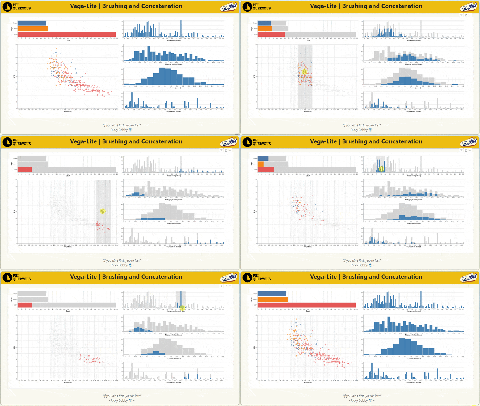
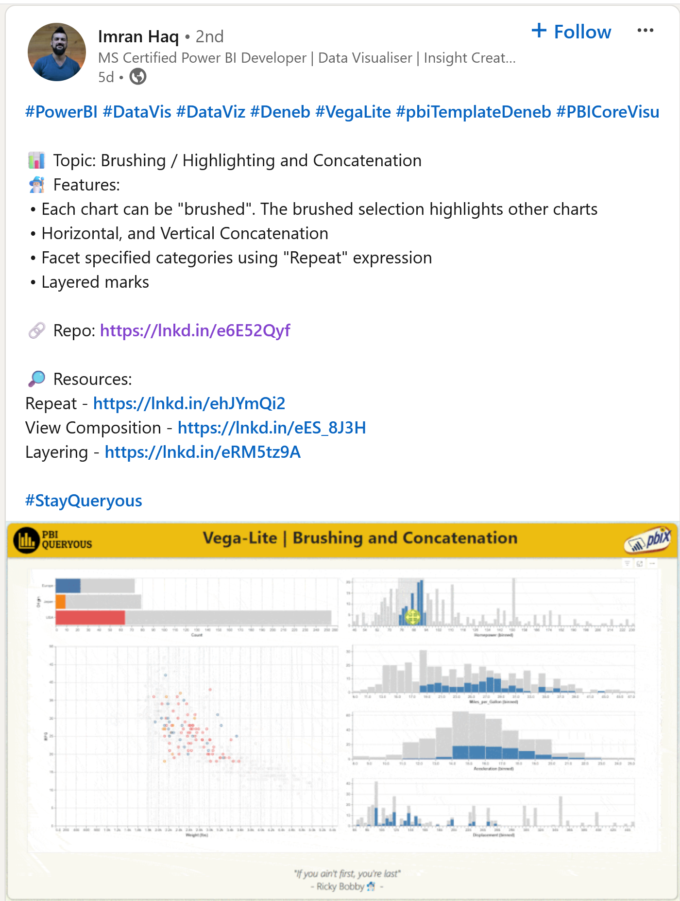
wish 006: Rolling brushing adjustable window
As seen below: an amazing work done by Imran Haq

source of the GIF: https://www.linkedin.com/posts/imranhaqbi_powerbi-datavis-dataviz-activity-7260964547547557888-DUHT
