Excel charts
with Dynamic Arrays 052:
Essential Sorting
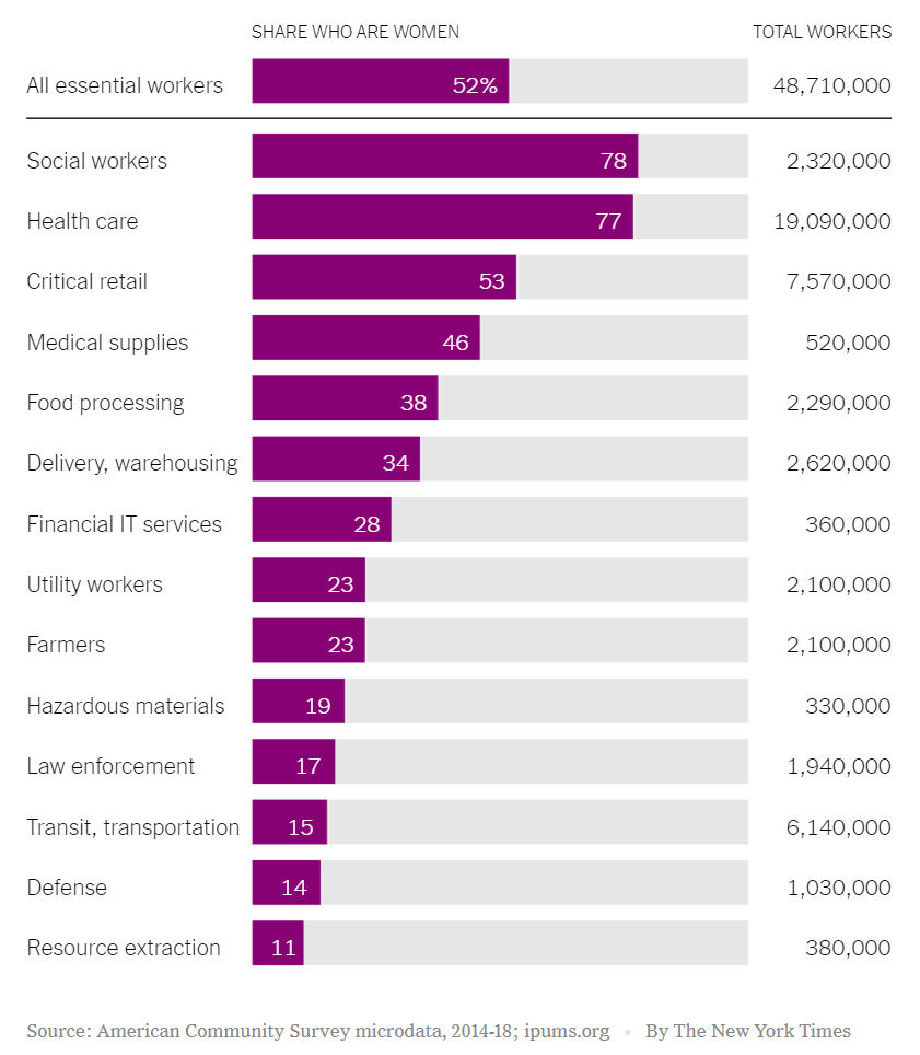
Inspired by the following graphic made by The New York Times:
 Source: https://www.nytimes.com/2020/09/24/learning/whats-going-on-in-this-graph-essential-workers.html
I decided to make a humble replica with mighty Excel, the original graphic was interesting, I just decided to add some interaction like sorting the axis items and/or the values displayed. All the credits to Excel functions: SORTBY and VSTACK for this to be possible as you will notice that the first item of the graph stays put (“All essential workers”) while the rest can be sorted by pivot table slicers. Also credits to Excel’s new calculation engine, which can allow us to make charts that are user-configurable.
And here’s how to build it in Excel:
For comments, questions or feedback, please feel free to leave them on comments section of the video above on YouTube. And, if you would like to get a copy of the file, you can download it from the button below.
And don’t forget: life is short.