Skip to content
spilled graphics
a vlog on data graphics with Excel & Power BI
home
about
vlog
spilled graphics
a vlog on data graphics with Excel & Power BI
Navigation Menu
Navigation Menu
home
about
vlog
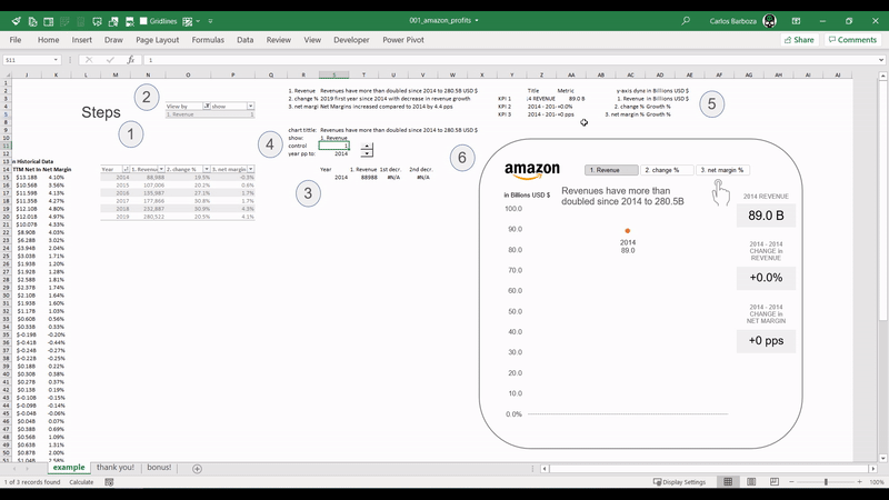
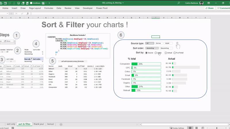
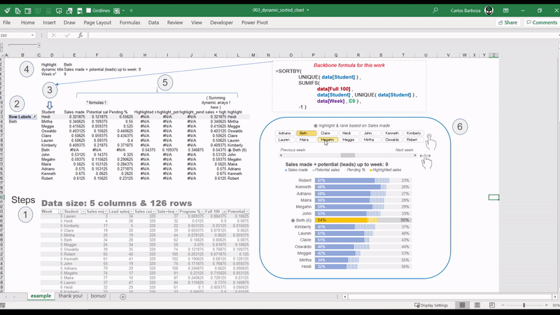
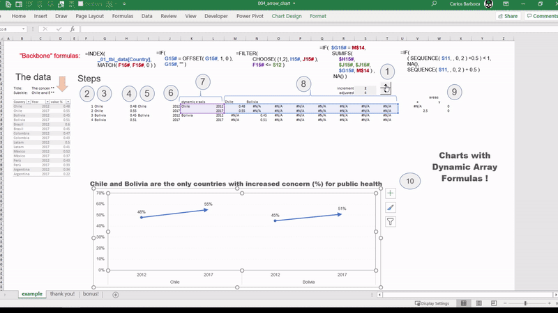
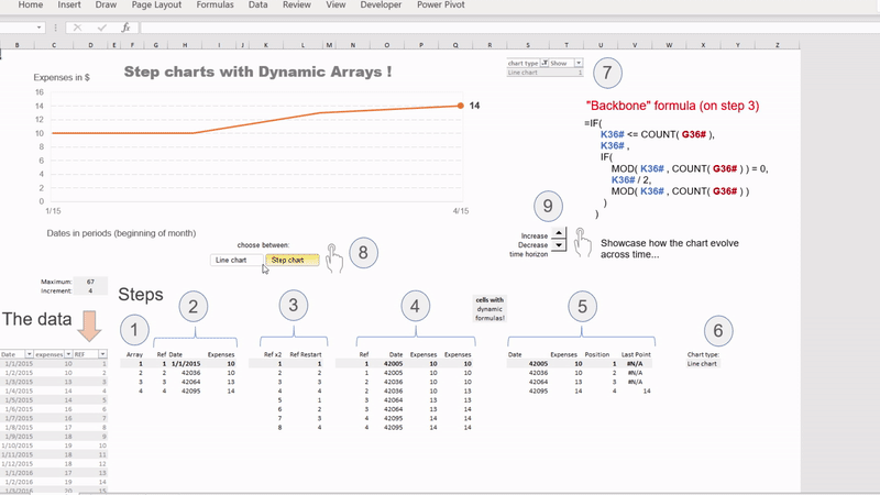
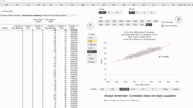
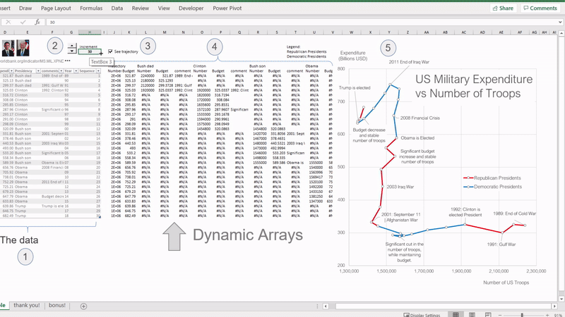
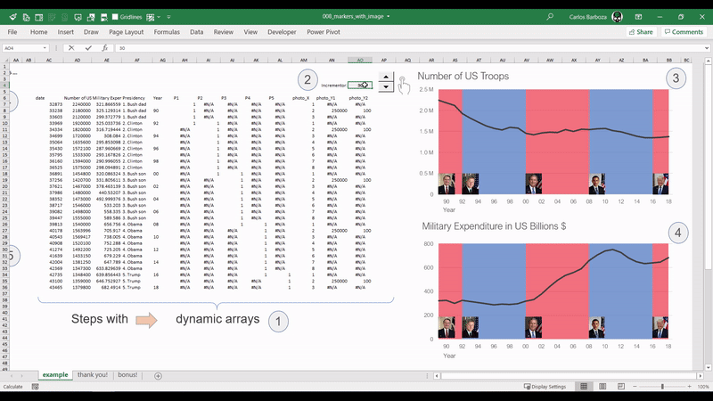
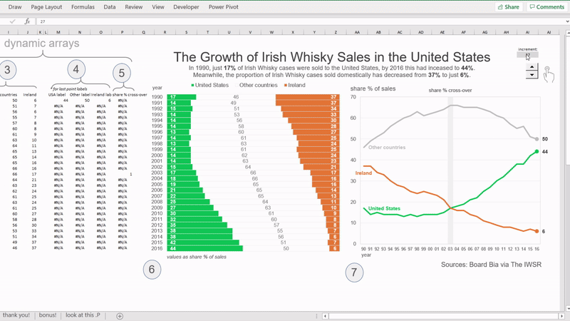
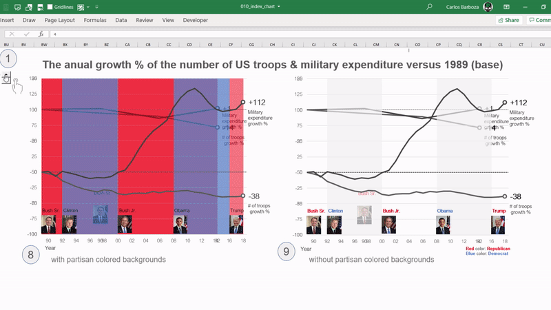
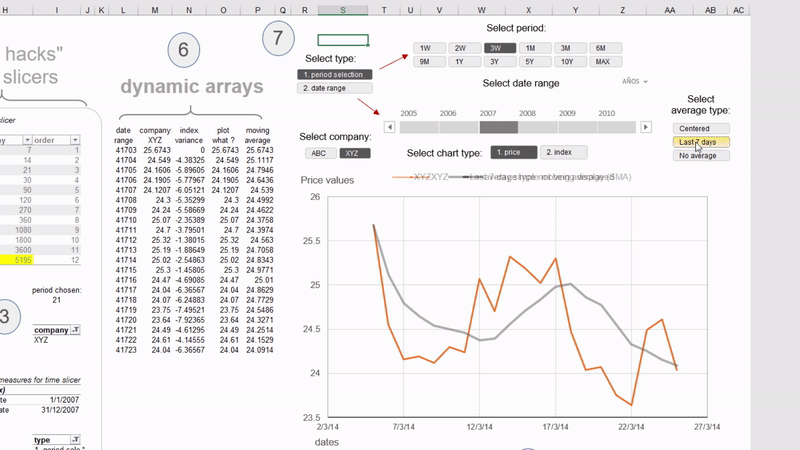
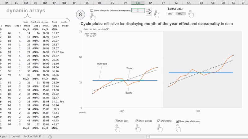
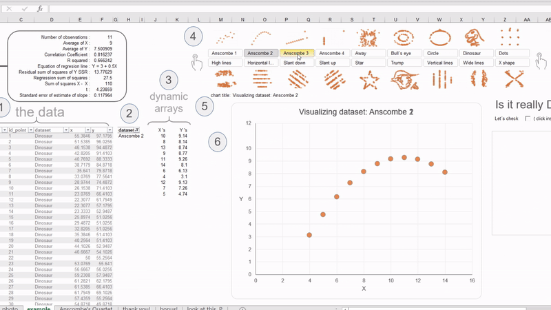
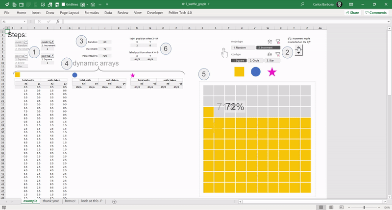
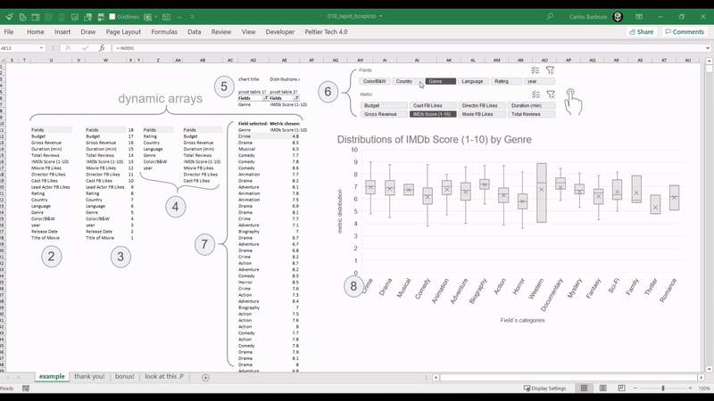
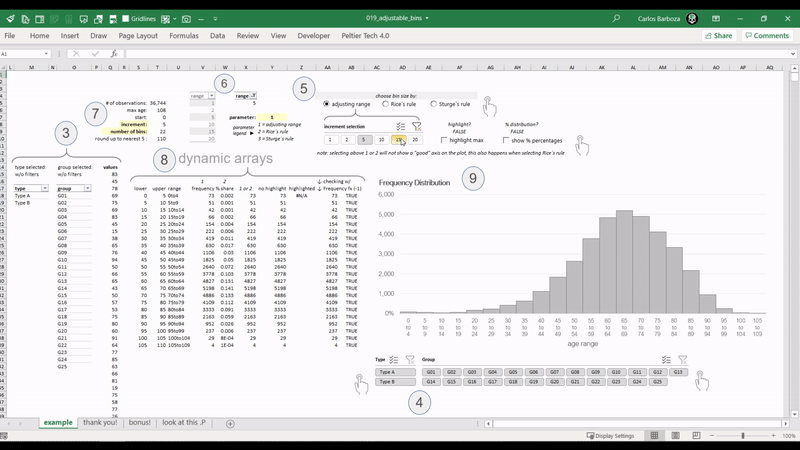
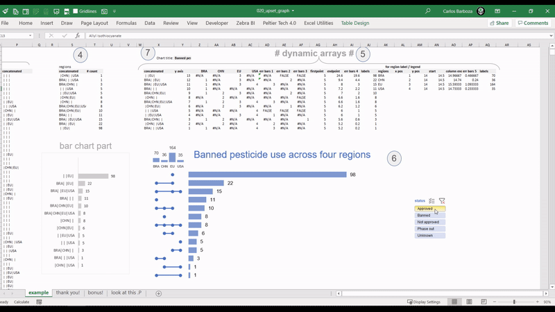
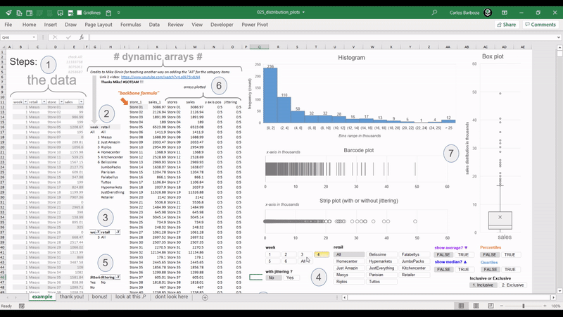
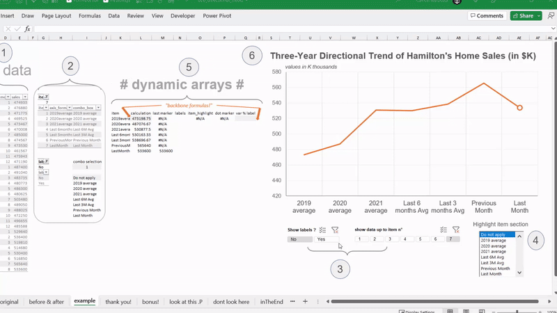
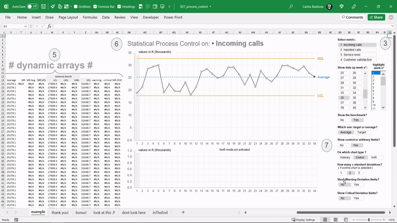
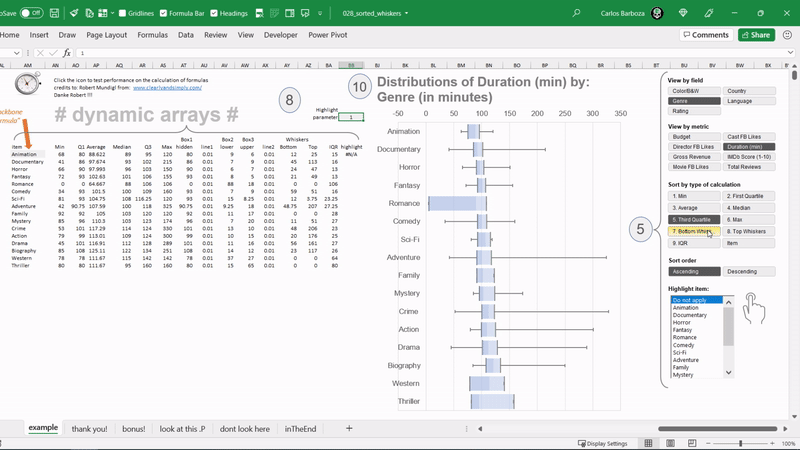
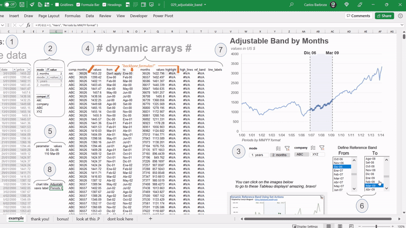
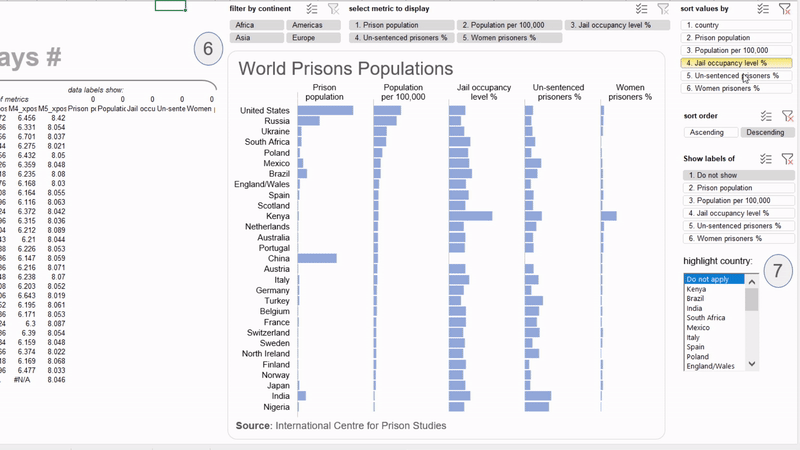
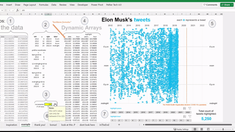
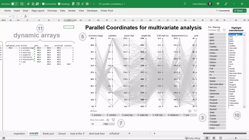
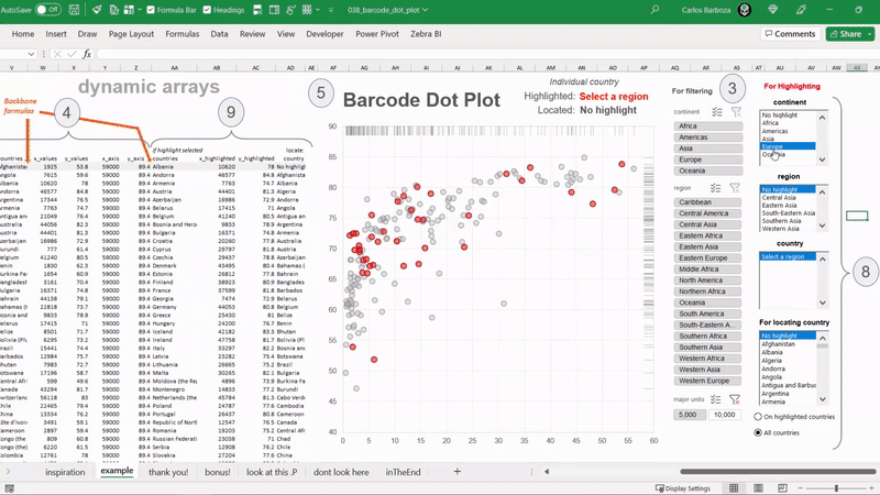
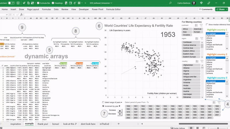
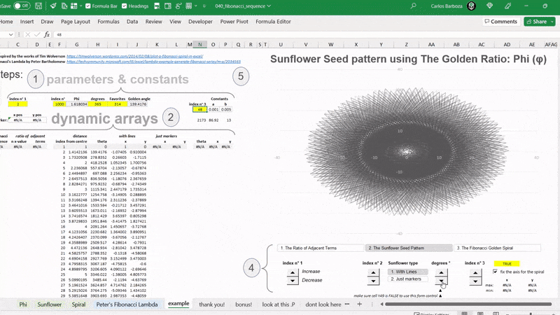
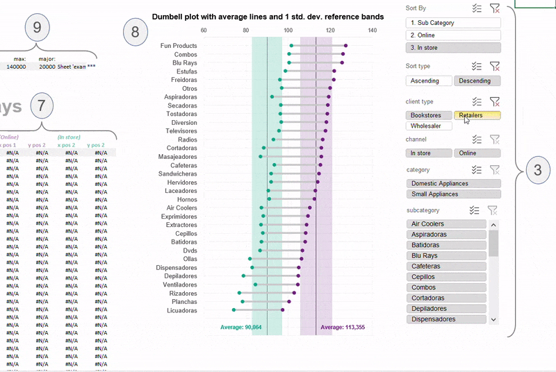
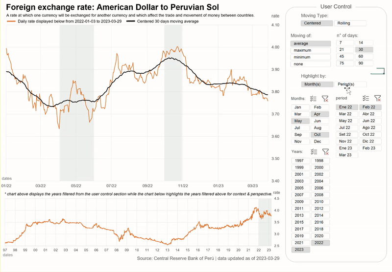
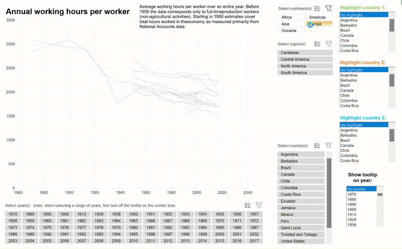
Excel charts with aynamic arrays
developed by carlos barboza using Excel's new functions