Skip to content

001: the band chart, in Power BI.

note: if you're on desktop or laptop, you can click on the images above ▲ to enlarge them

01. context for this post

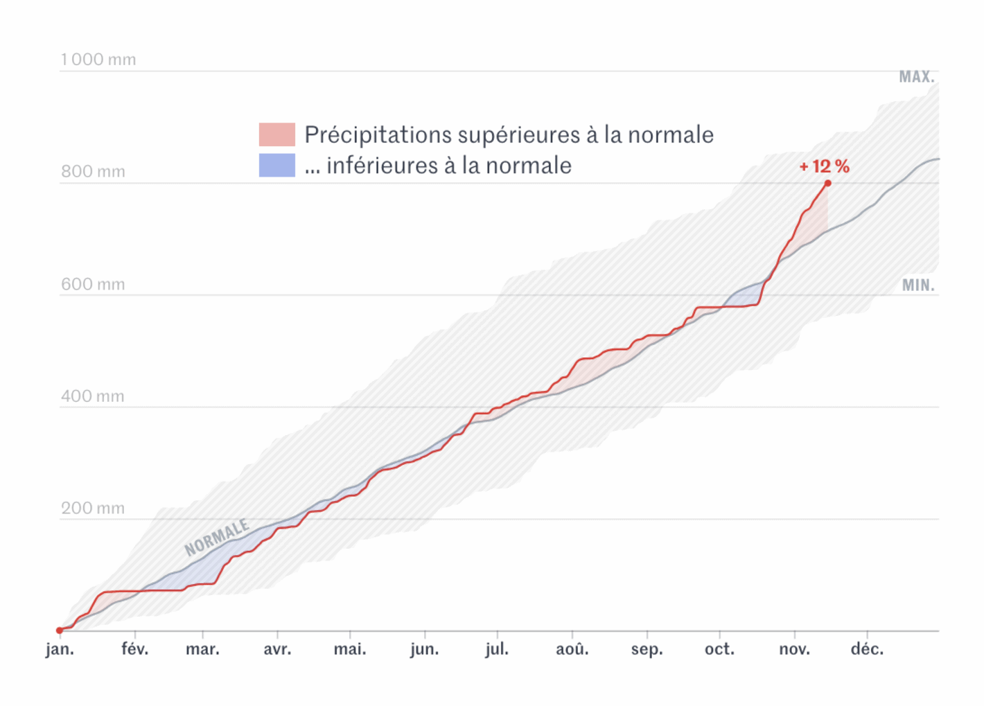
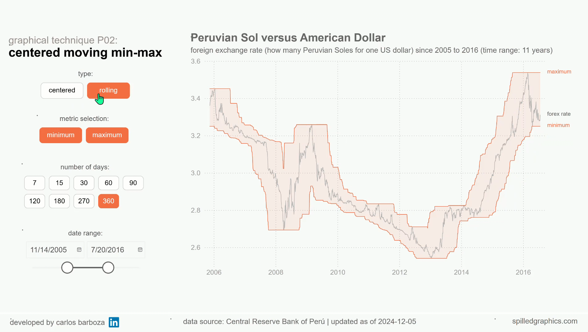
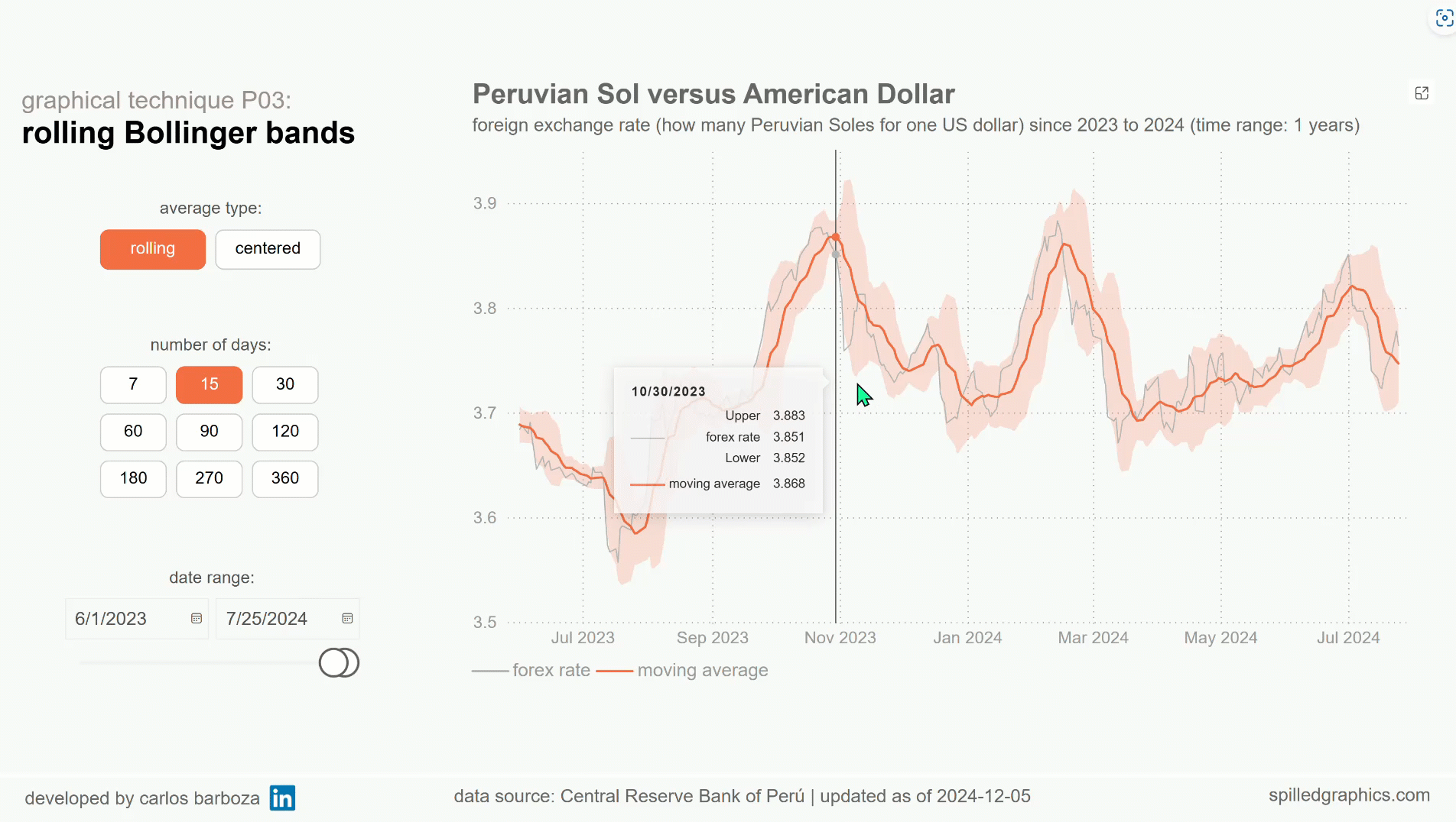
Band charts are not something new, but they are rarely seen in practice within business settings and that…it’s a big pity. They can be highly informative and provide rich context for visual analysis, especially when you are exploring the data. Consider this blog-post, a humble extension on Robert Mundigl´s original post on band charts which was written 15 years ago…and how you can implement them in Power BI.

Robert scratching his head questioning if your model is really….


If you read Rob´s post, you will find the following definition about band charts, which I quote:

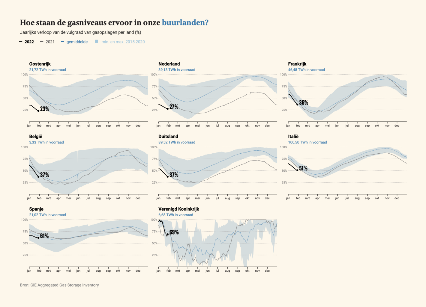
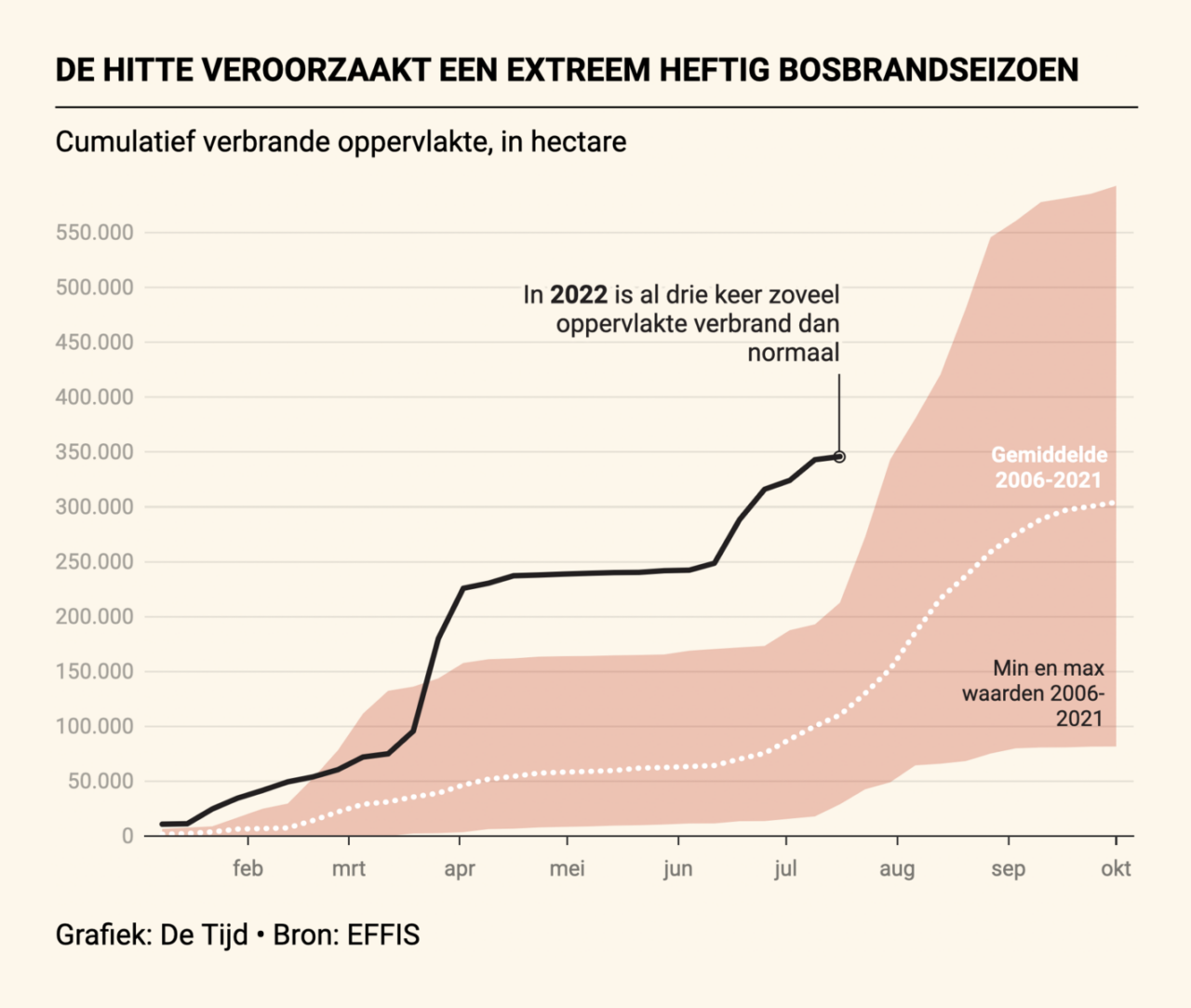
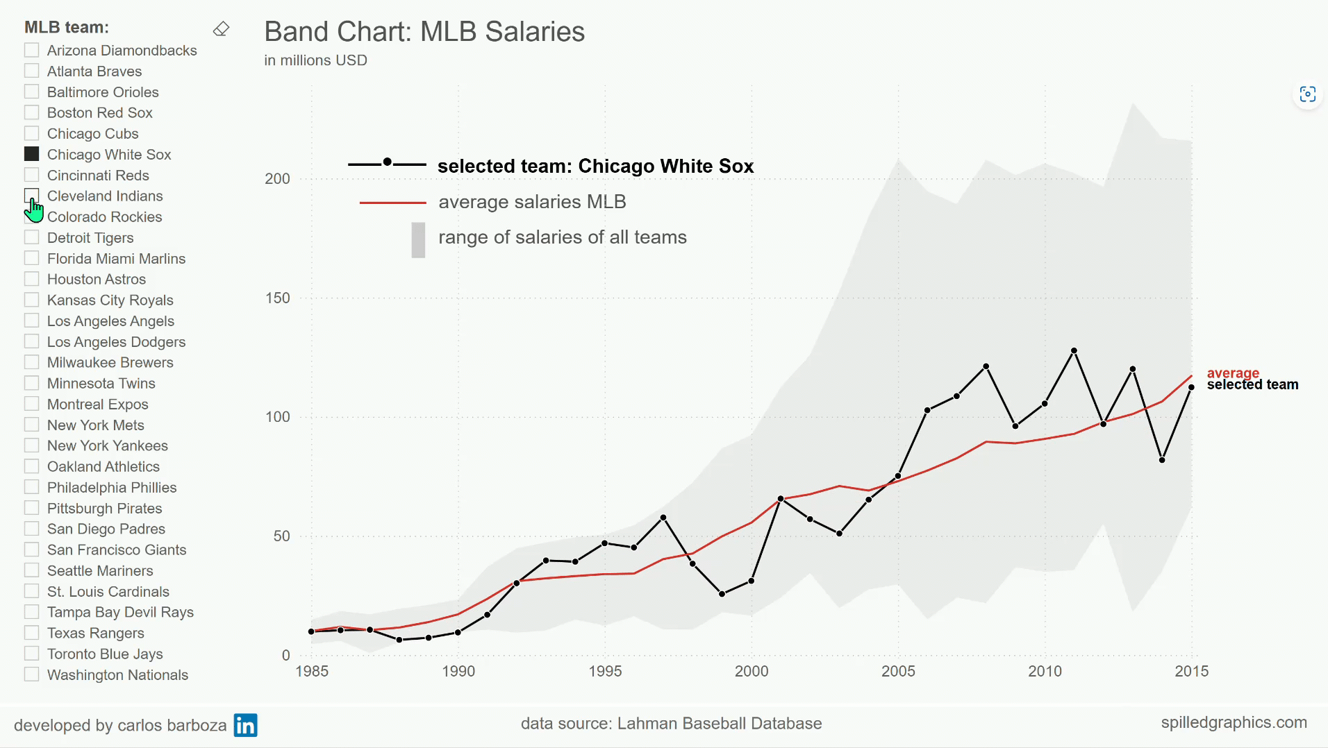
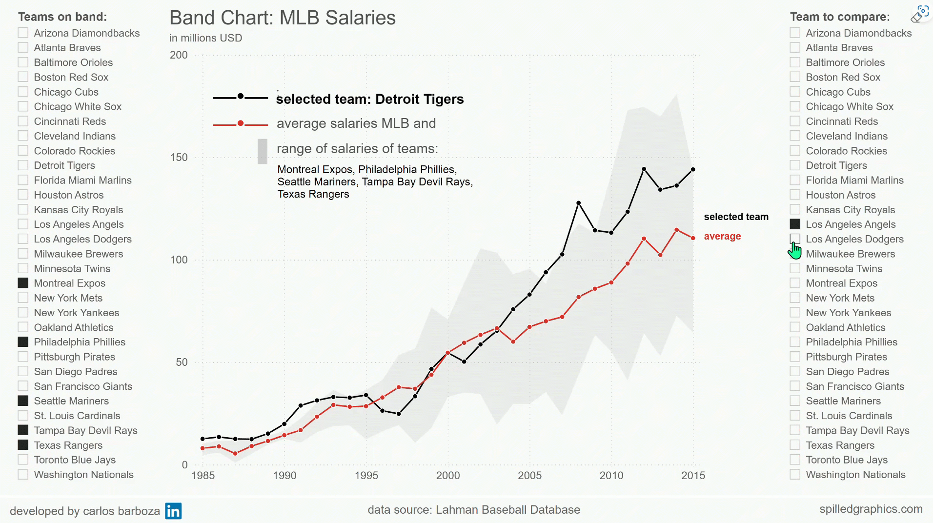
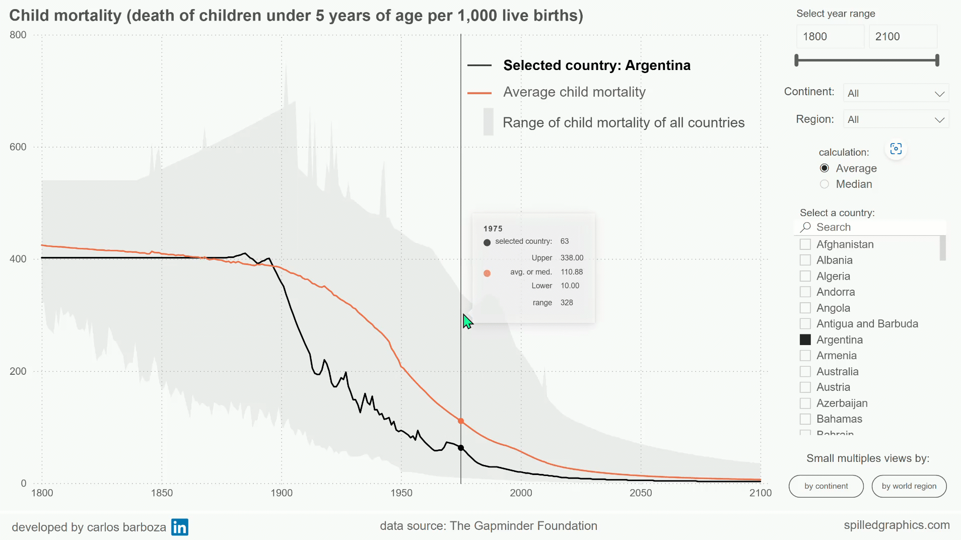
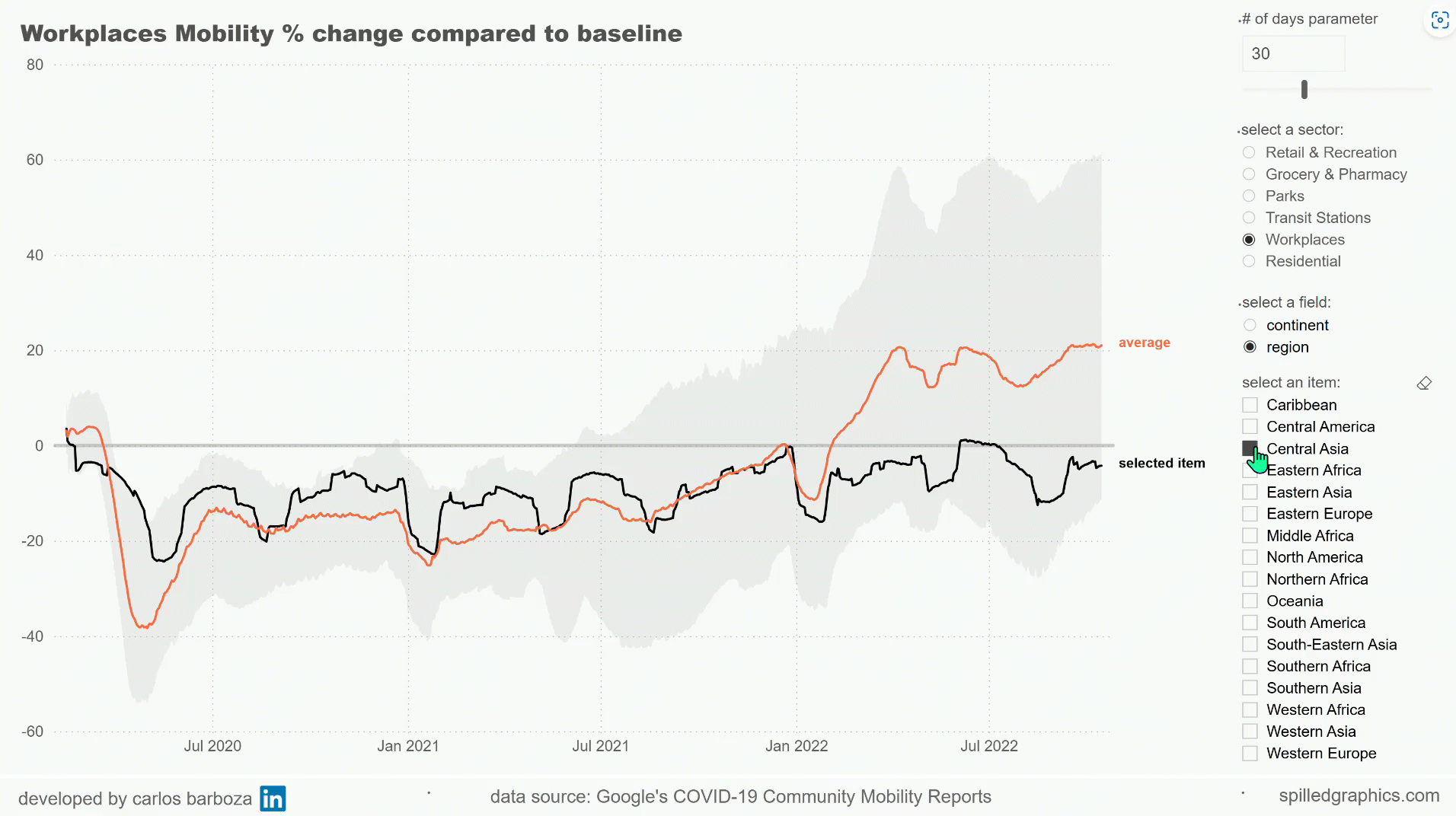
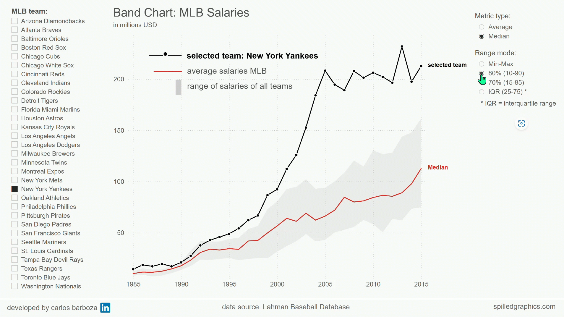
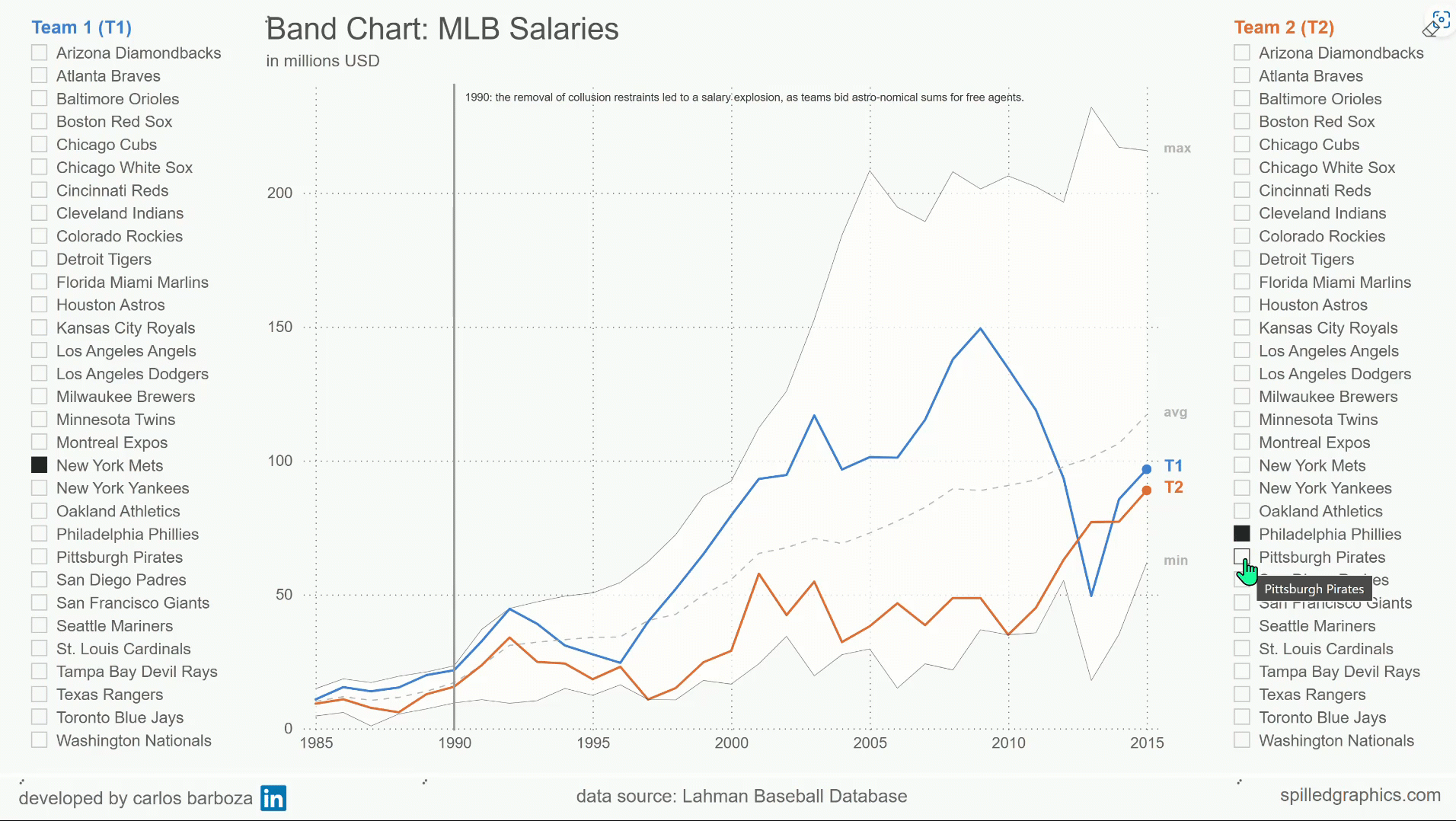
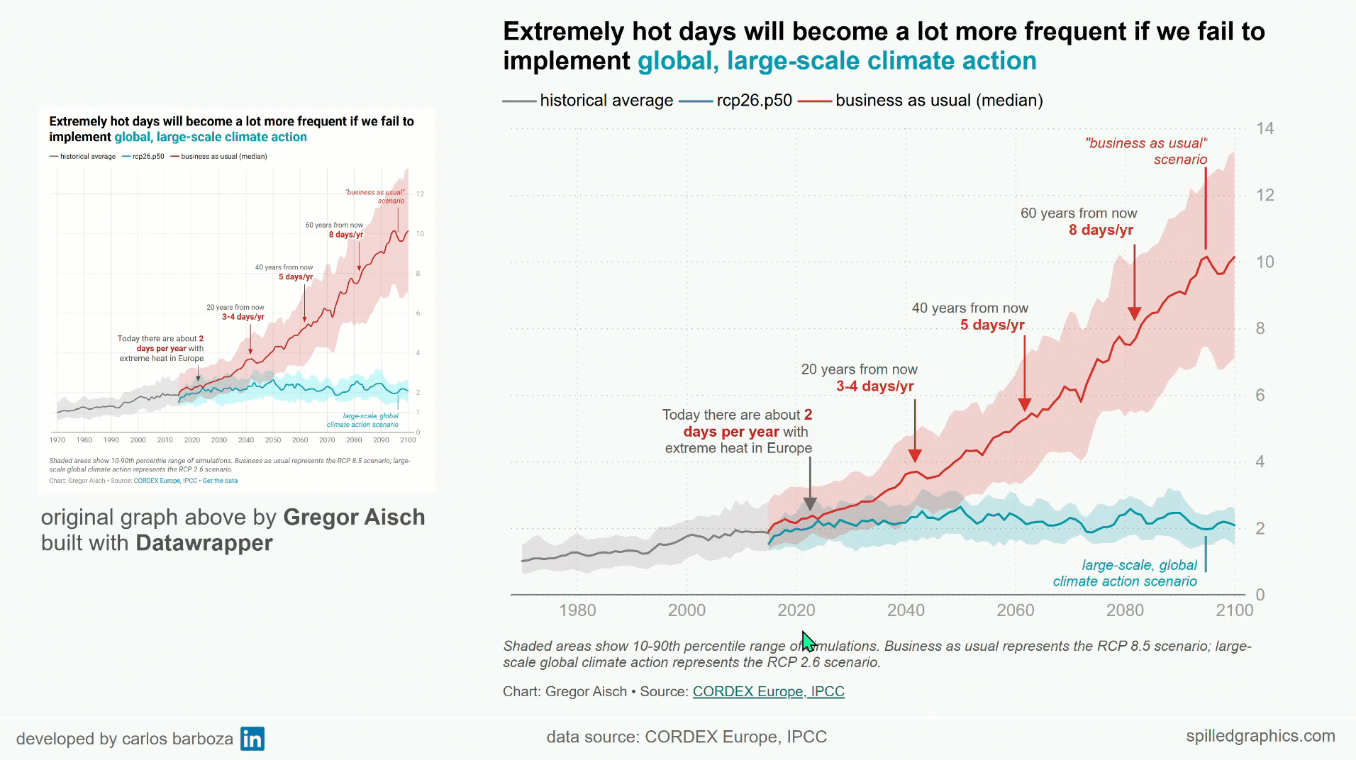
“Basically, a band chart is a standard line chart enhanced with a shaded area displaying the upper and lower boundaries of groups of data (e.g., the range between the minimum and the maximum of all members of the category). Band charts are very often supplemented by another line showing the arithmetic mean (the average).

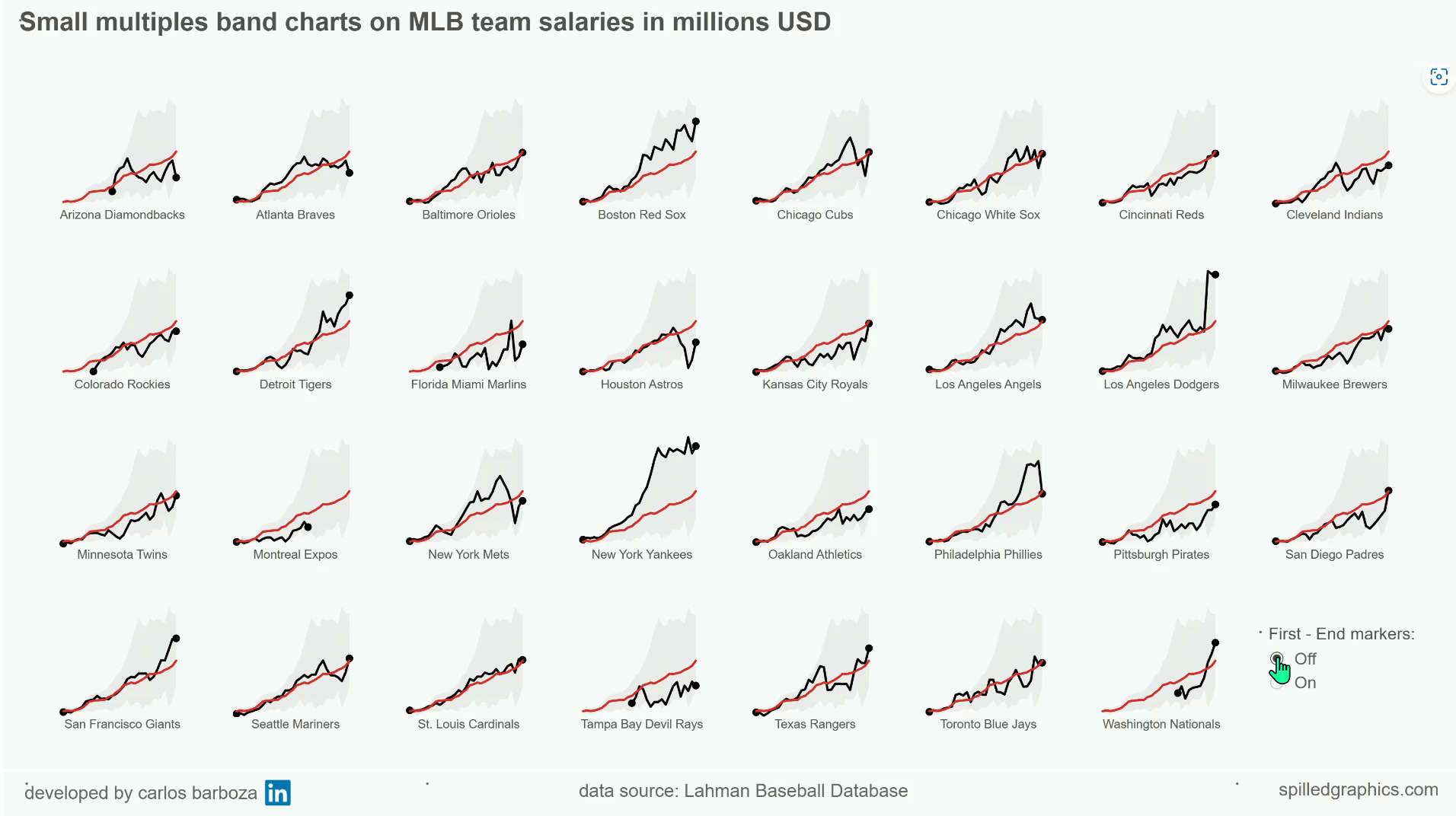
Band charts provide far more context to your visualization and more insight into your data. Especially if you have to explore unknown data sets. They are easy to implement, very intuitive, very effective and do not require one pixel more of your dashboard real estate than a standard single line chart.”

Ok, this definition of band charts is nice but let’s explore a bit more the calculations and visual parts needed, to visually see a band chart before proceeding on how to build it with Power BI.

02. the composition of band charts

Lorem ipsum dolor sit amet, consectetur adipiscing elit. Ut elit tellus, luctus nec ullamcorper mattis, pulvinar dapibus leo.

Lorem ipsum dolor sit amet, consectetur adipiscing elit. Ut elit tellus, luctus nec ullamcorper mattis, pulvinar dapibus leo.

Accordion Content

Accordion Content

Accordion Content

Accordion Content

Accordion Content

Accordion Content

Accordion Content

Accordion Content

03. how to build band charts in Power BI

Lorem ipsum dolor sit amet, consectetur adipiscing elit. Ut elit tellus, luctus nec ullamcorper mattis, pulvinar dapibus leo.

Lorem ipsum dolor sit amet, consectetur adipiscing elit. Ut elit tellus, luctus nec ullamcorper mattis, pulvinar dapibus leo.

Accordion Content

Accordion Content

Accordion Content

Accordion Content

Accordion Content

Accordion Content

Accordion Content

Accordion Content

04. interactive demo with Power BI

note: you can click on the bottom right arrow icon to: Open in full-screen mode

05. examples from major news outlets...

note: if you're on desktop or laptop, you can click on the images above ▲ to enlarge them

06. closing thoughts

I would like to thank (once again) my friend Robert for writing about band charts and Sean Lahman for sharing the MLB data. Thank you for reading. If you have any questions or doubts, please feel free to share them in the comments section below. Anything good can start with a discussion.

Subscribe
Notify of
guest
0 Comments
Oldest
Newest Most Voted
Inline Feedbacks
View all comments
0
Would love your thoughts, please comment.x
()
x