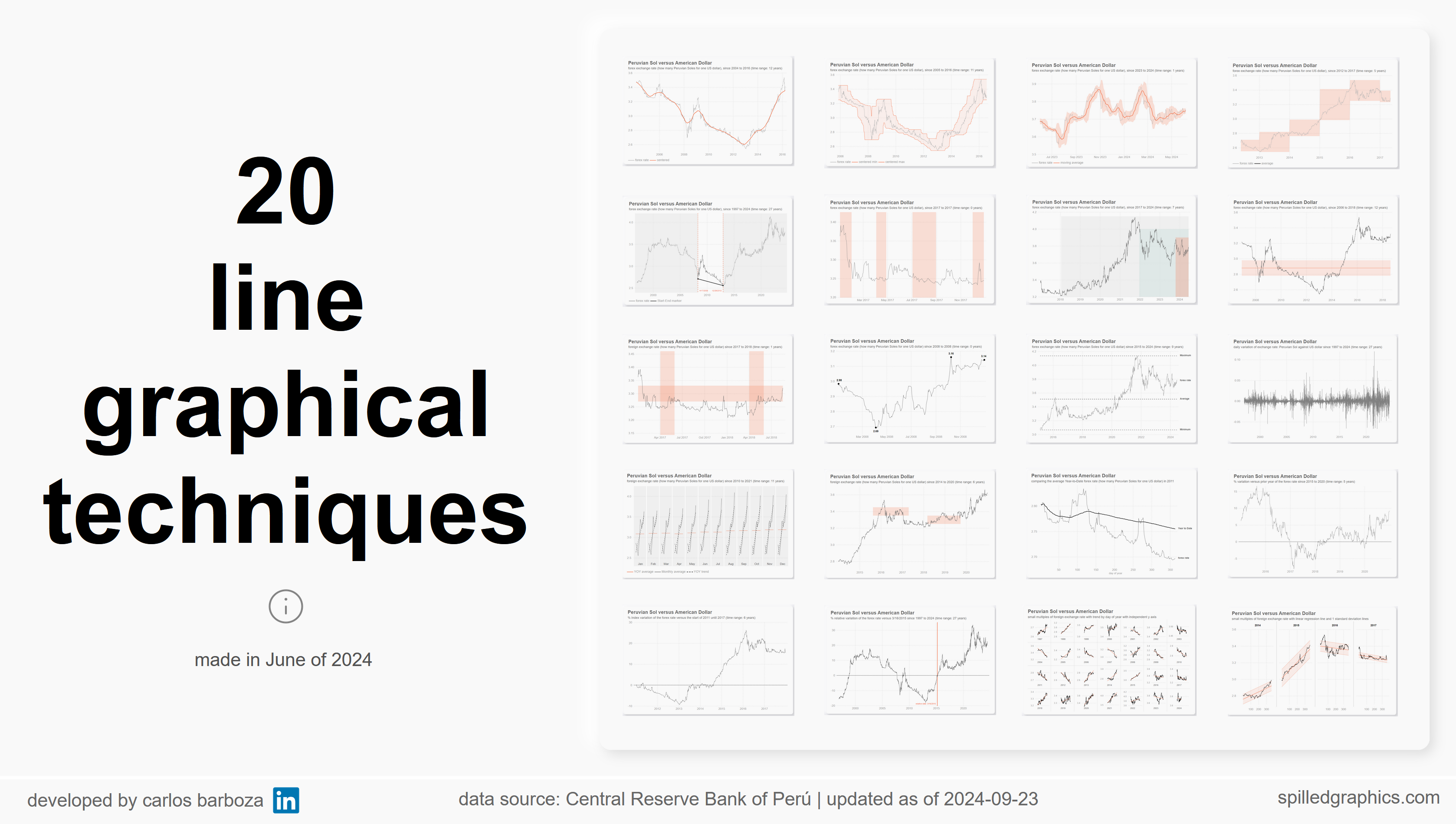
The different ways we can show one metric across time using the native features of the line chart visual of Power BI along with demonstrating the significance of intermediate DAX formulas to enhance dynamically the native settings of the visual. Data source: Central Reserve Bank of Perú.
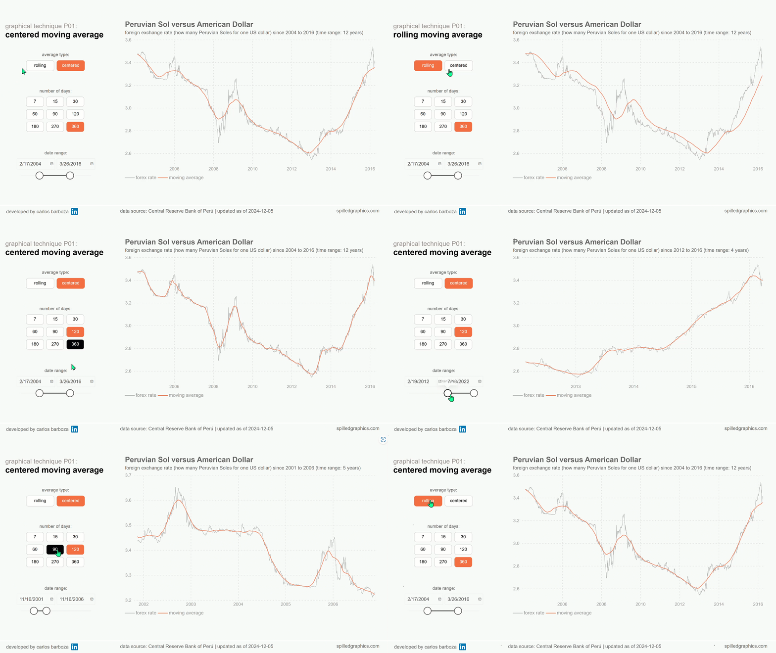
Moving averages are powerful tools for revealing trends hidden beneath short-term fluctuations. A rolling average works by continuously averaging a fixed number of recent data points and shifting—or “rolling”—forward in time with each new value. In contrast, a centered moving average places the average in the middle of the selected data window, reducing lag and offering a clearer, more accurate view of underlying patterns and long-term trends.
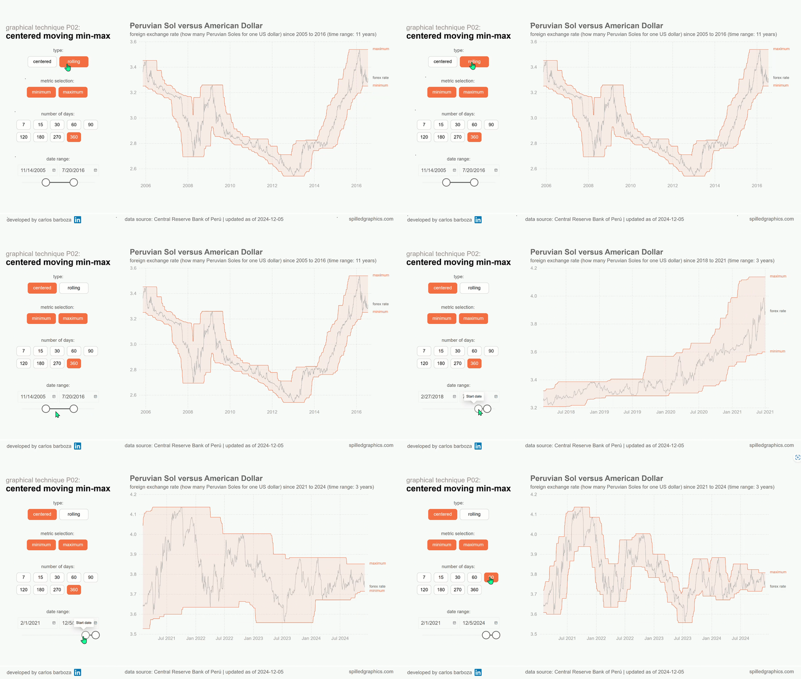
Instead of averages, how about moving minimums or maximums? The inputs for the calculations are the same as for the moving averages except now its calculating the lowest or highest value over specific time period and then, rolls or “moves” this min-max forward in time. These calculations could also be centered by taking the lowest or highest values from a set of data points located around the middle point of the rolling time period.
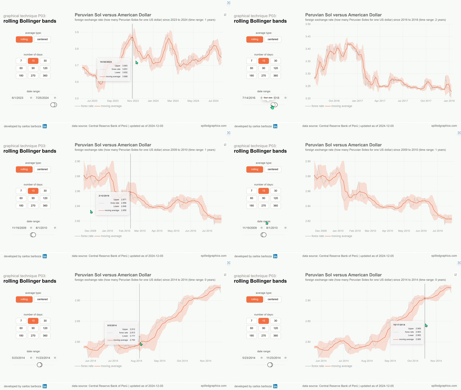
Developed by John Bollinger, these bands are a technical analysis tool to help investors or traders gauge stock market volatility. They appear on stock charts as three lines that move along with the price of a stock security. The center line is the stock price’s 20-day simple moving average (SMA) and the upper and lower bands are set at a certain number of standard deviations, usually two, above and below the center line.